
.svg)
.svg)
.svg)


%201.svg)

Key Takeaways
- Effective marketing dashboards serve specific stakeholder needs rather than showcasing marketing activity—executive dashboards prioritise revenue impact whilst operational dashboards focus on channel performance and tactical metrics requiring regular management attention
- KPI selection should ruthlessly prioritise metrics directly connected to business outcomes, eliminating vanity metrics that generate impressive numbers without revealing commercial performance or informing strategic decisions
- Visual design principles including appropriate chart type selection, colour coding consistency, and logical information hierarchy transform data into genuinely comprehensible business intelligence rather than impressive-looking complexity
- Dashboard tools ranging from Google Looker Studio (free) through Tableau and Power BI (mid-tier) to enterprise platforms enable different capability levels—tool selection should match stakeholder needs and team technical capability rather than defaulting to most sophisticated available option
- Regular dashboard review and maintenance cadences prevent metric drift, data connection failures, and strategic misalignment that gradually render initially valuable dashboards irrelevant or misleading
A Sydney digital agency produced monthly marketing reports for their largest client—a 47-page PDF compiling screenshots from Google Analytics, Google Ads, Facebook Ads Manager, LinkedIn Campaign Manager, and various SEO tools. Producing the report consumed two days of analyst time monthly. The client's marketing director admitted she read only the executive summary. The CEO never opened the document. Board presentations relied on three or four manually extracted metrics rather than the comprehensive report.
The agency rebuilt reporting as a live marketing dashboard—a single page displaying twelve carefully selected metrics with visual trend indicators, traffic light status signals, and month-over-month comparison. Dashboard production time dropped from two days to 30 minutes of data validation weekly. The marketing director checked the dashboard twice weekly rather than waiting for monthly reports. The CEO referenced it in fortnightly leadership meetings. Board presentations pulled directly from it.
Same data. Different presentation. Dramatically different stakeholder engagement and business value.
According to research from Databox, marketing teams using visual dashboards rather than static reports are 58% more likely to report that leadership understands marketing's contribution to business outcomes, demonstrating that presentation format fundamentally affects stakeholder comprehension and marketing credibility.
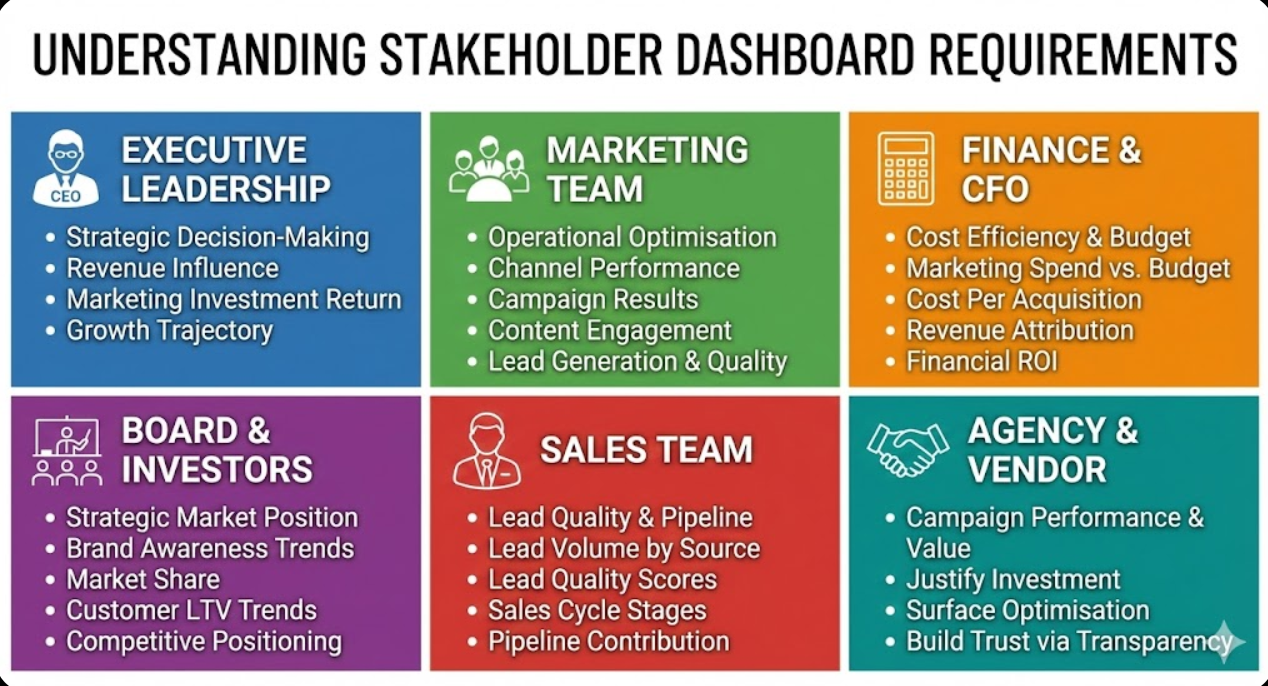
Understanding Stakeholder Dashboard Requirements
Effective dashboard design begins with understanding what different stakeholders actually need from marketing data rather than what marketing teams want to show.
Executive leadership requirements reflect strategic decision-making priorities rather than operational detail. CEOs, managing directors, and business owners need answers to fundamental questions: Is marketing generating revenue? Is marketing investment delivering acceptable returns? Are we growing faster than competitors? What's the trajectory over time? Executive dashboards should display revenue influenced by marketing, customer acquisition costs versus lifetime values, return on marketing investment by channel, and key trend indicators showing whether performance is improving or declining. Executives make decisions in minutes—dashboards must communicate essential answers immediately without requiring data literacy or analytical expertise.
Marketing team operational requirements focus on tactical performance management enabling daily and weekly optimisation decisions. Channel-specific performance metrics, campaign-level results, content engagement patterns, lead generation volumes and quality scores, and conversion rate trends across funnel stages serve marketing teams making daily optimisation decisions. Operational dashboards can accommodate more granular data and require more marketing literacy than executive equivalents—the audience has context enabling meaningful interpretation of channel-specific metrics that would confuse non-specialist executives.
Finance and CFO requirements prioritise cost efficiency, budget adherence, and financial return rather than marketing-specific metrics. Marketing spend versus budget, cost per acquisition by channel, revenue attributed to marketing investment, and marketing ROI expressed in financial terms rather than marketing metrics serve finance stakeholders who evaluate marketing through financial rather than marketing frameworks. Finance dashboards should translate marketing activity into financial outcomes using terminology and frameworks familiar to finance professionals rather than marketing-centric language requiring translation.
Board and investor requirements emphasise strategic market position, growth trajectory, and competitive standing relevant to governance and investment decisions. Brand awareness trends, market share indicators, customer acquisition trajectory, lifetime value trends, and competitive positioning benchmarks serve board members and investors evaluating organisational health and growth potential. Board dashboards should contextualise marketing performance within broader market conditions rather than presenting marketing metrics in isolation from business environment.
Sales team requirements focus on lead quality and pipeline contribution rather than traffic and engagement metrics marketing teams prioritise. Lead volume by source, lead quality scores, sales cycle stages attributed to marketing content, and content pieces referenced during sales conversations serve sales teams evaluating marketing's contribution to pipeline development. Sales-focused dashboards bridge marketing activity and revenue outcomes through pipeline metrics connecting both functional areas.
Agency and vendor reporting requirements for Australian businesses working with external marketing partners differ from internal stakeholder needs. Agency dashboards must demonstrate campaign performance, justify ongoing investment, and surface optimisation opportunities—whilst building trust through transparency and appropriate context for both strong and weak performance periods. Client-facing agency dashboards should present performance honestly with contextual explanation rather than selectively highlighting positive metrics whilst obscuring challenges.
Selecting the Right KPIs for Dashboard Inclusion
KPI selection determines whether dashboards inform decisions or simply display impressive-looking data that stakeholders ignore after initial review.
Revenue impact metrics earn dashboard priority through direct connection to business outcomes. Marketing-influenced revenue tracks deals where marketing touchpoints contributed to customer acquisition. Marketing-attributed revenue assigns credit to marketing channels through multi-touch attribution. Customer acquisition cost (CAC) measures total marketing investment divided by new customers acquired. Marketing return on investment compares revenue generated against marketing spend. These metrics speak the language business leaders understand—they justify marketing investment through commercial outcomes rather than activity metrics requiring faith that impressions eventually convert to revenue.
Pipeline contribution metrics connect marketing activity to sales outcomes for B2B Australian businesses with extended sales cycles. Marketing-qualified leads (MQLs) generated monthly, MQL-to-SQL conversion rates revealing lead quality, marketing-sourced pipeline value, and content pieces influencing closed deals provide sales-marketing alignment metrics serving both functions simultaneously. Pipeline contribution metrics require CRM integration connecting marketing activity data with sales outcome data—investment in integration infrastructure enables dashboard metrics otherwise unavailable through marketing platform data alone.
Channel performance metrics enable marketing teams to optimise spending allocation across digital channels. Cost per click and cost per conversion by channel enable direct efficiency comparison. Conversion rates by traffic source reveal which channels attract highest-quality visitors. Return on ad spend (ROAS) for paid channels justifies budget allocation decisions. Organic traffic growth and search ranking trends reveal SEO investment returns. Channel metrics serve operational marketing decisions requiring platform-level detail inappropriate for executive dashboards but essential for marketing team management.
Customer behaviour metrics reveal whether marketing attracts appropriate audiences who become valuable long-term customers. New versus returning customer ratios indicate audience development versus retention balance. Customer lifetime value by acquisition channel reveals which sources attract highest-value long-term customers beyond initial purchase metrics. Net Promoter Score trends connect marketing positioning with actual customer satisfaction. Churn rates by acquisition source reveal whether certain channels attract less loyal customers despite strong initial conversion rates.
Vanity metric elimination separates genuinely informative from superficially impressive metrics. Total website visits without conversion context reveal nothing about marketing effectiveness. Social media follower counts without engagement quality assessment indicate audience size not engagement value. Email list size without open rate, click rate, and conversion context measures quantity not quality. Impression counts for awareness campaigns without brand recall or sentiment tracking confirm exposure not impact. Eliminate metrics that impress stakeholders unfamiliar with digital marketing whilst concealing whether marketing actually drives business results—experienced stakeholders recognise vanity metrics immediately and lose confidence in reporting built around them.
Benchmarking context transforms raw metrics into meaningful performance assessment. Industry average conversion rates contextualise your performance against sector norms. Year-over-year comparison reveals growth trajectory independent of seasonal variation. Month-over-month trends indicate momentum direction. Previous quarter comparison provides recent trajectory context. Without benchmark context, metrics are meaningless—a 2.3% conversion rate is excellent or terrible depending entirely on industry, business model, traffic quality, and comparative period performance. Build benchmark context into dashboard design rather than requiring stakeholders to provide their own interpretive context.
Metric relationships reveal performance drivers invisible in isolated metrics. Analysing traffic alongside conversion rate simultaneously reveals whether traffic growth reflects audience quality improvement or volume-focused acquisition diluting conversion rates. Combining lead volume with lead quality scores reveals whether MQL increases represent genuine pipeline development or metric gaming through reduced qualification thresholds. Displaying cost-per-acquisition alongside customer lifetime value reveals whether acquisition efficiency is improving profitability or merely reducing costs at the expense of customer quality. Dashboard design should surface important metric relationships rather than displaying metrics in isolation that individually appear positive whilst collectively indicating problems.

Dashboard Design Principles for Australian Stakeholders
Effective dashboard visual design transforms data into comprehensible intelligence through deliberate application of information design principles.
Information hierarchy organises dashboard content from most to least important within visual scanning patterns. Place most critical metrics—typically revenue impact and headline performance indicators—in the upper left where Western reading patterns naturally begin. Secondary performance context occupies middle dashboard sections. Supporting detail and drill-down capabilities appear in lower sections or secondary dashboard tabs. Information hierarchy ensures stakeholders immediately encounter most important information rather than scanning entire dashboards searching for relevant data among comprehensive but undifferentiated displays.
Chart type selection matches visual format to data characteristics and communication objectives. Line charts communicate trends over time most clearly—revenue trajectory, traffic growth, conversion rate trends. Bar charts compare discrete categories effectively—channel performance comparison, content type engagement, campaign results ranking. Pie and donut charts show composition proportions for data summing to meaningful totals—traffic source distribution, marketing budget allocation. Scatter plots reveal relationships between two variables—conversion rate versus traffic volume, CAC versus LTV by channel. Gauge charts display single metric performance against target—current month revenue versus target, budget utilisation percentage. Mismatched chart types obscure rather than illuminate data—a line chart suggesting trends in categorical comparison data, or a pie chart with too many segments to meaningfully differentiate, produce confusion rather than insight.
Colour coding consistency enables rapid performance assessment without detailed reading. Traffic light systems (red/amber/green) communicate performance against targets immediately—green indicating on or above target, amber indicating marginal underperformance requiring attention, red indicating significant underperformance requiring immediate action. Consistent colour use across dashboard elements prevents confusion where identical colours mean different things in different contexts. Accessible colour choices account for colour blindness affecting approximately 8% of Australian males—avoid red/green-only coding without secondary shape or label differentiation for accessibility.
Data labelling clarity ensures numbers require no interpretation assistance. Display actual values alongside chart visualisations—stakeholders shouldn't need to estimate values from chart positions. Percentage change indicators showing month-over-month and year-over-year movement provide immediate trend context. Currency formatting for revenue metrics (using AUD with appropriate decimal places for Australian business context), percentage formatting for rates, and consistent number formatting throughout dashboards reduce cognitive load. Avoid requiring stakeholders to understand implied units—label everything explicitly even when context seems obvious.
White space and visual breathing room improve comprehension by preventing information density overwhelming cognitive processing. Resist the temptation to fill every dashboard pixel with metrics—strategic white space separates related metric groups, helps eyes track from one element to the next, and reduces the visual overwhelm that causes stakeholders to disengage from data-dense dashboards. Professional dashboard design uses significantly less information density than amateur designs attempting to justify dashboard value through metric volume rather than metric relevance.
Mobile responsiveness serves Australian executives increasingly accessing dashboards on smartphones and tablets rather than exclusively through desktop computers. Design dashboards with mobile viewing in mind—large enough text for comfortable reading on phone screens, touch-friendly interactive elements, and simplified mobile layouts prioritising most critical metrics when screen real estate constrains comprehensive display. Test dashboards on actual mobile devices rather than assuming desktop designs scale adequately to smaller screens.
Narrative context transforms data displays into comprehensible stories. Brief text annotations explaining significant metric changes—"Traffic decline reflects website migration completed 12 March" or "Conversion spike from EOFY promotion 15-30 June"—prevent stakeholders from misinterpreting normal business events as marketing problems or successes requiring investigation. Contextual annotations are particularly valuable for non-marketing stakeholders lacking background to independently explain metric variations. Annotations should be brief (one to two sentences maximum) and explanatory rather than defensive—context not excuses.
Dashboard Tools for Australian Businesses
Tool selection should match stakeholder needs, team technical capability, and budget constraints rather than defaulting to most sophisticated or least expensive available options.
Google Looker Studio (formerly Google Data Studio) provides powerful free dashboard creation with native integration to Google Analytics 4, Google Ads, Google Search Console, and YouTube Analytics alongside community connector access to hundreds of additional data sources. Google Looker Studio enables shareable live dashboards, scheduled email delivery, and collaborative editing without per-user licensing costs that enterprise platforms impose. Learning curve is moderate—users comfortable with Google products typically build competent dashboards within several days of practice. Looker Studio suits Australian SMEs and agencies wanting professional dashboards without significant tool investment, particularly those with Google-centric marketing technology stacks.
Microsoft Power BI provides enterprise-grade business intelligence with sophisticated data modelling, advanced visualisation capabilities, and deep Microsoft ecosystem integration. Power BI Desktop is free for individual use with Power BI Service subscription (starting around $14 AUD per user monthly) enabling sharing and collaboration. Power BI's DAX query language enables complex calculated metrics beyond simple platform data aggregation. Australian businesses using Microsoft 365 benefit from native integration with Excel, SharePoint, and Teams enabling dashboard distribution through existing communication channels. Power BI suits mid-market and enterprise Australian businesses requiring sophisticated data modelling, complex calculations, or integration with non-marketing business data.
Tableau offers industry-leading data visualisation with powerful analytical capabilities, beautiful default visualisations, and extensive customisation flexibility. Tableau pricing begins around $42 AUD per user monthly for Tableau Creator, with Viewer licences at lower per-user rates. Tableau's drag-and-drop interface enables sophisticated visualisations without programming knowledge, whilst Python and R integration serves advanced analytical requirements. Tableau suits Australian businesses where visualisation quality and analytical sophistication justify premium pricing—typically larger organisations where data-driven culture places high value on analytical presentation quality.
Databox provides marketing-focused dashboard creation with pre-built metric templates for common marketing platforms including Google Analytics, HubSpot, Salesforce, Facebook Ads, and dozens of others. Databox's free tier covers three data source connections with three dashboards, making initial implementation accessible without commitment. Paid plans starting around $72 USD monthly provide unlimited connections and advanced features. Databox's marketing-specific template library accelerates dashboard creation for marketing teams without requiring design expertise—pre-built KPI templates provide sensible starting configurations that customisation refines for specific business contexts.
HubSpot Reporting serves businesses using HubSpot CRM and marketing platforms through native reporting with excellent sales-marketing alignment metrics unavailable in pure marketing analytics tools. HubSpot's reporting dashboard capabilities are available within existing HubSpot subscription tiers, making them cost-effective for existing HubSpot customers. Marketing and sales funnel visibility within single platform—from first website visit through closed revenue—provides attribution clarity that tools requiring separate platform integration struggle to replicate. HubSpot reporting suits Australian businesses with HubSpot-centric marketing and sales technology stacks where native integration outweighs external dashboard tool flexibility.
Klipfolio provides real-time dashboard creation with extensive data connector library and dashboard sharing capabilities. Klipfolio plans start around $99 USD monthly providing team dashboard access. Klipfolio's real-time data refresh capabilities serve businesses where marketing metrics change rapidly and require near-live monitoring—high-volume e-commerce operations, time-sensitive campaign management, and media businesses where audience metrics update continuously. Real-time refresh differentiates Klipfolio from tools providing daily or periodic data updates that miss intraday performance variations requiring immediate response.
AgencyAnalytics serves marketing agencies managing multiple client dashboards with white-label reporting, client portal access, and automated reporting delivery. AgencyAnalytics plans begin around $10 USD per client monthly with volume pricing for larger agency client portfolios. Pre-built marketing channel integration library covering most platforms agencies use reduces setup time per client significantly. White-label capability enables agency-branded dashboards maintaining professional presentation without revealing technology infrastructure. AgencyAnalytics suits Australian marketing agencies requiring scalable multi-client reporting infrastructure rather than building individual client dashboards through general-purpose business intelligence tools.
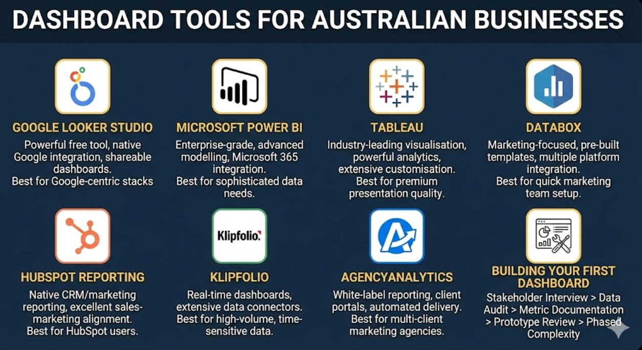
Building Your First Marketing Dashboard
Practical dashboard construction follows systematic process ensuring finished dashboards serve stakeholder needs rather than reflecting technical capability or data availability.
Stakeholder interview process gathers requirements before touching any dashboard tool. Interview each dashboard audience individually—what decisions do they make that marketing data should inform? What questions do they currently struggle to answer about marketing performance? What metrics do they currently track manually because reporting doesn't provide them? What would make them check a marketing dashboard weekly rather than monthly? Stakeholder interviews take 30-60 minutes each but prevent weeks of build time producing dashboards that miss actual stakeholder needs. Document requirements explicitly—dashboard briefs should specify required metrics, preferred update frequency, access methods, and decision-making context dashboards must serve.
Data source audit identifies what data is available, reliable, and connectable before designing dashboards assuming data access that doesn't exist. Review all marketing platform data sources and assess data quality, identify gaps between required metrics and available data, determine connection methods for each source, and flag data quality issues requiring resolution before dashboard accuracy is trustworthy. Dashboards built on unreliable data actively damage marketing credibility—stakeholders discovering data inaccuracies lose trust in all dashboard reporting regardless of which metrics are actually reliable.
Metric calculation documentation defines exactly how each dashboard metric is calculated, preventing confusion when stakeholders question numbers or different data sources show conflicting figures. Document metric definitions including data source, calculation methodology, inclusion and exclusion criteria, and known limitations. This documentation is particularly important for composite metrics like marketing ROI that combine data from multiple sources through calculations requiring explicit definition to enable consistent interpretation. Metric documentation should be accessible to stakeholders—not buried in technical notes but summarised in dashboard context where stakeholders encounter unfamiliar metrics.
Prototype review cycles validate dashboard designs with actual stakeholders before investing significant build time. Create low-fidelity prototypes (sketched layouts, simple mockups) showing dashboard structure and metric selection, present to primary stakeholders gathering feedback on metric relevance and layout comprehensibility, iterate based on feedback before building functional dashboards, and conduct final review with live data ensuring real-world data display matches prototype expectations. Prototype review prevents discovering after significant build investment that stakeholders want fundamentally different information organisation than delivered.
Phased complexity introduction builds stakeholder familiarity before adding analytical sophistication. Launch initial dashboards with core metrics stakeholders immediately understand—revenue, leads, traffic—before introducing sophisticated attribution models, predictive metrics, or complex calculated measures requiring explanation. Stakeholders comfortable with dashboard basics engage more productively with sophisticated additions than those encountering comprehensive analytical complexity simultaneously. Plan dashboard evolution roadmaps scheduling feature additions as stakeholder data literacy develops through regular engagement.
Dashboard Maintenance and Governance
Dashboard value degrades without systematic maintenance preventing data connection failures, metric drift, and strategic misalignment from accumulating unnoticed.
Data connection monitoring prevents dashboard displays from silently showing stale or incorrect data when API connections fail, platform authentication expires, or data source structures change following platform updates. Implement automated monitoring alerting when data fails to refresh within expected windows. Designate dashboard owners responsible for investigating and resolving data connection issues promptly—dashboards showing outdated data without clear indication actively mislead stakeholders making decisions on inaccurate information.
Metric relevance reviews ensure dashboards evolve alongside business strategy rather than calcifying around original metric selections that no longer reflect current priorities. Conduct quarterly reviews assessing whether displayed metrics still reflect key business questions and strategic priorities. Business strategy evolution—new market entry, product launches, pivot from acquisition to retention focus—frequently renders previously relevant metrics less important whilst creating demand for metrics not currently tracked. Dashboard governance processes enabling metric additions and removals maintain ongoing relevance.
Access management ensures appropriate stakeholders receive dashboard access without inadvertent exposure of commercially sensitive data to inappropriate audiences. Configure view-only access for most stakeholders preventing accidental modification, maintain edit access for designated dashboard owners only, review access lists quarterly removing departed team members and adding new stakeholders, and create separate dashboard versions for different audience sensitivity requirements when single dashboards contain data inappropriate for all audiences.
Training and onboarding ensures new stakeholders interpret dashboards correctly from initial exposure. Create brief dashboard guides explaining metric definitions, calculation methodologies, benchmark contexts, and appropriate interpretive frameworks. Conduct 30-minute dashboard orientation sessions with new stakeholders preventing misinterpretation habits forming through unsupported initial exploration. Experienced stakeholders explaining dashboard context to new colleagues informally transfers institutional knowledge—but formal documentation ensures consistent interpretation across stakeholder turnover.
Performance optimisation maintains dashboard loading speeds that stakeholder patience requires. Dashboards loading slowly—particularly those connecting to multiple data sources through complex queries—cause stakeholder abandonment before data is reviewed. Optimise by reducing unnecessary data connections, simplifying complex calculated metrics, implementing appropriate data caching, and archiving historical dashboards no longer requiring live data connections. Dashboard performance monitoring identifies degradation before it affects stakeholder experience significantly.
Frequently Asked Questions
How many metrics should Australian marketing dashboards display, and how do you decide what to include versus exclude?
Effective dashboards display significantly fewer metrics than most marketing teams initially propose—typically 8-15 carefully selected KPIs for executive dashboards and 15-25 for operational marketing team dashboards. The inclusion test is ruthless: would this metric change prompt a different business decision? If a metric moving 20% in either direction wouldn't change what stakeholders do, it doesn't belong on a dashboard. Exclude metrics that are interesting but not decision-driving, metrics that stakeholders can't influence through available actions, vanity metrics generating impressive numbers without revealing commercial performance, and metrics that duplicate information already shown through other dashboard elements. Include metrics that directly answer the questions stakeholders ask most frequently, metrics revealing whether key strategic initiatives are working, metrics that change business or marketing decisions when they move, and metrics connecting marketing activity to commercial outcomes stakeholders care about.
What's the best approach for Australian agencies to present marketing dashboards to clients who have varying levels of digital marketing literacy?
Client dashboard design must match client literacy rather than agency analytical sophistication—technically impressive dashboards that clients can't interpret generate frustration and erode trust rather than demonstrating value. For less digitally literate clients, prioritise plain-language metric labelling (avoid acronyms), traffic light performance indicators enabling rapid assessment without metric interpretation, prominent narrative context explaining what numbers mean and what actions follow from them, and limited metric selection preventing overwhelm. For sophisticated clients comfortable with digital marketing concepts, more granular channel-specific data, attribution model explanations, and comparative benchmarking provide analytical depth that simpler dashboards inadequately serve. Assess client literacy through initial conversations rather than assuming—the most dangerous dashboard mistake serves the wrong literacy level in either direction, patronising sophisticated clients or overwhelming less experienced ones.
How should Australian businesses handle situations where different marketing platforms report conflicting performance metrics for the same activities?
Platform metric discrepancies are normal and inevitable due to different attribution models, tracking methodologies, and measurement philosophies across platforms—acknowledging and explaining this reality rather than pretending single-source truth exists builds more credibility than selectively citing whichever platform shows better performance. Choose a primary attribution source (typically GA4 as independent platform not self-reporting like advertising platforms) for dashboard primary metrics, display platform self-reported metrics in secondary positions with clear labelling indicating their source and known discrepancy context, and document in dashboard guides why specific sources are trusted for specific metrics. Create metric definitions specifying exactly which platform measures which dashboard KPI—consistency in data source selection, even if imperfect, produces more reliable trend analysis than switching sources when different platforms show preferred numbers.
What dashboard update frequency is appropriate for different stakeholder types and metric categories, and how does real-time data differ from periodic updates?
Update frequency should match the decision-making cadence each metric informs rather than defaulting to real-time data collection for all metrics. Real-time or near-real-time updates suit metrics requiring immediate response—active paid advertising campaign performance (hourly updates enable intraday budget optimisation), live event or promotion traffic (immediate response to engagement spikes), and e-commerce revenue during peak sales periods (real-time monitoring of promotion performance). Daily updates suit most operational marketing metrics—yesterday's campaign results, previous day's organic traffic, daily lead volumes—where next-day visibility enables timely optimisation without requiring always-on monitoring. Weekly updates suit channel performance trends, content engagement patterns, and lead quality metrics where daily variation creates noise obscuring meaningful patterns. Monthly updates suit executive revenue impact metrics, quarterly strategic reviews, and brand health indicators where trend analysis requires sufficient data accumulation. Implementing real-time data for metrics that stakeholders review weekly wastes data infrastructure investment whilst creating unnecessary dashboard complexity.
How should Australian marketing teams structure dashboard presentations during board or executive meetings to maximise engagement and decision-making impact?
Dashboard-driven meeting presentations should guide stakeholders through data narratives rather than expecting independent dashboard interpretation during meetings. Begin with headline performance summary—are we on track to business objectives or not? Provide immediate answer before detail. Follow with three to five key insights from dashboard data explaining performance drivers behind headline numbers. Present one to two strategic recommendations emerging from data patterns—dashboards should inform decisions, not just report history. Allocate two-thirds of meeting time to discussion and decision-making rather than data presentation. Pre-circulate dashboards 24-48 hours before meetings enabling stakeholder review and question preparation, converting meeting time from passive data consumption to active strategic discussion. Avoid presenting every dashboard metric—curate the subset most relevant to current strategic priorities and meeting agenda, trusting that stakeholders can explore complete dashboards independently for comprehensive detail.
What are the most common dashboard mistakes Australian marketing teams make that undermine stakeholder trust and engagement over time?
Fundamental mistakes include dashboard abandonment after initial launch—dashboards requiring manual effort to maintain gradually develop data errors and stale metrics that destroy stakeholder trust when discovered. Inconsistent metric definitions that change between reporting periods make trend analysis impossible and suggest manipulated rather than measured performance. Selective positive metric highlighting that excludes underperformance destroys credibility with sophisticated stakeholders who recognise cherry-picked reporting. Dashboard complexity expanding beyond stakeholder literacy as marketing teams add metrics serving team curiosity rather than stakeholder decisions. Failing to connect marketing metrics to business outcomes—dashboards showing channel metrics without connecting them to revenue impact fail the fundamental test of demonstrating marketing's commercial contribution. Data latency without clear labelling—displaying outdated metrics without timestamps indicating data currency misleads stakeholders making decisions on information they believe is current.
How should Australian businesses approach dashboard creation when marketing data is fragmented across multiple platforms without integration infrastructure?
Fragmented data is the most common dashboard creation obstacle for Australian SMEs—marketing technology stacks frequently include platforms without native integration or API access enabling automated data consolidation. Practical approaches include manual data entry dashboards for small metric sets where manual update effort is manageable (typically under 15 metrics requiring monthly manual refresh), third-party connector services (Supermetrics, Funnel.io, Windsor.ai) that extract data from diverse marketing platforms into centralised destinations for dashboard tools, Google Sheets as intermediate data layer manually updated and connected to Looker Studio dashboards, and prioritising integration infrastructure investment for highest-priority metrics whilst accepting manual processes for lower-priority data. Perfect automated integration is aspirational—starting with imperfect but useful dashboards using available data builds stakeholder engagement with dashboard culture whilst identifying which integrations justify investment based on demonstrated value.
Marketing Dashboards Transform Stakeholder Relationships
Marketing dashboard creation transforms the chronic credibility challenge marketing teams face—proving commercial contribution through data stakeholders can't interpret—into a strategic communication advantage that builds confidence, justifies investment, and enables data-driven decisions across Australian organisations.
The frameworks outlined in this guide—stakeholder-centred design, ruthless KPI selection, principled visual presentation, appropriate tool selection, and disciplined maintenance—provide comprehensive foundation for dashboard programmes that stakeholders actually use rather than impressive technical displays they ignore after initial novelty fades.
Australian marketing teams investing in genuinely useful dashboard creation consistently discover that improved stakeholder understanding of marketing's commercial contribution leads to stronger budget advocacy, more strategic marketing conversations, and organisational cultures where marketing decisions are informed by evidence rather than intuition or organisational politics.
Ready to build marketing dashboards that genuinely serve your Australian stakeholders and demonstrate marketing's commercial contribution? Maven Marketing Co. provides comprehensive marketing dashboard design, build, and maintenance services ensuring your performance data becomes compelling business intelligence that drives confident decision-making. Let's transform your marketing data into dashboards that stakeholders actually use.

Table of contents
read more blogs
Customer Journey Mapping: From Awareness to Advocacy
Australian businesses invest heavily in acquiring new customers whilst remaining largely unaware of the complete experience those customers navigate from initial brand discovery through purchase, onboarding, ongoing relationship, and eventual advocacy or churn. This ignorance is expensive—organisations unknowingly create friction at critical journey stages that haemorrhages prospects before conversion, delivers disappointing post-purchase experiences that undermine retention, and misses systematic advocacy development opportunities that would otherwise generate valuable referrals. Customer journey mapping addresses this blindspot comprehensively, documenting every touchpoint, emotion, and decision point customers encounter throughout their relationship lifecycle—revealing where experiences delight, where they frustrate, and where they completely fail to meet customer expectations. This comprehensive guide reveals how Australian businesses can develop, validate, and act on customer journey maps that improve conversion rates, strengthen retention, reduce churn, and systematically develop the customer advocacy that drives sustainable organic growth.

A/B Testing Framework: Statistical Significance for Australian Businesses
Australian businesses implementing A/B testing without statistical rigour consistently make one of two expensive mistakes—either declaring winners from tests with insufficient data and implementing changes that actually harm conversion rates, or abandoning genuinely effective improvements because poorly designed tests failed to detect real performance differences. Both errors waste testing resources whilst producing false confidence in decisions that proper statistical frameworks would have made reliable. Statistical significance isn't academic complexity reserved for data scientists—it's the practical foundation ensuring A/B test conclusions reflect genuine performance differences rather than random variation that coincidentally favoured one variant during a specific testing period. This comprehensive guide reveals how Australian businesses can implement statistically sound A/B testing frameworks that produce reliable conversion improvements through disciplined hypothesis development, appropriate sample size planning, proper test execution, and statistically valid result interpretation—transforming testing programmes from expensive guesswork into systematic conversion optimisation engines.

Heatmap Analysis Tools: Understanding User Behavior on Your Site
Australian businesses invest substantially in website design, content creation, and traffic acquisition whilst remaining largely ignorant of how visitors actually interact with their sites—which elements attract attention, which calls-to-action get ignored, how far down pages visitors scroll before abandoning, and which interface elements confuse or frustrate users attempting to convert. Heatmap analysis tools bridge this critical knowledge gap, translating millions of individual visitor interactions into visual representations revealing behaviour patterns that traditional analytics metrics cannot capture. Where Google Analytics tells you how many visitors left a page, heatmaps show you exactly where they were looking, what they clicked, and how far they scrolled before leaving—transforming abstract drop-off statistics into actionable interface insights. This comprehensive guide reveals how Australian businesses can implement, interpret, and act on heatmap analysis across click, scroll, move, and session recording formats to understand genuine user behaviour and make evidence-based optimisation decisions that improve conversion rates.


