.svg)
.svg)
.svg)


%201.svg)

Key Takeaways
- Heatmap analysis tools visualise aggregate visitor behaviour patterns through colour-coded representations revealing which page elements attract engagement, where visitors lose interest, and what interface problems cause conversion drop-off
- Click heatmaps identify which elements receive interaction and which are ignored, revealing navigation confusion, missed calls-to-action, and unexpected click patterns that redesign and copy optimisation can address
- Scroll heatmaps show how far down pages visitors typically progress, identifying the critical threshold where most visitors stop scrolling and ensuring important content and calls-to-action appear above that threshold
- Session recordings complement aggregate heatmap data by showing individual visitor journeys, revealing specific frustration patterns, rage clicks, and navigation confusion that colour-coded averages can obscure
- Combining heatmap insights with GA4 quantitative data produces comprehensive understanding of both what visitors do and why they do it, enabling targeted optimisation rather than broad redesigns based on incomplete evidence

A Canberra financial planning firm redesigned their homepage three times in two years based on designer intuition and client feedback from existing customers. Each redesign cost approximately $8,000 and produced minimal measurable conversion improvement. Prospective client inquiry rates stubbornly remained around 1.2% of homepage visitors despite attractive designs that the team and existing clients praised enthusiastically.
Heatmap implementation revealed the disconnect immediately. Click heatmaps showed visitors repeatedly clicking a client testimonial photograph—apparently expecting it to link to a case study or expanded testimonial. The click was a dead end. Scroll heatmaps revealed that 68% of visitors never scrolled far enough to see the contact form positioned below the fold. Move heatmaps showed visitors spending significant time hovering over service descriptions but never clicking the adjacent call-to-action buttons, suggesting copy failed to sufficiently motivate action.
Three targeted changes based on heatmap evidence: testimonial photos linked to expanded case studies, contact form repositioned above the fold, and service description copy revised to address specific client concerns revealed by hover patterns. Total implementation cost: $600. Result: inquiry conversion rate improved from 1.2% to 3.1% within 60 days—a 158% improvement from evidence-based micro-optimisations costing a fraction of previous intuition-based redesigns.
According to research from Hotjar, businesses using heatmap analysis alongside traditional analytics improve conversion rates 2-3x faster than those relying on quantitative data alone, demonstrating the unique diagnostic value of behavioural visualisation tools.
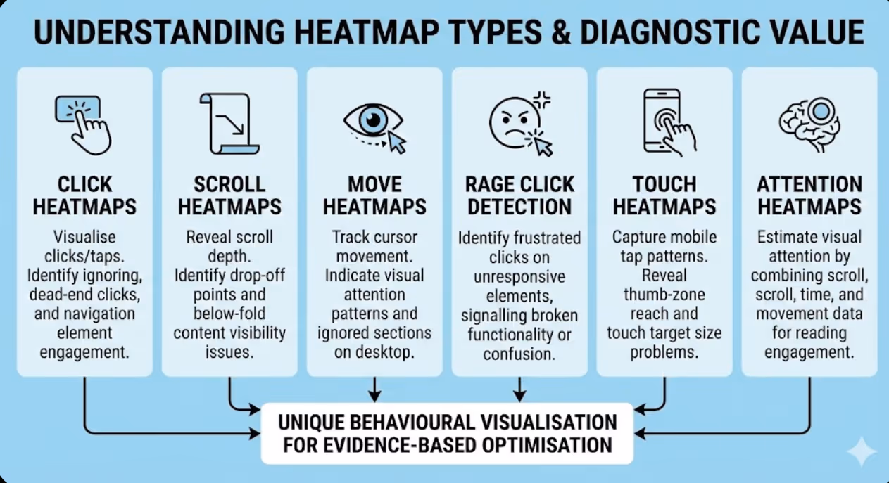
Understanding Heatmap Types and Their Diagnostic Value
Different heatmap formats reveal distinct aspects of user behaviour, with each type answering specific questions that others cannot address.
Click heatmaps visualise where visitors click or tap across page surfaces, revealing which elements attract interaction and which are ignored. Colour coding progresses from cool blues (minimal clicks) through greens and yellows to hot reds (maximum click concentration), enabling immediate visual identification of high and low engagement areas. Click heatmaps answer fundamental interface questions: Are visitors clicking calls-to-action? Are they clicking non-interactive elements they mistakenly believe are clickable? Are navigation elements being used as expected? Are important page elements receiving disproportionately low engagement suggesting visibility or copy problems?
Scroll heatmaps reveal how far down pages visitors typically progress before stopping, expressed as percentage of visitors reaching each vertical page position. The fold line—the point below which content requires scrolling to view—typically shows significant visitor drop-off. Scroll heatmaps reveal what percentage of visitors see below-fold content, identify the specific scroll depth where most visitor abandonment occurs, and expose mismatches between content importance and content position. Critical conversion elements (calls-to-action, pricing, key value propositions) positioned below typical scroll depth are effectively invisible to most visitors regardless of their quality.
Move heatmaps track cursor movement across page surfaces, using mouse position as proxy for visual attention on desktop devices. Research suggests moderate correlation between where users move their cursors and where they're looking, making move heatmaps useful indicators of visual attention patterns distinct from actual clicks. Move heatmaps reveal which content areas attract reading attention, which elements users hover over without clicking (potentially indicating hesitation or unclear affordance), and which page sections users completely ignore in their navigation. Move heatmaps provide attention data between the extremes of scroll depth (did they reach this area?) and clicks (did they interact with this element?).
Rage click detection identifies frustrated interaction patterns where visitors rapidly click the same element repeatedly, typically indicating broken functionality, non-responsive elements, or interface confusion. Rage clicks often occur on elements visitors believe should be interactive but aren't—static images that appear linkable, disabled buttons that don't communicate their inactive state clearly, or broken links returning errors. Rage click analysis prioritises technical and interface fixes addressing genuine user frustration rather than stylistic improvements that don't resolve functional problems.
Touch heatmaps for mobile devices capture tap patterns replacing mouse-based click data with touch interactions. Mobile touch heatmaps reveal thumb-zone reach patterns on smartphone screens, identifying whether interactive elements fall within comfortable one-handed reach. Touch target size problems—elements too small for reliable tapping on touchscreens—appear clearly in touch heatmaps as missed tap attempts around small target areas. Given Australia's mobile-dominant traffic patterns, dedicated mobile touch heatmap analysis is essential rather than optional for comprehensive behaviour understanding.
Attention heatmaps estimate actual visual attention by combining scroll depth, time-on-page, and cursor movement data into composite attention scores. Unlike pure click or move heatmaps, attention heatmaps attempt to answer where visitors actually focus their reading attention rather than where they mechanically interact. These composite heatmaps are particularly valuable for content-heavy pages where reading engagement matters more than click interaction—blog posts, long-form sales pages, and informational service descriptions where attention patterns inform copywriting rather than interface decisions.

Leading Heatmap Tools for Australian Businesses
Several quality heatmap platforms suit different Australian business scales, technical capabilities, and analytical requirements.
Hotjar remains the most widely adopted heatmap platform globally, offering comprehensive behaviour analytics including click, move, and scroll heatmaps, session recordings, and on-site survey capabilities within integrated platform. Hotjar's free tier provides heatmaps for up to 35 daily sessions with limited historical data—sufficient for initial behaviour analysis on lower-traffic pages. Paid plans starting around $39 USD monthly provide unlimited heatmaps, extended data retention, and advanced filtering. Hotjar suits Australian SMEs requiring comprehensive behaviour analytics with straightforward implementation and intuitive interface requiring minimal technical expertise.
Microsoft Clarity provides entirely free heatmap and session recording capabilities without usage limits, making it particularly attractive for budget-conscious Australian businesses. Microsoft Clarity offers click and scroll heatmaps, session recordings, rage click and dead click detection, and integration with Google Analytics providing combined quantitative and qualitative analysis. Clarity's machine learning automatically surfaces interesting sessions worth reviewing, reducing time spent finding diagnostically valuable recordings among thousands of routine sessions. The free-forever model without session limits makes Clarity exceptional value—Australian businesses should implement Clarity immediately regardless of whether paid tools are also used.
Crazy Egg pioneered commercial heatmap analytics, offering click heatmaps, scroll maps, overlay reports (showing click percentages per element), and confetti reports (showing individual clicks with traffic source attribution). Crazy Egg plans begin around $29 USD monthly providing 30,000 monthly tracked pageviews. Confetti reports represent Crazy Egg's distinctive feature—the ability to see individual clicks coloured by traffic source, device type, or other segments enables behaviour comparison between audience groups impossible in aggregate heatmaps alone. Crazy Egg suits businesses wanting to understand whether behaviour differences exist between organic search visitors versus paid traffic versus social media audiences.
FullStory targets enterprise and scale-up businesses requiring advanced behaviour analytics with sophisticated search and analysis capabilities. FullStory's digital experience intelligence platform captures complete interaction data enabling retroactive analysis of any behaviour pattern, pixel-perfect session replay, frustration signal detection, and advanced funnel analysis. FullStory's pricing is enterprise-focused and opaque—contact sales for Australian business pricing. FullStory suits larger Australian businesses where sophisticated behaviour analysis justifies premium platform investment.
Lucky Orange combines heatmaps with live visitor viewing, conversion funnels, form analytics, and chat capabilities in integrated platform starting around $18 USD monthly. Lucky Orange's live visitor feature enables watching current website visitors in real-time—particularly valuable for customer service optimisation and real-time conversion support. Dynamic heatmaps capturing interactions within infinite scroll pages, modal popups, and single-page applications address technical limitations affecting simpler heatmap implementations. Lucky Orange suits businesses wanting comprehensive visitor analytics beyond static page heatmaps.
Mouseflow provides six heatmap types (click, move, scroll, attention, live, geo) alongside session recordings, funnel analysis, and form analytics. Mouseflow free plan covers 500 monthly recordings with paid plans beginning around $31 USD monthly. Geo heatmaps overlaying click and scroll data on geographic world maps enable behaviour comparison across Australian states and territories—valuable for businesses serving diverse geographic markets where regional behaviour differences influence optimisation decisions. Mouseflow suits technically sophisticated teams wanting maximum heatmap format variety and geographic segmentation capability.
Contentsquare (formerly including Clicktale) serves enterprise organisations requiring advanced experience analytics with AI-powered insight generation, revenue attribution per page zone, and sophisticated segmentation. Enterprise pricing makes Contentsquare appropriate only for large Australian businesses with substantial digital revenue justifying premium analytics investment. Contentsquare's zone-based revenue attribution—showing which specific page sections contribute to completed purchases—enables ROI calculation per design element impossible in standard heatmap platforms.
Implementing Heatmap Analysis Effectively
Strategic implementation maximises heatmap value whilst managing data collection and privacy obligations relevant to Australian businesses.
Page prioritisation focuses heatmap resources on highest-impact analysis opportunities. Implement heatmaps immediately on highest-traffic pages (homepage, primary service or product pages), key conversion pages (contact forms, checkout, quote request pages), pages showing high bounce or exit rates in GA4 (indicating potential friction), and recently redesigned pages needing validation that changes improved rather than harmed user experience. Attempting to heatmap every page simultaneously produces data volume overwhelming analysis capacity—strategic prioritisation ensures analytical resources focus where insights drive largest conversion improvements.
Sample size requirements determine when heatmap data becomes reliable for optimisation decisions. Click heatmaps typically require minimum 500-1,000 unique visitor sessions before patterns become statistically reliable rather than reflecting random individual variation. Scroll heatmaps require similar minimum sessions for reliable fold-point identification. Low-traffic pages require longer data collection periods—a page receiving 100 daily visitors needs 5-10 days minimum before heatmap patterns are sufficiently reliable for confident optimisation decisions. Avoid drawing firm conclusions from heatmaps with fewer than 300 sessions regardless of how convincing apparent patterns seem.
Segmented heatmap analysis compares behaviour across distinct visitor groups revealing differences masked by aggregate data. Configure separate heatmaps for mobile versus desktop visitors—behaviour patterns differ dramatically between device types, and aggregate heatmaps obscure these critical differences. Compare new versus returning visitor behaviour identifying whether site familiarity changes interaction patterns. Analyse traffic source segments comparing organic search, paid advertising, and social media visitor behaviour. Different segments frequently interact with identical pages completely differently—optimising for aggregate behaviour potentially harms specific high-value segments whose behaviour diverges from the average.
Australian privacy compliance requires careful heatmap implementation under Privacy Act 1988 obligations. Heatmap tools collect visitor behaviour data that may constitute personal information under Australian privacy law. Implementation requirements include disclosing heatmap data collection in privacy policy, ensuring cookie consent mechanisms cover behaviour analytics cookies, configuring heatmap tools to suppress sensitive data fields (passwords, payment card numbers, personal identification numbers) from recording, and reviewing data retention settings to minimise unnecessary personal information storage. Most reputable heatmap platforms include sensitive data suppression features—verify these are correctly configured before launching data collection. The Office of the Australian Information Commissioner provides guidance on privacy obligations relevant to analytics data collection.
Baseline documentation captures current heatmap patterns before optimisation changes, enabling comparison measuring actual behaviour change rather than inferring improvement from conversion metrics alone. Screenshot and export heatmaps before implementing design or copy changes. Post-implementation heatmaps confirming desired behaviour changes (increased call-to-action clicks, improved scroll depth to below-fold content) provide validation beyond conversion rate metrics that might improve for unrelated reasons. Baseline documentation transforms heatmap analysis from one-time diagnostic tool into ongoing measurement methodology tracking behaviour change over time.
Integration with analytics platforms combines heatmap qualitative insights with GA4 quantitative data for comprehensive understanding. Hotjar's native GA4 integration enables filtering heatmaps by GA4 segments, showing how specific audience groups behave on your pages. Microsoft Clarity's Google Analytics integration surfaces behaviour insights alongside traffic and conversion data. Cross-platform analysis answering questions like "how do visitors who convert behave differently from those who don't?" requires connecting heatmap behaviour data with conversion outcome data available only through analytics platform integration.

Interpreting Click Heatmap Insights
Click heatmap interpretation requires understanding what patterns indicate user experience problems versus normal healthy interaction.
Navigation element click distribution reveals whether site architecture matches mental models visitors bring to your site. Healthy navigation patterns show relatively even click distribution across navigation items proportional to content importance. Problematic patterns include one navigation item receiving overwhelming clicks suggesting others are invisible or misunderstood, navigation items receiving no clicks suggesting irrelevance or poor labelling, and footer navigation receiving disproportionate clicks suggesting primary navigation fails to surface important destinations. Navigation click patterns inform information architecture decisions about menu organisation, labelling, and hierarchy.
Call-to-action click rates directly indicate conversion element effectiveness. Primary CTAs (contact buttons, buy now links, quote request forms) should receive prominent click heat concentrations in healthy conversion-optimised pages. Low CTA click heat despite high page traffic suggests visibility problems (CTA lost among competing visual elements), copy problems (CTA text fails to motivate action), placement problems (CTA appears at wrong point in content before sufficient value has been communicated), or trust problems (visitors interested but insufficiently confident to take requested action).
Non-linked element clicks reveal false affordances confusing visitors. When heatmaps show significant click concentration on non-interactive page elements—paragraph text, decorative images, unlinked headings, static icons—visitors believe those elements should be clickable based on visual styling suggesting interactivity. False affordance problems waste significant visitor attention on dead ends. Solutions include making unlinked elements that visitors expect to be clickable actually link to relevant destinations, or visually differentiating them from interactive elements eliminating the false affordance.
Below-fold click patterns reveal the proportion of visitors engaging with content requiring scrolling to access. Significant below-fold click activity indicates visitors scroll sufficiently to reach that content and find it interesting enough to engage with. Minimal below-fold click activity despite content being there could indicate either that visitors don't scroll far enough to reach it or that they reach it but find it uncompelling. Scroll heatmap correlation—comparing where visitors stop scrolling with where below-fold click activity ends—distinguishes between these explanations informing appropriate optimisation responses.
Form field interaction patterns within click heatmaps reveal which form elements attract engagement and which cause abandonment. Click patterns showing visitors interacting with early form fields but not later ones indicate specific field-level abandonment problems. Clicks on form labels rather than input fields suggest interface confusion about where to type. Repeated clicks on submit buttons suggest submission failures or loading delays causing multiple frustrated submission attempts. Form click analysis enables surgical field-level optimisation more targeted than redesigning entire forms based on overall completion rates.
Interpreting Scroll Heatmap Data
Scroll heatmap interpretation focuses on identifying critical thresholds where visitor engagement drops and ensuring important content appears above those thresholds.
Average fold identification determines where most visitors stop scrolling without specific page interaction. Australian mobile visitors on typical smartphone screens view approximately 600-800 pixels of vertical content before scrolling, whilst desktop visitors on widescreen monitors view 800-1,000 pixels before folding. Scroll heatmaps reveal the actual fold for your specific pages—which varies significantly based on viewport sizes of your actual audience's devices and browsers. Critical commercial elements (primary value proposition, key CTAs, pricing) should appear within the scroll depth reached by at least 80% of visitors.
Content abandonment patterns identify specific page sections where visitor drop-off accelerates. Scroll depth percentage typically declines gradually as pages lengthen, but sharp drop-off at specific positions indicates content quality problems or friction causing visitors to abandon engagement at that exact point. Long blocks of dense text, irrelevant content sections, or content significantly mismatching initial page promise often produce sharp scroll abandonment. Identifying and removing or repositioning content triggering abandonment sometimes improves below-fold content visibility more than above-fold content restructuring.
Sticky element performance evaluation uses scroll data to assess whether fixed navigation bars, floating CTAs, or sticky sidebars improve engagement with key conversion elements. If sticky CTAs are performing well, heatmaps should show click activity distributed throughout scroll depth rather than concentrated near top where non-sticky CTAs would receive all interaction. Scroll data confirming visitors reach mid-page and below provides context for whether sticky element implementation is necessary—pages where 90% of visitors never scroll more than 30% don't benefit from sticky navigation designed for deep-scrolling visitors.
Long-form content engagement analysis reveals actual reading depth for blog posts, comprehensive guides, and detailed service pages. Comparing scroll depth across different content pieces identifies which topics sustain engagement through full article length versus which produce early abandonment despite initial clicks. Content sustaining engagement to 80%+ scroll depth across most visitors demonstrates genuine reader interest warranting repurposing, promotion, and internal linking investment. Content consistently abandoned at 20-30% scroll depth despite reasonable traffic may need restructuring, rewriting, or retirement from content strategy.
Mobile versus desktop scroll comparison typically reveals dramatically different engagement patterns requiring separate optimisation strategies. Australian mobile visitors frequently scroll less deeply than desktop visitors, partly due to mobile content length feeling more overwhelming and partly due to smaller screens making pages feel longer. Content critical for conversion must appear within mobile scroll depth, which is often considerably shallower than desktop equivalent. Separate mobile and desktop scroll heatmaps enable appropriate content prioritisation for each device experience rather than compromising between incompatible requirements.
Session Recording Analysis
Session recordings provide the qualitative depth that aggregate heatmaps cannot capture, revealing specific individual visitor experiences that explain behaviour patterns.
Strategic recording selection focuses review time on most diagnostically valuable sessions. Rather than reviewing recordings randomly or sequentially, filter for sessions with specific characteristics revealing most about conversion problems. Filter by exit page (sessions ending on high drop-off pages), session duration (sessions lasting longer than average suggesting engagement but not converting), rage click events (sessions containing frustrated rapid clicking), specific referral sources (understanding how different traffic sources behave differently), or conversion status (comparing converting versus non-converting session behaviour). Strategic filtering produces insight-dense review sessions rather than watching representative but unremarkable average behaviour.
Frustration pattern recognition in session recordings identifies specific UX problems causing conversion drop-off. Common frustration patterns include rage clicking (rapid repeated clicks indicating broken elements or unresponsive interfaces), erratic cursor movement preceding page abandonment (indicating confusion or inability to find desired content), excessive back-button usage within pages suggesting navigation confusion, extended hovering over specific page elements suggesting uncertainty about their function or clickability, and form field clearing and re-entry suggesting field validation problems or unclear input requirements.
Navigation observation reveals whether visitors find expected content efficiently or struggle to locate important information. Recordings showing visitors visiting multiple pages before finding sought information indicate navigation architecture problems. Visitors using site search immediately upon arrival suggest primary navigation fails to surface expected content. Back-button patterns revealing visitors frequently returning to previous pages indicate content expectations weren't met on destination pages. Navigation observation informs information architecture improvements more reliably than analytical assumptions about ideal content organisation.
Form completion observation captures the specific moments where form abandonment occurs within individual sessions. Watching visitors begin form completion then abandon reveals which specific fields or steps trigger exit—information field-level analytics provides in aggregate but session recordings illuminate through actual observed behaviour. Common observations include visitors pausing extensively at certain fields (suggesting unclear requirements), minimising browser to check information before returning (indicating form requests hard-to-retrieve information), and abandoning immediately after seeing total form length on first page (suggesting perceived completion effort exceeds perceived value).
Mobile session recording deserves particular attention given Australia's high mobile traffic proportion. Mobile recordings reveal thumb reach limitations causing missed tap targets, pinch-zoom behaviour indicating text too small to read comfortably, horizontal scrolling frustration when mobile content extends beyond screen width, keyboard overlay obscuring important interface elements during form entry, and mobile-specific navigation confusion distinct from desktop behaviour. Mobile-specific recording review ensures optimisation addresses actual mobile visitor experience rather than inferring mobile problems from desktop observations.

Building a Heatmap Analysis Workflow
Systematic workflows transform heatmap capability into ongoing optimisation programmes rather than one-time diagnostic exercises.
Regular analysis cycles maintain consistent heatmap insight generation. Weekly session recording review (30 minutes) monitors for emerging friction patterns and technical problems. Monthly heatmap analysis (2 hours) assesses aggregate behaviour patterns on primary conversion pages. Quarterly deep analysis (half day) investigates behaviour patterns across broader site sections, incorporating segmented analysis comparing behaviour across device types, traffic sources, and audience segments. Regular cycles prevent heatmap tools becoming expensive subscriptions generating data nobody reviews.
Insight documentation creates institutional knowledge enabling pattern recognition across analysis sessions. Maintain analysis log documenting key findings from each review session, hypothesised causes for observed behaviour patterns, proposed optimisation responses, and implementation status. Documentation enables connecting insights from multiple analysis sessions revealing recurring patterns that individual session observations might not surface. Team members reviewing documented insights accelerate learning beyond what individual analysts accumulate through isolated review sessions.
Hypothesis development translates observations into testable optimisation proposals. Structure hypotheses as "We observed [specific behaviour pattern] which we believe is caused by [proposed explanation], and we hypothesise that [proposed change] will result in [expected behaviour improvement], which we'll measure by [specific metric]." Structured hypotheses prevent implementing changes based on observed patterns without considered causal explanation—jumping from observation to solution without hypothesis development produces changes that sometimes accidentally improve metrics but fail to build understanding enabling future optimisation.
A/B test integration validates heatmap-informed optimisations through controlled experiments before full implementation. Implement proposed changes on test variant, run A/B test until statistical significance, and review heatmaps for both original and variant confirming that hypothesised behaviour change actually occurred alongside conversion metric improvement. Heatmap validation of A/B test results—confirming that visitors interact differently with variant as expected—provides stronger evidence that observed conversion improvement reflects genuine behaviour change rather than statistical noise or confounding factors.
Frequently Asked Questions
How do heatmap analysis tools handle privacy requirements for Australian businesses under the Privacy Act 1988, and what configuration is required for legal compliance?
Australian businesses must configure heatmap tools carefully to comply with Privacy Act 1988 and Australian Privacy Principles governing personal information collection. Essential compliance steps include updating your privacy policy to disclose behaviour analytics data collection, implementing cookie consent mechanisms that cover analytics cookies before heatmap tracking activates, configuring sensitive data suppression within your heatmap platform to mask form fields containing passwords, payment details, tax file numbers, and other sensitive information from recordings, and reviewing data retention settings to minimise storage of personal information beyond analytical necessity. Most reputable platforms including Hotjar, Microsoft Clarity, and Mouseflow include data masking features—verify correct configuration before collecting live visitor data. Consult your privacy policy with a qualified lawyer familiar with Australian privacy law if your business handles sensitive personal information, operates in regulated industries, or serves healthcare or financial services customers with heightened privacy expectations.
What's the difference between heatmap data and Google Analytics data, and why do Australian businesses need both rather than just one?
Google Analytics 4 and heatmap tools answer complementary but distinct questions requiring both for comprehensive understanding. GA4 provides quantitative measurement answering what visitors do in aggregate—how many visited, which pages they viewed, where they exited, what they converted on, and which channels sent them. Heatmap tools provide qualitative visualisation answering how visitors interact with specific pages—which elements they clicked, how far they scrolled, where their attention focused, and what frustrated them. GA4 might reveal that 73% of visitors exit a specific product page without adding to cart—critically important information that reveals a problem exists. Heatmaps reveal that visitors extensively click a product image that doesn't zoom, abandon below a confusing price presentation, and never scroll to the add-to-cart button—explaining why the problem exists and what to fix. Both data sources are necessary because neither alone provides sufficient diagnostic capability for evidence-based optimisation decisions.
How should Australian businesses prioritise which pages to heatmap first when implementing behaviour analysis for the first time?
First-time implementation should prioritise pages where behaviour insights most directly improve commercial outcomes rather than simply covering highest-traffic pages. Immediate priority pages include primary conversion pages (contact forms, checkout pages, quote request pages) where behaviour insights directly address revenue-impacting drop-off, homepage and primary service pages where first impressions determine whether visitors continue exploring or immediately leave, pages showing high exit rates in GA4 without obvious content explanations suggesting hidden UX friction, and recently redesigned pages where validating that changes improved actual behaviour provides learning for future design decisions. Lower priority pages for initial implementation include blog posts with clear engagement patterns, pages receiving minimal traffic regardless of conversion importance, and informational pages without conversion objectives. Systematic prioritisation based on commercial impact ensures heatmap investment generates optimisation insights rather than simply accumulating interesting data without actionable implications.
How many session recordings should Australian businesses review to get reliable insights, and how do they avoid spending excessive time watching recordings?
Research quality rather than recording quantity produces reliable insights—5-10 strategically selected recordings on a specific page or user segment typically reveals major UX problems, whilst 20-30 recordings provides confident pattern identification for most optimisation questions. Avoid watching recordings randomly or sequentially without strategic filtering, which produces poor insight-per-hour ratios from unrepresentative average sessions. Time-efficient review practices include watching recordings at 2x speed (most platforms support speed control) except during moments of hesitation, rage clicking, or confusion warranting full-speed observation, using frustration signal filters to surface recordings containing interesting behaviour without watching uneventful sessions, setting specific observation questions before each review session (watching for specific friction rather than hoping something interesting appears), and stopping when you stop seeing new patterns rather than reviewing arbitrary numbers of recordings. Diminishing returns typically appear after 30-50 recordings for most specific optimisation questions—additional review time is better invested in implementing and testing insights already gathered.
What are the most common heatmap analysis mistakes Australian marketers make that lead to incorrect optimisation decisions?
Most consequential mistakes include drawing conclusions from insufficient sample sizes—heatmaps with fewer than 300-500 sessions show patterns heavily influenced by individual outlier behaviour rather than representative audience behaviour. Analysing aggregate heatmaps without segmentation misses critical differences between mobile and desktop behaviour, potentially optimising for desktop patterns that actively harm mobile conversion. Confusing correlation with causation when observing that low-click elements perform poorly—elements might receive low clicks because they're positioned below typical scroll depth, not because they're uncompelling to visitors who actually see them. Implementing heatmap-observed changes without A/B testing validation sometimes worsens conversion despite logical reasoning about observed behaviour patterns. Focusing exclusively on above-fold optimisation because that's where most click data appears, whilst ignoring below-fold content strategy influencing whether sufficiently motivated visitors ultimately convert. Finally, reviewing heatmaps in isolation from GA4 data misses the quantitative context making observed behaviour patterns meaningful—a page with low click engagement might reflect genuinely uninterested visitors who should exit or conversion-blocking friction that's costing revenue.
How do heatmaps work on single-page applications and dynamically loaded content that traditional heatmap implementations struggle to capture?
Traditional heatmap implementations designed for static multi-page websites struggle with single-page applications (SPAs), infinite scroll pages, modal popups, and dynamically loaded content that doesn't trigger page reloads. Advanced heatmap platforms including Lucky Orange, FullStory, and recent Hotjar updates have improved dynamic content support through JavaScript-based tracking that monitors DOM changes rather than relying solely on page load events. Implementation solutions for dynamic content include configuring virtual pageview tracking in your heatmap platform corresponding to SPA route changes, using platform-specific APIs enabling manual heatmap triggering when significant content changes occur, and ensuring modal and overlay interactions are captured through appropriate event tracking configuration. If your Australian business operates an SPA, e-commerce site with AJAX cart functionality, or content platform with dynamic loading, verify your chosen heatmap platform explicitly supports your technical architecture before committing to platform investment.
Can heatmap analysis tools be used for mobile app behaviour analysis, or are they limited to website analysis only?
Traditional heatmap tools are primarily designed for web browser environments and aren't directly applicable to native mobile applications without specialised implementation. However, several platforms offer mobile-specific solutions worth considering for Australian businesses with significant app traffic. Platforms including UXCam, Appsee, and Mixpanel provide touch heatmaps and session recordings for native iOS and Android applications through SDK integration. For businesses operating progressive web apps (PWAs) rather than native applications, standard web heatmap tools typically function adequately since PWAs run within browser environments. Businesses relying on mobile websites rather than native apps can use standard heatmap tools configured for mobile viewport analysis. The key distinction is between mobile websites (accessible through browsers, compatible with standard heatmap tools), progressive web apps (browser-based, generally compatible), and native mobile applications (requiring specialised mobile analytics SDK implementation distinct from web heatmap platforms).
Heatmap Analysis Transforms Website Optimisation
Heatmap analysis tools transform website optimisation from assumption-based redesign into evidence-driven improvement, revealing how Australian visitors actually interact with your pages rather than how designers and marketers assume they do. The gap between assumed and actual user behaviour is frequently large—and consistently profitable to close through targeted optimisation informed by genuine behavioural evidence.
The frameworks outlined in this guide—strategic tool selection, systematic implementation, disciplined interpretation, and integrated workflow development—provide comprehensive foundation for heatmap analysis programmes that generate ongoing conversion improvements from continuous behavioural insight rather than periodic expensive redesigns based on intuition.
Australian businesses implementing systematic heatmap analysis consistently discover that visitors behave differently than expected, that small targeted changes driven by behavioural evidence outperform broad intuition-based redesigns, and that continuous behavioural monitoring prevents UX problems accumulating undetected until they produce significant conversion and revenue impacts.
Ready to implement heatmap analysis that reveals how Australian visitors actually behave on your website? Maven Marketing Co. provides comprehensive user behaviour analysis services including heatmap implementation, session recording analysis, insight synthesis, and evidence-based optimisation recommendations ensuring your website improvements are driven by genuine visitor behaviour rather than assumptions. Let's discover what your visitors are actually doing and fix what's costing you conversions.

Table of contents
read more blogs

Handing the Keys to Google's AI: How to Keep Control of Your Ad Budget Inside Performance Max
Performance Max is Google's most automated campaign type, and also the one that provokes the most anxiety among Australian advertisers who have spent years developing campaign management practices that depend on visibility, control, and the ability to make deliberate, measurable changes. The anxiety has some basis. Performance Max does take more control away from the advertiser than any previous Google Ads campaign type: it chooses the placements, it selects the creative combinations, it determines the bid for each impression, and it distributes the budget across Google's inventory in ways the advertiser cannot directly specify. The part of the anxiety that is not well based is the conclusion that these constraints make Performance Max unmanageable or a blank cheque handed to Google's algorithm. Performance Max has a specific set of levers that, when correctly configured, give advertisers meaningful influence over where the budget goes, which audiences it targets, which creative assets it uses, and which conversion events it optimises toward. Understanding and using these levers is the difference between a Performance Max campaign that works within the advertiser's strategic parameters and one that wastes budget on inventory, audiences, and objectives that the business never intended to pursue.

When Customers Search on TikTok and Instagram Instead of Google — How Australian Brands Adapt
Something structurally significant has changed in how younger Australian consumers research purchases, and most Australian brands have not yet adjusted their discoverability strategy to reflect it. A proportion of the audience that would previously have opened Google to search for "best brunch spots Fitzroy" or "honest review Mecca skincare serum" is now opening TikTok or Instagram instead. They are searching within these platforms for short video content that shows them what they want to know: the actual food, the actual product, the actual experience, from people who have actually been there or used the item. This is not a marginal behaviour limited to a niche demographic. TikTok's own data has reported that a significant share of its users use the platform as a search engine, and the query patterns on Instagram's search function have expanded well beyond celebrity and hashtag discovery into product, venue, and service research. For Australian brands that have built their discoverability strategy entirely on Google organic search and Google Ads, this shift represents a gap that is growing over time as the audience that uses social platforms as primary discovery tools ages into demographics with higher purchasing power. This article covers what the shift to social search means practically, what content and account configuration signals these platforms use to surface results, and what Australian brands need to do differently to be found on TikTok and Instagram by people who are actively looking for what they offer.

How to Build a Google Business Profile That Converts Browsers Into Booked Appointments
A Google Business Profile that has been set up and left alone is doing roughly the same work as a shop front with the lights off. It confirms the business exists and provides the phone number, but it is not actively persuading a local searcher who is comparing three businesses in the search results to choose this one rather than the competitors sitting directly above and below it in the local pack. The businesses that win appointments from Google local search are not simply those that are closest to the searcher or those with the most reviews, although proximity and reviews both matter. They are the businesses that have treated their Google Business Profile as a conversion surface rather than a directory entry, and have populated every element of the profile with the specific information, imagery, and social proof that a local searcher needs to make a confident decision to book rather than keep browsing. The difference between a profile that ranks and converts and one that ranks but loses its potential customers to competitors is in the specific decisions this article covers: how to write the business description, which photos produce engagement, how to use posts to maintain freshness signals, how to respond to reviews in a way that builds rather than diminishes trust, and how to configure the booking and contact features that reduce friction between intent and appointment.


