.svg)
.svg)
.svg)


%201.svg)
Key Takeaways
- Lead generation optimisation is not primarily a design task. The decisions about which pages carry conversion elements, what those elements say, and where they appear within the page structure are strategy decisions that precede design.
- Every page on a service business website that receives meaningful organic or paid traffic is a potential lead generation touchpoint and should be assessed for whether it includes an appropriate conversion element matched to the intent of visitors arriving at that page.
- Form friction, the effort required to complete and submit an enquiry, is one of the most significant variables in lead generation performance. Reducing the number of required fields to the genuine minimum consistently improves completion rates.
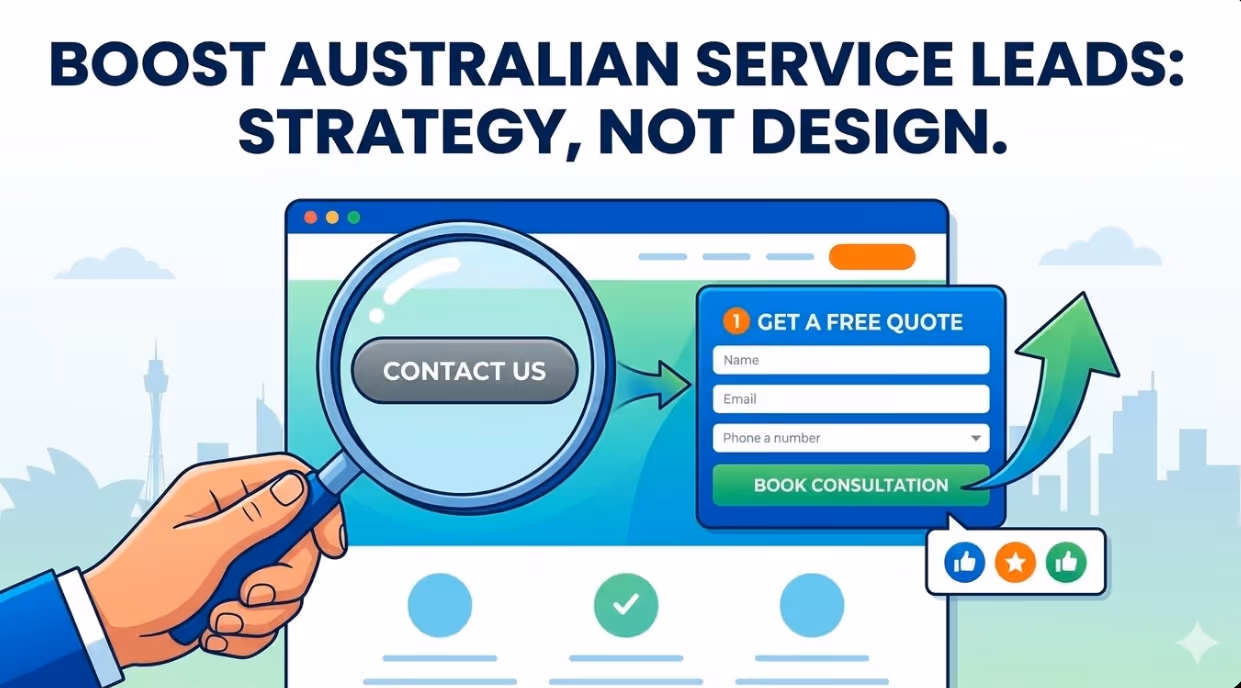
- The call to action text on a button or link is not cosmetic copy. It is the final instruction the visitor receives before deciding to convert or leave, and the specificity, relevance, and benefit clarity of that text directly affects conversion rate.
- Above the fold placement of the primary conversion element on a service page significantly outperforms placement at the bottom of the page, particularly for visitors arriving from paid search who have formed a query with strong purchase intent before clicking.
- Social proof elements, including testimonials, case studies, client logos, and review scores, placed in close proximity to conversion elements substantially increase the conversion rate of those elements for Australian service businesses.
- Forms spread across multiple steps, those that break a longer form into two or three sequential screens, consistently outperform single screen forms with the same total number of fields, because the initial commitment required to begin the form is lower.
The Lead Generation Problem on Most Australian Service Websites
A contact page with a form and a phone number is the minimum viable lead generation infrastructure, but most Australian service business websites treat it as the complete solution. The evidence that it is not complete is visible in any website analytics account that has been set up correctly: the proportion of website visitors who complete a contact form on most service business websites is typically between one and three percent, meaning 97 to 99 percent of visitors leave without making contact.
Some of those visitors were never going to enquire regardless of what the site offered. They were researching, comparing, or browsing without purchase intent. But a meaningful fraction of that 97 to 99 percent had genuine interest and sufficient intent to have converted under better conditions: if the conversion opportunity had been placed more prominently, if the form had been simpler, if the call to action had spoken more directly to what they were looking for, or if social proof had been present at the moment of decision to reassure them that the business was the right choice.
Lead generation optimisation is the systematic process of identifying where those conversion opportunities are being missed and redesigning the elements responsible for capturing them. It is not a redesign project. It is a structural and messaging project that can be executed on an existing website without changing the design substantially, and it produces measurable improvements in enquiry volume within weeks of implementation.
Form Placement Strategy
The Contact Page Is Not Enough
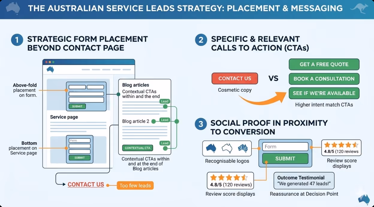
The contact page receives a small fraction of overall website traffic. Most visitors arrive on service pages, location pages, blog articles, case study pages, and the homepage. If the only place to convert is the contact page and the only path to the contact page is a navigation link, the majority of visitors will leave without encountering a conversion element at the moment when their interest is highest.
The solution is to embed conversion elements on the pages where traffic is actually concentrated. For Australian service businesses, this means:
Service pages should carry a form or a prominent button that serves as the call to action within the first screen of content (above the fold), as well as a second conversion element at the natural conclusion of the page content. A visitor arriving from a Google search for a specific service is in the highest possible intent state at the moment of landing. Meeting that intent with a visible conversion element immediately is a fundamental lead generation principle.
Location and suburb pages for businesses serving specific geographic markets should include a contact form embedded in the page rather than relying on a link to the contact page. A visitor searching for a service in a specific suburb is motivated by local intent, and adding a navigation step between that motivation and the conversion opportunity reduces completion rates.
Blog articles and content pages should include contextually relevant calls to action within the body of the content and at the conclusion of each article. An article about a problem the business solves is being read by visitors who are experiencing that problem. The article is the moment of highest intent in their relationship with the business's content, and a call to action placed at the end of an article that has demonstrated relevant expertise produces a meaningfully higher response than a generic "Contact Us" link in the navigation.
The homepage should carry a primary conversion element above the fold for visitors who arrive with intent and want to act immediately, and secondary conversion elements within the body of the page for visitors who are evaluating the business before deciding whether to enquire.
Reducing Form Friction
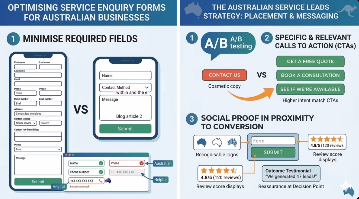
Form friction is the collective effort required to complete and submit an enquiry. Every field added to a form is a unit of friction. Every required field that is not strictly necessary to respond to the enquiry is a unit of unnecessary friction that reduces completion rates.
The principle of minimum necessary fields is the most reliable lever for improving form completion rates. The fields genuinely required to respond to an initial enquiry for most Australian service businesses are: name, contact method (email or phone, not both in the first instance), and a brief description of what the visitor needs. Three to four fields is the practical minimum viable form for a meaningful enquiry. Five to seven fields is the maximum that most visitors will tolerate without a material drop in completion rate.
Fields that should not be in an initial enquiry form for most Australian businesses include: company name (unless B2B only), address, how did you hear about us (collect this in the conversation that follows the initial contact), detailed project specifications (this is for the consultation, not the form), and any field that is collected because it would be useful rather than because the business cannot respond to the enquiry without it.
Inline validation, where the form provides immediate feedback on each field as the visitor completes it rather than returning all errors after submission, reduces the failure rate of form completions significantly. A visitor who submits a form with an invalid email address and receives a page reload with a vague error message frequently abandons rather than correcting the error. Inline validation that highlights the problematic field immediately and explains specifically what needs to be corrected produces substantially higher completion rates.
Placeholder text in form fields should describe the expected format or example content rather than simply labelling the field. "Your phone number" as placeholder text in a phone field is less helpful than "+61 4XX XXX XXX or 03 XXXX XXXX." The label identifies the field; the placeholder helps the visitor understand what a valid entry looks like.
Multi-Step Forms
A form spread across multiple steps breaks a longer enquiry form into two or three sequential screens presented as a single conversational flow. The first screen typically asks one or two easy, questions requiring minimal commitment (What type of service are you looking for? Where are you located?). The second screen asks for contact details. The optional third screen may include a brief description or additional specifics.
The reason forms spread across multiple steps outperform equivalent single screen forms is the commitment and consistency and consistency principle: once a visitor has answered the first screen's questions and clicked Next, they have invested in the form and are more likely to complete the subsequent screens than they would have been to complete the same questions presented all at once on a single long form. The psychological principle is that a small initial commitment reduces the barrier to the larger subsequent commitment.
For Australian service businesses in categories where leads are genuinely valuable, implementing a form spread across multiple steps on the primary service pages is one of the conversion optimisation with the highest return changes available.
Call to Action Strategy
The Problem With "Contact Us"
"Contact Us" is the most commonly used call to action on Australian business websites and one of the least effective. The problem is specificity: "Contact Us" tells the visitor what to do but gives them no information about what will happen next, what they will receive, or why acting now rather than later serves their interests. It is an instruction without a benefit.
Effective call to action text does three things: it uses an action verb, it specifies what the visitor will receive or what will happen next, and where space allows, it creates a reason to act now rather than later.
Comparing "Contact Us" to alternatives demonstrates the improvement available from specificity:
- "Get a Free Quote" is more specific about what the visitor will receive
- "Book a Free Consultation" is more specific and adds the word free, which reduces perceived risk
- "Tell Us About Your Project" is conversational and lower commitment than "Submit an Enquiry"
- "See If We're Available" creates a mild scarcity signal and frames the interaction as mutual evaluation
None of these alternatives require any design change. They are copy changes to existing buttons that can be implemented in minutes and tested through A/B testing or simply by making the change and comparing conversion rates over subsequent weeks.
Matching Call to Action Text to Page Intent
The most effective call to action on a service page is not the same as the most effective call to action on a blog article or a case study page. The intent of the visitor differs, and the conversion element should speak to where the visitor is in their decision process.
A visitor on a pricing page has expressed strong purchase intent. The call to action can be direct: "Get Your Custom Quote" or "Start Your Project." A visitor reading a blog article may be at the beginning of their research. The appropriate call to action is lower commitment: "Download Our Free Guide" or "See How We've Helped Similar Businesses" before moving toward a direct enquiry request.
This principle of calls to action matched to visitor intent requires thinking about the conversion funnel at a page level rather than applying a single call to action uniformly across the site. For most Australian service businesses, this means having at least two distinct call to action variants: a direct enquiry request for pages where intent is strong, and a content or resource offer requiring less commitment for pages where the visitor is in an earlier stage of evaluation.
Social Proof in Proximity to Conversion Elements
Social proof works most effectively when it appears in the immediate vicinity of the decision point, not on a separate testimonials page that requires navigation to find. A review quote, a client logo row, a trust badge, or a case study summary placed within the same visual section as a form or call to action button provides the reassurance the visitor needs at the exact moment they need it.
For Australian service businesses, the most commercially effective social proof formats to place near conversion elements are:
Specific outcome testimonials. Not "Great service, very professional" but "We generated 47 qualified leads in the first month. Highly recommend." Specific, testimonials focused on specific outcomes are more persuasive than generic positive reviews because they give the prospective client something concrete to compare against their own desired outcome.
Named client logos. A row of recognisable client logos near the conversion element signals that credible organisations trust the business. For B2B services, this is often the single most impactful social proof element.
Review score displays. A Google review score of 4.8 from 120 reviews, displayed with the star rating graphic near the form, provides independent validation that reduces perceived risk at the conversion moment.
FAQs
How should Australian businesses decide which page to prioritise for lead generation optimisation first?The prioritisation should be based on the combination of traffic volume and current conversion rate. A page receiving 500 visitors per month with a two percent conversion rate is producing ten leads per month. Improving that page's conversion rate to four percent produces an additional ten leads per month at no additional traffic cost. Use Google Analytics 4 to identify the pages with the highest organic and paid traffic that currently have no embedded conversion element, or where the existing conversion element has a low completion rate. For most Australian service businesses, the primary service landing page, the homepage, and the most trafficked blog article are the starting points with the highest priority. The pages receiving paid traffic are particularly high priority because the conversion gap on those pages has an immediate and direct cost: every visitor who leaves without converting represents ad spend that did not produce a commercial outcome.
What is the right number of calls to action on a single page?A single page should have one primary call to action that is consistently repeated in two to three locations: at the top of the page (above the fold), at a natural pause partway through the content, and at the conclusion of the page. The primary call to action should be the same button style, colour, and text in each location so it is immediately recognisable as the same action. Secondary calls to action, such as a newsletter subscription or a content download, should be visually distinct from the primary conversion element so the hierarchy is clear. The error to avoid is either having no call to action visible above the fold, or having too many competing conversion elements that dilute the visitor's attention and make the primary action less obvious. One primary, consistently repeated: this is the principle that produces the cleanest conversion architecture on most Australian service pages.
How should Australian businesses track whether their form placement and CTA changes are producing measurable improvements?GA4 event tracking should be configured to record both form views (the form was visible in the viewport) and form submissions (the form was successfully completed). The ratio of submissions to views provides the effective conversion rate of each form, which is more accurate than the ratio of submissions to page views because not all page visitors scroll to the location of the form. For A/B testing specific changes, Google Optimise has been discontinued, and the current options for Australian businesses include VWO, Optimizely, and AB Tasty for managed testing, or the simpler approach of making the change, recording the date, and comparing conversion rates for the 28 days before and after the change in GA4. This comparison of the period before and after is not as statistically rigorous as a controlled A/B test but is practical for most Australian small and medium businesses that do not have the traffic volume to run valid split tests on individual page elements within a reasonable timeframe.
The Enquiries Are Already on the Site. They Just Cannot Find Their Way Out.
For most Australian service businesses with established websites, the visitors needed to generate significantly more leads are already arriving. The organic and paid traffic is reaching the relevant pages. What is missing is the conversion infrastructure that captures intent at the right moments, presents the decision to enquire with minimum friction, and provides the reassurance that turns consideration into contact. The changes required to build that infrastructure are primarily structural and copy changes, and the returns they generate, measured in additional enquiries from existing traffic, consistently outperform equivalent investment in acquiring additional traffic to a site that cannot convert what it already has.
Maven Marketing Co audits and optimises lead generation infrastructure for Australian business websites, including form placement strategy, call to action development, and conversion tracking implementation.
Talk to the team at Maven Marketing Co →

Table of contents
read more blogs

Handing the Keys to Google's AI: How to Keep Control of Your Ad Budget Inside Performance Max
Performance Max is Google's most automated campaign type, and also the one that provokes the most anxiety among Australian advertisers who have spent years developing campaign management practices that depend on visibility, control, and the ability to make deliberate, measurable changes. The anxiety has some basis. Performance Max does take more control away from the advertiser than any previous Google Ads campaign type: it chooses the placements, it selects the creative combinations, it determines the bid for each impression, and it distributes the budget across Google's inventory in ways the advertiser cannot directly specify. The part of the anxiety that is not well based is the conclusion that these constraints make Performance Max unmanageable or a blank cheque handed to Google's algorithm. Performance Max has a specific set of levers that, when correctly configured, give advertisers meaningful influence over where the budget goes, which audiences it targets, which creative assets it uses, and which conversion events it optimises toward. Understanding and using these levers is the difference between a Performance Max campaign that works within the advertiser's strategic parameters and one that wastes budget on inventory, audiences, and objectives that the business never intended to pursue.

When Customers Search on TikTok and Instagram Instead of Google — How Australian Brands Adapt
Something structurally significant has changed in how younger Australian consumers research purchases, and most Australian brands have not yet adjusted their discoverability strategy to reflect it. A proportion of the audience that would previously have opened Google to search for "best brunch spots Fitzroy" or "honest review Mecca skincare serum" is now opening TikTok or Instagram instead. They are searching within these platforms for short video content that shows them what they want to know: the actual food, the actual product, the actual experience, from people who have actually been there or used the item. This is not a marginal behaviour limited to a niche demographic. TikTok's own data has reported that a significant share of its users use the platform as a search engine, and the query patterns on Instagram's search function have expanded well beyond celebrity and hashtag discovery into product, venue, and service research. For Australian brands that have built their discoverability strategy entirely on Google organic search and Google Ads, this shift represents a gap that is growing over time as the audience that uses social platforms as primary discovery tools ages into demographics with higher purchasing power. This article covers what the shift to social search means practically, what content and account configuration signals these platforms use to surface results, and what Australian brands need to do differently to be found on TikTok and Instagram by people who are actively looking for what they offer.
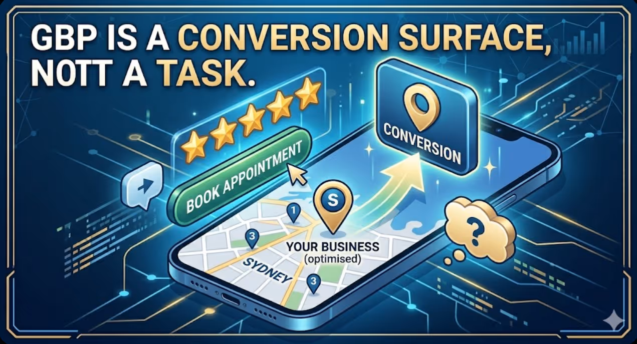
How to Build a Google Business Profile That Converts Browsers Into Booked Appointments
A Google Business Profile that has been set up and left alone is doing roughly the same work as a shop front with the lights off. It confirms the business exists and provides the phone number, but it is not actively persuading a local searcher who is comparing three businesses in the search results to choose this one rather than the competitors sitting directly above and below it in the local pack. The businesses that win appointments from Google local search are not simply those that are closest to the searcher or those with the most reviews, although proximity and reviews both matter. They are the businesses that have treated their Google Business Profile as a conversion surface rather than a directory entry, and have populated every element of the profile with the specific information, imagery, and social proof that a local searcher needs to make a confident decision to book rather than keep browsing. The difference between a profile that ranks and converts and one that ranks but loses its potential customers to competitors is in the specific decisions this article covers: how to write the business description, which photos produce engagement, how to use posts to maintain freshness signals, how to respond to reviews in a way that builds rather than diminishes trust, and how to configure the booking and contact features that reduce friction between intent and appointment.


