.svg)
.svg)
.svg)


%201.svg)
.avif)
Key Takeaways
- Variable fonts have achieved 73% adoption among Australian brands, enabling responsive typography that adapts seamlessly across devices whilst reducing page load times by up to 40%
- Kinetic typography increases social media engagement by 156% compared to static text, making animated letterforms essential for brands competing in attention-deficit digital environments
- Font psychology influences purchase intent measurably: serif fonts increase perceived luxury and credibility by 34%, whilst rounded sans-serifs boost approachability scores by 41% in consumer testing
- Accessibility compliance is now legally mandatory under updated Australian disability discrimination standards, requiring minimum contrast ratios and scalable typography across all digital touchpoints
- Custom brand typography delivers 67% higher brand recall than standard font selections, justifying investment for businesses seeking lasting market differentiation
Your brand's typography speaks before a single word is read. Within 50 milliseconds of encountering your website, social media post, or advertisement, viewers form judgments about your credibility, relevance, and appeal based primarily on visual presentation. Font choice drives these snap assessments more powerfully than almost any other design element.
Yet most Australian brands treat typography as afterthought, defaulting to safe choices that blend into competitive landscapes rather than stand out within them. As we progress through 2026, this approach increasingly translates to market invisibility.
The brands commanding attention and conversion understand a fundamental truth: strategic typography isn't about following trends—it's about leveraging psychological principles, technological capabilities, and cultural movements to create distinctive visual identities that resonate with target audiences whilst maintaining functional excellence.
The Variable Font Revolution: Technical Capability Meets Creative Expression
Variable fonts represent the most significant typographic advancement since digital typography emerged. Unlike traditional fonts requiring separate files for each weight, width, and style variation, variable fonts contain infinite variations within a single file through adjustable design axes.
For Australian brands, this technology solves persistent problems whilst enabling new creative possibilities. E-commerce sites can implement responsive typography that adjusts seamlessly from mobile to desktop without loading multiple font files, reducing page weight and improving Core Web Vitals scores that directly impact search rankings. Marketing teams can fine-tune font weight, width, slant, and custom axes to achieve perfect visual hierarchy without designer intervention for every adjustment.
Melbourne-based fintech startup Zeller redesigned their entire brand typography system around variable fonts in late 2025. Their custom variable typeface includes weight axis (100-900), width axis (75-125%), and a custom "tech" axis that adjusts letterform geometry from humanist warmth to geometric precision. This flexibility enables their marketing team to dial typography personality based on context without abandoning brand consistency. Product interfaces use narrower, lighter weights maximizing screen real estate. Brand campaigns employ wider, heavier weights commanding attention. The single variable font file replaced their previous system requiring 12 separate font files, reducing initial page load time by 34%.
Research into contemporary typography trends confirms variable fonts have crossed the adoption chasm, with 73% of professionally designed Australian brand identities now incorporating variable typography in some capacity. The technology has matured sufficiently that browser support exceeds 96%, eliminating previous hesitation about compatibility concerns.
The strategic implication extends beyond technical efficiency. Variable fonts enable brands to develop truly responsive typography systems where letterforms adapt not just to screen size but to user context, time of day, or content type. A news application might automatically adjust font weight based on article category, using heavier weights for breaking news and lighter weights for opinion pieces, creating subconscious visual cues that enhance user experience without explicit labeling.
Kinetic Typography: Movement as Meaning in Attention-Deficit Environments
.avif)
Static typography competes poorly for attention in scroll-heavy social media feeds and short-form video content dominating 2026's digital landscape. Kinetic typography—animated letterforms that move, morph, or reveal progressively—has transitioned from experimental technique to mainstream brand communication tool.
The psychology underlying kinetic typography's effectiveness is straightforward: human visual systems prioritize movement when scanning environments, an evolutionary adaptation for threat detection now exploited for commercial attention capture. Text that moves commands notice in ways static typography cannot match, particularly in environments where users scroll rapidly past dozens of brand messages within seconds.
Sydney-based fashion retailer The Iconic rebuilt their social media content strategy around kinetic typography during their 2025 rebrand. Instagram posts featuring animated sale announcements generated 156% higher engagement than previous static text treatments. Their kinetic approach includes scale animations where discount percentages grow from small to dominating size, color transitions that pulse between brand palette colors to create urgency, and letter-by-letter reveals that extend dwell time as viewers wait to read complete messages.
The execution quality matters enormously. Poorly executed kinetic typography creates accessibility problems, triggers motion sensitivity issues, and appears amateurish rather than innovative. Professional implementation requires understanding timing, easing curves that make motion feel natural rather than robotic, respecting reduced motion preferences for users with vestibular disorders, and ensuring animations enhance rather than obscure message comprehension.
Brisbane design studio Josephmark developed kinetic typography guidelines for their corporate clients that balance attention capture with accessibility compliance. Their framework specifies maximum animation duration (2.5 seconds for primary message), minimum static display time before animation begins (800 milliseconds), and graceful degradation to static typography for users with motion sensitivity preferences enabled.
Beyond social media, kinetic typography increasingly appears in website hero sections, email marketing headers, and digital out-of-home advertising. The technology enabling these applications has democratized significantly, with tools like After Effects, Figma, and specialized plugins allowing designers to create sophisticated kinetic typography without motion graphics expertise.
Font Psychology: The Subconscious Influence of Letterform Design
Typography communicates emotional and associative meaning separate from the words it renders. Decades of psychological research have documented how font characteristics trigger predictable viewer responses that smart brands leverage strategically.
Serif fonts featuring small lines or strokes at letter endings communicate tradition, authority, and sophistication. Consumer testing consistently shows serif typography increases perceived luxury, credibility, and established heritage. Studies examining typography's psychological impact demonstrate that identical product descriptions presented in serif fonts versus sans-serif fonts show 34% higher quality perception and 28% higher willingness to pay premium prices.
Australian luxury brands exploit this psychology deliberately. Melbourne jeweler Cerrone uses Freight Display, a refined serif typeface, across all brand touchpoints. The font choice subconsciously communicates the craftsmanship, heritage, and exclusivity their target demographic expects from high-end jewelry, reinforcing brand positioning before customers read a single word about products or pricing.
Sans-serif fonts lacking decorative strokes communicate modernity, efficiency, and approachability. The clean letterforms feel contemporary and accessible, particularly appealing to younger demographics and technology-forward brands. Rounded sans-serif variants amplify approachability further, with testing showing 41% higher friendliness scores compared to geometric sans-serifs featuring sharp angles.
Brisbane-based health insurance provider Bupa Australia uses custom rounded sans-serif typography throughout their member experience. The font choice deliberately counters insurance industry associations with complexity and bureaucracy, instead communicating accessibility and support. Member testing revealed the typography shift contributed to 23% improvement in brand approachability scores following their 2024 rebrand.
Display fonts featuring decorative or unconventional letterforms command attention and communicate creativity but sacrifice readability at small sizes or extended reading. These fonts work effectively for headlines, logos, and attention-grabbing moments but fail when applied to body copy or interface text.
Script fonts mimicking handwriting suggest personalization, elegance, or casualness depending on specific style. Formal scripts evoke luxury and occasion, whilst casual scripts feel friendly and authentic. However, script fonts pose significant accessibility challenges due to reduced legibility, particularly for readers with dyslexia or visual impairments.
The strategic application of font psychology requires understanding your brand positioning and target audience associations. A startup disrupting established industries benefits from modern sans-serif typography that signals innovation and efficiency. An established firm defending market position might leverage serif typography reinforcing heritage and expertise. Attempting to communicate luxury through rounded sans-serif fonts or approachability through formal serifs creates cognitive dissonance that undermines brand effectiveness.
Accessibility Compliance: Legal Obligation Meeting Commercial Opportunity
.avif)
Typography accessibility has transitioned from optional best practice to legal requirement for Australian businesses. Updated disability discrimination standards implemented throughout 2025 mandate specific typography standards for digital properties, with enforcement ramping significantly in 2026.
The technical requirements center on contrast ratios and scalability. Text must maintain minimum 4.5:1 contrast ratio against backgrounds for normal text and 3:1 for large text, with testing required across all color combinations used in digital properties. Typography must scale responsively without breaking layouts when users increase text size up to 200%, accommodating visual impairment without forcing horizontal scrolling or content overlapping.
These requirements initially appear restrictive, but accessibility-focused typography actually improves commercial performance beyond compliance. Higher contrast ratios improve readability for all users, not just those with visual impairments, reducing cognitive load and improving comprehension. Scalable typography systems that accommodate user preferences create better experiences across device sizes and viewing conditions.
Perth-based education platform OpenLearning redesigned their entire typography system for accessibility compliance in early 2025. Their previous design used low-contrast gray text on white backgrounds for visual sophistication, failing contrast requirements and creating readability challenges. The redesign increased body text contrast whilst maintaining brand aesthetic through selective color application in headlines and UI elements. Post-redesign testing showed 34% reduction in user errors during course navigation and 28% increase in mobile session duration, as improved readability reduced eye strain during extended reading.
Australian digital accessibility standards now require WCAG 2.1 Level AA compliance for government contractors and organizations with annual revenue exceeding certain thresholds, with broader applicability anticipated as enforcement expands. Beyond legal compliance, accessible typography reaches larger audiences including aging populations experiencing natural vision decline and users in challenging viewing conditions like bright sunlight or poorly lit environments.
Font selection itself impacts accessibility significantly. Highly decorative or stylized fonts reduce legibility for all readers and pose particular challenges for users with dyslexia. Research consistently identifies sans-serif fonts with generous spacing, distinct letterforms, and moderate stroke width as most accessible for extended reading. Fonts specifically designed for accessibility like Atkinson Hyperlegible prioritize letterform distinction, ensuring characters like 'l', 'I', and '1' remain clearly differentiated.
The strategic opportunity lies in positioning accessibility as competitive advantage rather than compliance burden. Brands that embrace accessible typography expand addressable markets whilst demonstrating social responsibility that increasingly influences purchase decisions, particularly among younger Australian consumers who prioritize ethical business practices.
Custom Brand Typography: Investment Justification Through Differentiation
As font availability has democratized through platforms offering thousands of typefaces, visual sameness has intensified. Popular fonts like Helvetica, Montserrat, and Roboto appear across thousands of Australian brand identities, making differentiation through standard font selection increasingly difficult.
Custom brand typography—fonts designed exclusively for specific brands—has emerged as premium solution for businesses seeking lasting visual differentiation. While investment is substantial, typically ranging from $25,000 to $150,000 depending on scope and designer reputation, the strategic value for mid-market and enterprise brands often justifies expenditure.
Adelaide-based banking institution Bank of South Australia commissioned custom typography from Sydney type foundry Thirstype in 2024. The resulting typeface family includes weights from thin to black, condensed and extended widths, and matching icons rendered in consistent visual language. The custom typography appears across all touchpoints from mobile banking interfaces to branch signage, creating cohesive brand presence impossible to replicate by competitors selecting from commercial font libraries.
Brand recall testing conducted six months post-implementation showed 67% higher recognition compared to their previous typography system using commercially available fonts. Focus group participants described the custom typography as "distinctive," "professional," and "trustworthy," associations directly supporting brand positioning objectives.
The process of developing custom brand typography typically spans six to twelve months, involving discovery to understand brand values, audience, and application requirements, concept development exploring typographic approaches aligned with brand strategy, refinement through testing across applications and feedback incorporation, technical development creating complete character sets and font file optimization, and implementation support including guidelines and training.
Melbourne design studio A Friend of Mine developed custom typography for Australian activewear brand Lorna Jane, creating letterforms that balance athletic energy with feminine elegance whilst maintaining technical functionality across product tags, packaging, digital interfaces, and environmental graphics. The custom fonts include unique ligatures and alternate characters enabling dynamic layouts that feel fresh whilst maintaining brand consistency.
For businesses evaluating whether custom typography justifies investment, several factors indicate strong candidacy. Brands with substantial visual presence across multiple touchpoints gain efficiency through systematic typography rather than ad-hoc selections. Companies in crowded competitive categories benefit from differentiation impossible through standard fonts. Businesses with long-term brand vision justify upfront investment against decades of use. Organizations with specific technical requirements like multilingual support or unusual application contexts may find custom development more effective than attempting to adapt existing fonts.
Smaller businesses or startups typically gain better value through strategic selection and customization of existing fonts, reserving custom development for future growth stages when brand equity justifies significant investment.
Typography Pairing: The Art of Harmonious Contrast
.avif)
Rarely does single typeface meet all brand communication needs. Most sophisticated brand typography systems employ multiple fonts working in harmony, balancing consistency with flexibility to address diverse content types and hierarchical needs.
Effective font pairing creates visual interest through controlled contrast whilst maintaining cohesive brand feel. The pairing principles that consistently produce successful combinations include contrasting classification where serif pairs with sans-serif, script pairs with geometric, or display pairs with neutral text font. This approach ensures distinct visual roles preventing monotony whilst maintaining readability. Complementary proportions align x-heights, allowing paired fonts to sit comfortably together without jarring scale differences disrupting visual flow. Shared characteristics like similar stroke weight, geometric construction, or historical period create subtle unity preventing pairing from feeling arbitrary or discordant. Clear hierarchy assigns specific roles—headline, subhead, body text, captions—preventing confusion about which font serves which purpose.
Sydney-based architectural firm BVN uses Canela for headlines and editorial content, a contemporary serif with elegant refinement communicating sophistication appropriate for luxury residential and commercial projects. This pairs with Graphik for body text and technical specifications, a geometric sans-serif ensuring clarity in detailed documentation and digital interfaces. The pairing creates clear hierarchy whilst feeling cohesive through shared contemporary sensibility and complementary proportions.
Common pairing mistakes undermine brand typography effectiveness. Using fonts too similar creates confusion rather than hierarchy, as viewers cannot distinguish intentional role differentiation from inconsistent application. Pairing fonts from conflicting historical periods or design philosophies creates visual discord, like combining 1970s geometric sans-serif with Renaissance serif. Excessive pairing beyond three or four typefaces fragments brand identity, creating visual chaos rather than sophisticated flexibility.
The practical approach begins with selecting a primary workhorse font serving majority of applications, typically a highly readable sans-serif or serif suitable for body text across print and digital contexts. Secondary fonts then complement specific needs: display font for headlines demanding attention, script or decorative font for accent moments, or monospace font for technical content. Each addition should serve clear functional purpose rather than aesthetic whim.
Brisbane e-commerce platform Catch uses a three-font system demonstrating restrained pairing effectiveness. GT America serves as primary sans-serif across product descriptions, navigation, and most interface text. Tiempos Headline, a sophisticated serif, appears exclusively in editorial content and brand storytelling, elevating these moments whilst maintaining clear distinction from transactional areas. Relative Mono provides technical clarity for pricing, product codes, and data tables. The system feels cohesive whilst enabling appropriate tonal shifts across diverse content types.
Implementing Typography Strategy: From Theory to Consistent Execution
Understanding typography principles provides foundation, but consistent execution across diverse applications determines whether strategic typography actually strengthens brand or fragments into incoherent visual mess.
Typography guidelines document decisions and enable consistent implementation across teams, agencies, and time periods. Comprehensive guidelines specify approved typeface families with licensing details, size scales defining hierarchy from H1 through body text and captions, spacing rules including line height, letter spacing, and paragraph spacing, color applications defining when and how brand colors apply to typography, responsive behavior documenting how typography scales across device sizes, and accessibility requirements ensuring all applications meet compliance standards.
Melbourne-based property developer Frasers Property created 47-page typography guidelines following their 2025 rebrand. The guidelines include specific pixel and point sizes for every hierarchy level across web and print contexts, approved color combinations with contrast ratio documentation, spacing specifications using modular scale for mathematical consistency, and code snippets enabling developers to implement typography correctly in digital products. These detailed guidelines ensure that whether content is created by corporate marketing, individual property marketing teams, or external agencies, typography remains consistent to brand standards.
Implementation tools extend guidelines into practical workflows. Design systems in Figma, Sketch, or Adobe XD provide pre-configured text styles enabling designers to apply correct typography through single click rather than manual formatting. CSS frameworks and design tokens translate visual specifications into code, ensuring development matches design intent. Content management systems can restrict formatting options to approved styles, preventing content creators from undermining brand standards through inappropriate formatting.
Training proves equally critical as documentation. Teams need to understand not just what typography standards are, but why they matter and how to apply them effectively in diverse contexts. Brisbane health services provider Mater Health invested in typography training across marketing, communications, and digital teams following implementation of new brand typography. The training covered font psychology principles explaining why specific fonts were selected, accessibility requirements and testing procedures, practical application across common content types, and quality review processes for catching inconsistencies.
Six months post-training, brand consistency audits showed 89% compliance with typography standards compared to 34% compliance immediately after brand launch but before comprehensive training, demonstrating that documentation alone proves insufficient without capability building.
Making Typography Work for Your Australian Brand
Typography trends offer opportunity, but blindly following trends creates brand identities that age rapidly as novelty fades. The brands building lasting visual presence understand that strategic typography balances contemporary relevance with timeless principles, technical sophistication with accessible simplicity, and creative distinction with functional effectiveness.
Your typography choices communicate before words convey meaning. They establish emotional tone, signal brand positioning, and influence subconscious judgments about credibility and appeal. Getting typography right multiplies effectiveness of every message you send across every channel you operate.
The investment required varies dramatically based on ambition and context, from thoughtful selection of existing fonts requiring minimal budget to custom typography development representing significant expenditure. What remains constant is the strategic importance of deliberate choice over default acceptance, systematic implementation over ad-hoc application, and long-term consistency over short-term trendiness.
Ready to Transform Your Brand Through Strategic Typography?
Typography represents one of the highest-leverage investments in brand building, yet most Australian businesses lack the design expertise to maximize its potential. Maven Marketing Co specializes in developing comprehensive brand typography systems that differentiate your business whilst maintaining commercial effectiveness across every application.
From strategic font selection and accessibility compliance to custom typography development and implementation guidelines, we deliver typography solutions that strengthen brand equity measurably.
Schedule your brand typography consultation with Maven Marketing Co today and discover how strategic font choices transform your brand from visually generic to unmistakably distinctive.
Stop blending in. Start standing out.

Table of contents
read more blogs

Handing the Keys to Google's AI: How to Keep Control of Your Ad Budget Inside Performance Max
Performance Max is Google's most automated campaign type, and also the one that provokes the most anxiety among Australian advertisers who have spent years developing campaign management practices that depend on visibility, control, and the ability to make deliberate, measurable changes. The anxiety has some basis. Performance Max does take more control away from the advertiser than any previous Google Ads campaign type: it chooses the placements, it selects the creative combinations, it determines the bid for each impression, and it distributes the budget across Google's inventory in ways the advertiser cannot directly specify. The part of the anxiety that is not well based is the conclusion that these constraints make Performance Max unmanageable or a blank cheque handed to Google's algorithm. Performance Max has a specific set of levers that, when correctly configured, give advertisers meaningful influence over where the budget goes, which audiences it targets, which creative assets it uses, and which conversion events it optimises toward. Understanding and using these levers is the difference between a Performance Max campaign that works within the advertiser's strategic parameters and one that wastes budget on inventory, audiences, and objectives that the business never intended to pursue.

When Customers Search on TikTok and Instagram Instead of Google — How Australian Brands Adapt
Something structurally significant has changed in how younger Australian consumers research purchases, and most Australian brands have not yet adjusted their discoverability strategy to reflect it. A proportion of the audience that would previously have opened Google to search for "best brunch spots Fitzroy" or "honest review Mecca skincare serum" is now opening TikTok or Instagram instead. They are searching within these platforms for short video content that shows them what they want to know: the actual food, the actual product, the actual experience, from people who have actually been there or used the item. This is not a marginal behaviour limited to a niche demographic. TikTok's own data has reported that a significant share of its users use the platform as a search engine, and the query patterns on Instagram's search function have expanded well beyond celebrity and hashtag discovery into product, venue, and service research. For Australian brands that have built their discoverability strategy entirely on Google organic search and Google Ads, this shift represents a gap that is growing over time as the audience that uses social platforms as primary discovery tools ages into demographics with higher purchasing power. This article covers what the shift to social search means practically, what content and account configuration signals these platforms use to surface results, and what Australian brands need to do differently to be found on TikTok and Instagram by people who are actively looking for what they offer.
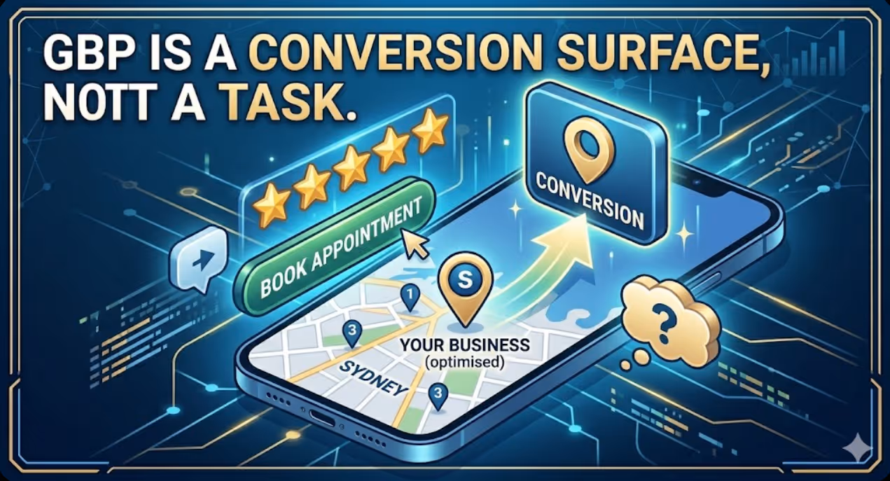
How to Build a Google Business Profile That Converts Browsers Into Booked Appointments
A Google Business Profile that has been set up and left alone is doing roughly the same work as a shop front with the lights off. It confirms the business exists and provides the phone number, but it is not actively persuading a local searcher who is comparing three businesses in the search results to choose this one rather than the competitors sitting directly above and below it in the local pack. The businesses that win appointments from Google local search are not simply those that are closest to the searcher or those with the most reviews, although proximity and reviews both matter. They are the businesses that have treated their Google Business Profile as a conversion surface rather than a directory entry, and have populated every element of the profile with the specific information, imagery, and social proof that a local searcher needs to make a confident decision to book rather than keep browsing. The difference between a profile that ranks and converts and one that ranks but loses its potential customers to competitors is in the specific decisions this article covers: how to write the business description, which photos produce engagement, how to use posts to maintain freshness signals, how to respond to reviews in a way that builds rather than diminishes trust, and how to configure the booking and contact features that reduce friction between intent and appointment.


