.svg)
.svg)
.svg)


%201.svg)

Key Takeaways
- Typography hierarchy creates visual order through systematic size, weight, and style variations that guide readers from headlines through body text to supporting details without conscious effort
- Effective type scales use mathematical ratios (1.25x, 1.5x, or golden ratio 1.618x) to establish harmonious size relationships between hierarchy levels, creating professional polish and reading ease
- Visual flow principles including proximity, alignment, contrast, and white space direct attention sequentially through marketing materials, reducing cognitive load and increasing message retention
- Readability optimization requires appropriate font choices, sufficient size (minimum 16px for body text), adequate line spacing (1.4-1.6x font size), and optimal line length (50-75 characters) for comfortable sustained reading
- Consistent typography systems applied across all marketing materials build brand recognition, project professionalism, and accelerate content creation through reusable hierarchy frameworks
Open a professionally designed magazine and notice how effortlessly your eyes flow from cover headlines to article introductions to body text. You never question what to read first or where to look next. Visual hierarchy guides you naturally through information without conscious navigation decisions.
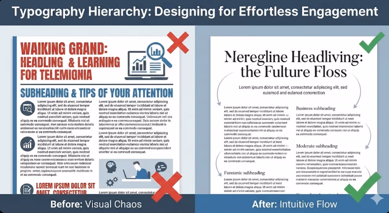
Now examine typical small business marketing materials—websites, brochures, presentations, emails. Too often, everything screams for attention equally. Headlines compete with body text. Important information hides in paragraphs identical to filler content. Readers must work to extract meaning from visual chaos.
The human eye follows predictable patterns when encountering new visual information. Effective typography hierarchy leverages these patterns, using size, weight, colour, and spacing to create reading paths that feel intuitive and effortless. Poor hierarchy forces readers to hunt for structure and importance, creating friction that causes abandonment.
Research in visual cognition shows that readers decide whether to engage with content within 2-3 seconds based largely on perceived readability and information structure. Typography hierarchy determines whether those crucial seconds result in engagement or rejection.
Understanding the Fundamentals of Typography Hierarchy
Typography hierarchy establishes information importance through visual differentiation that guides readers through content logically and effortlessly.
Visual weight determines perceived importance through size, colour, and font weight variations. Larger, bolder, darker elements signal greater importance and naturally attract attention first. Smaller, lighter, fainter elements recede visually, appropriately subordinating supporting information. Human vision automatically interprets these weight differences as importance indicators before conscious reading begins.
Hierarchy levels in most marketing materials include four to six distinct tiers. Primary headlines capture attention and communicate main message. Secondary headings organize content into sections. Tertiary headings create sub-divisions within sections. Body text delivers detailed information. Captions, footnotes, and meta-information provide supporting context. Each level requires distinct visual treatment that clearly differentiates it from adjacent levels.
Contrast creates differentiation that makes hierarchy levels instantly distinguishable. Insufficient contrast between levels creates ambiguous hierarchy where readers can't quickly determine relative importance. Excessive contrast creates jarring visual jumps that feel disconnected rather than smoothly flowing. Optimal contrast balances clear differentiation with harmonious relationships.
Consistency builds patterns that readers learn unconsciously. When all primary headlines use the same size, weight, and spacing treatment, readers quickly internalize that visual pattern as marking top-level information. Inconsistent hierarchy treatments force readers to constantly relearn visual language, creating cognitive friction.
White space amplifies hierarchy by isolating important elements and creating visual breathing room. Headlines surrounded by generous white space command more attention than those crowded by text. Strategic spacing between hierarchy levels visually separates content chunks, improving scanability and comprehension.
Alignment creates order that guides eye movement predictably. Left-aligned text creates strong vertical edge that anchors scanning. Centered alignment focuses attention but becomes difficult to read in longer passages. Right-aligned text feels unconventional and slows reading. Consistent alignment within hierarchy levels while varying alignment between levels creates additional differentiation.

Establishing Type Scales for Harmonious Hierarchy
Type scales provide mathematical frameworks for selecting font sizes that create visually harmonious relationships between hierarchy levels.
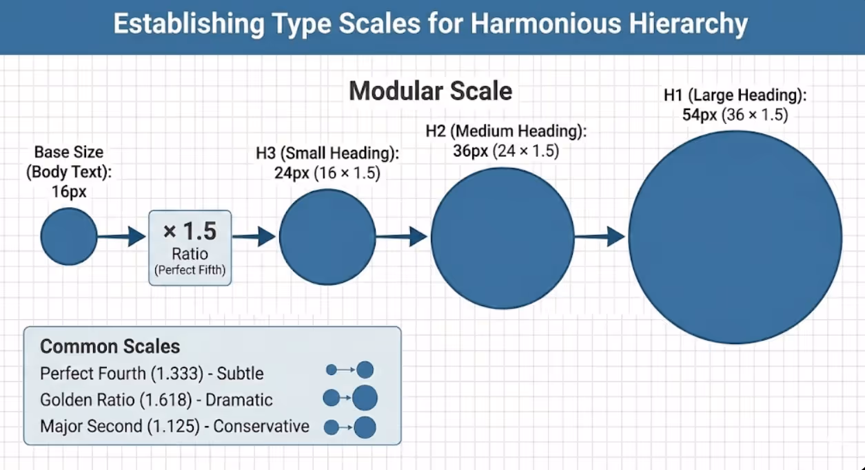
Modular scales multiply base font size by consistent ratio to generate hierarchy sizes. Common ratios include 1.25 (major third), 1.333 (perfect fourth), 1.5 (perfect fifth), 1.618 (golden ratio), and 2 (double). For example, with 16px base size and 1.5 ratio: body text is 16px, small headings are 24px (16 × 1.5), medium headings are 36px (24 × 1.5), and large headings are 54px (36 × 1.5). These mathematically-derived relationships create natural visual harmony that feels balanced without conscious calculation.
Traditional scales based on print typography history provide proven frameworks. The "Perfect Fourth" scale (1.333 ratio) creates subtle, refined hierarchy appropriate for professional documents. The "Golden Ratio" scale (1.618) produces dramatic size differences suitable for marketing materials requiring strong visual impact. The "Major Second" scale (1.125) generates conservative hierarchy for text-heavy documents.
Platform-specific considerations influence scale selection. Mobile devices benefit from larger scales creating clear differentiation on small screens. Desktop displays accommodate subtler scales since larger viewing area makes smaller size differences perceptible. Print materials require consideration of viewing distance—posters need aggressive scales while brochures examined at reading distance use moderate scales.
Practical type scale implementation for Australian business materials might look like this for digital applications: Body text at 16-18px (comfortable reading size), Level 4 headings at 20-24px (1.25-1.33x body), Level 3 headings at 28-32px (1.75-2x body), Level 2 headings at 36-42px (2.25-2.5x body), Level 1 headings at 48-64px (3-4x body). This creates clear hierarchy without excessive size jumps that feel disconnected.
Testing and refinement ensures theoretical scales work in practice. Print sample pages or create mockups showing all hierarchy levels in context. Do size differences create clear distinction? Do relationships feel harmonious? Does largest size overwhelm or smallest strain readability? Adjust ratios and base sizes until hierarchy feels natural and functional.
Flexibility within systems allows adjustments for specific contexts while maintaining overall consistency. Some headlines might use larger sizes for emphasis while others use standard hierarchy sizing. Important callouts or pull quotes might break standard scale for impact. These exceptions work when deliberate and sparingly applied within otherwise consistent system.
Font Selection Strategies for Clear Hierarchy
Strategic font choices reinforce hierarchy through personality, readability, and visual differentiation beyond size alone.
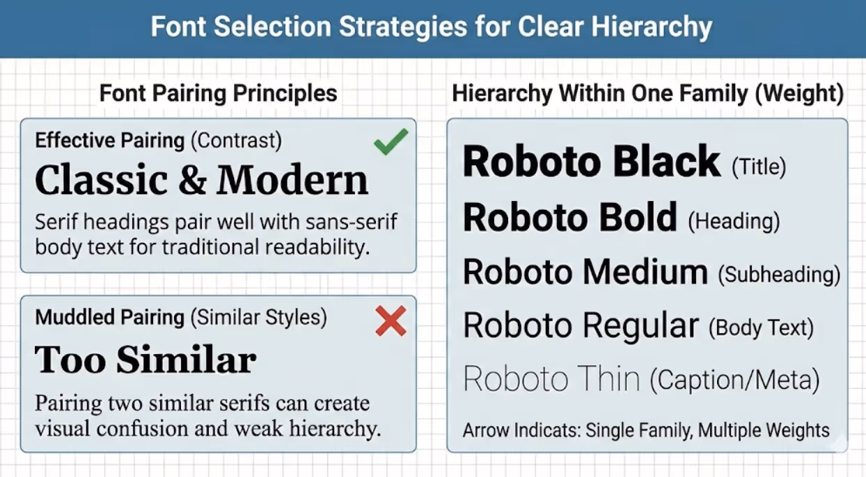
Font pairing principles combine typefaces that contrast while harmonizing. Common successful approaches pair serif headings with sans-serif body text (traditional, readable contrast) or sans-serif headings with serif body text (modern feel, classic readability). Pairing two sans-serifs or two serifs requires significant style difference to prevent muddled hierarchy. Limit font families to two or three maximum to maintain visual cohesion.
Serif fonts include small decorative strokes on letter endings, creating traditional, authoritative feel. Serifs guide eyes horizontally along lines, potentially improving sustained reading comfort in long print text. Classic serifs like Georgia, Garamond, or Merriweather work well for body text in professional documents. Modern serifs like Playfair Display or Libre Baskerville create sophisticated headline impact.
Sans-serif fonts lack decorative strokes, appearing clean and contemporary. Sans-serifs typically render more clearly on screens, making them preferred for digital body text and interfaces. Fonts like Open Sans, Lato, or Roboto offer excellent readability. Geometric sans-serifs like Montserrat or Futura create bold, modern headlines. Humanist sans-serifs like Gill Sans or Verdana balance contemporary feel with reading comfort.
Font weight variations create hierarchy within single typeface family. Thin, light, regular, medium, semi-bold, bold, and black weights provide extensive hierarchy options without introducing additional fonts. Using single font family with varied weights creates unified, professional appearance while maintaining clear hierarchy. This approach suits minimalist design aesthetics and simplifies font management.
Display fonts designed specifically for headlines and short text add personality at top hierarchy levels. Decorative, condensed, or stylized display fonts capture attention for titles and featured headings. However, display fonts sacrifice readability at small sizes or in long passages. Restrict display fonts to primary headlines only, using standard fonts for all other hierarchy levels.
Font contrast through style varies regular, italic, and bold within hierarchy. Body text typically uses regular weight. Emphasis within body text uses italic. Subheadings might use bold. This styling variation creates subtle hierarchy within text blocks while maintaining single font family. However, using too many styles simultaneously (bold italic, for instance) often appears overwrought rather than emphatic.
Readability requirements must override aesthetic preferences. Beautiful fonts that strain readability at body text sizes fail regardless of visual appeal. Test font legibility at intended sizes and contexts. Can users comfortably read extended passages? Do similar letters (I, l, 1 or O, 0) distinguish clearly? Does font render well on target platforms (screens, print)? Prioritize readability for body text levels while allowing more creative choices for large headlines.
Creating Visual Flow Through Strategic Spacing
Spacing creates invisible structure that guides eyes through content naturally while providing visual rest that prevents fatigue.
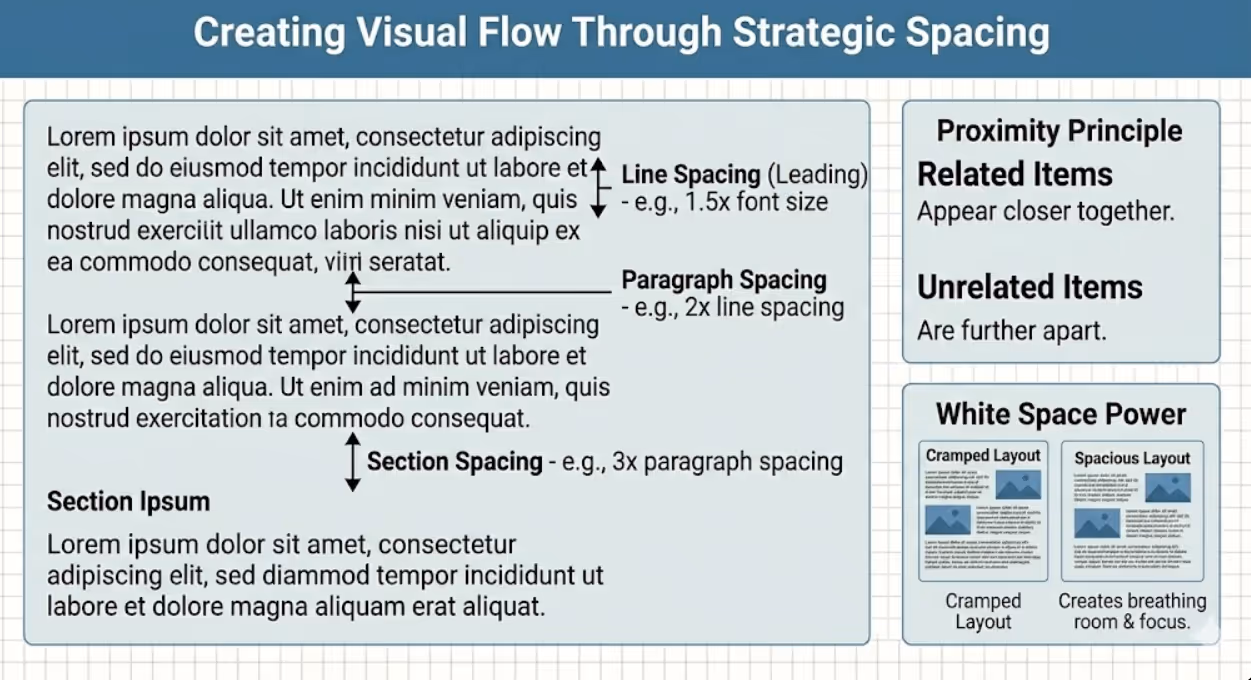
Line spacing (leading) affects readability and visual rhythm dramatically. Too-tight spacing creates cramped, dense text blocks that appear intimidating and strain reading. Too-loose spacing disconnects lines, slowing reading speed. Optimal line spacing for body text ranges 1.4-1.6 times font size. For 16px text, use 22-26px line height. Headings benefit from tighter line spacing (1.1-1.3x) since shorter line length reduces disconnection risk.
Paragraph spacing creates visual separation between distinct thoughts without requiring indentation. Space between paragraphs should clearly exceed line spacing within paragraphs (typically 1.5-2x line spacing). This differentiation signals paragraph breaks instantly. Combining paragraph spacing with first-line indentation is redundant and wastes space—choose one approach consistently.
Section spacing separating major content divisions should significantly exceed paragraph spacing (typically 2-3x paragraph spacing or more). This creates clear visual "chapters" that help readers navigate long documents. Generous section spacing also provides opportunities for subheadings, pull quotes, or imagery that breaks monotony.
Margins and padding frame content and prevent overcrowding. Insufficient margins make content feel claustrophobic and reduce perceived quality. Generous margins project confidence and sophistication. Digital content benefits from percentage-based margins that scale with screen size. Print materials need margins adequate for comfortable holding and binding. Side margins slightly larger than top/bottom margins typically feel balanced.
Proximity principles dictate that related elements should appear closer together than unrelated elements. Headings should sit closer to following paragraphs than preceding ones, visually connecting to content they introduce. List items need less spacing between items than between distinct lists. Captions should obviously relate to images through close proximity. Respecting proximity creates intuitive relationships without requiring explicit labeling.
Rhythm and consistency in spacing creates visual pattern that aids scanning. When all primary headings use identical spacing above and below, readers subconsciously recognize that spacing pattern as marking section divisions. Inconsistent spacing destroys this learned pattern, forcing conscious processing of structure rather than intuitive navigation.
White space as design element serves function beyond separation. Strategic emptiness draws attention to surrounded content, provides visual rest in dense materials, and projects sophistication that cramped layouts can't achieve. Resist temptation to fill available space—often removing content or increasing spacing improves communication effectiveness more than adding information.
Optimizing Readability Across Contexts and Platforms
Effective typography hierarchy ensures comfortable reading regardless of medium, viewing distance, or audience characteristics.
Font size minimums prevent readability failures. Body text should never fall below 14px for digital or 10pt for print, with 16px digital and 11-12pt print being more comfortable standards. Users can zoom or squint through undersized text, but this friction causes abandonment. Australian accessibility standards recommend 12pt minimum for print communications. Older demographics require larger sizes (14pt+ print, 18px+ digital) for comfortable reading.
Line length optimization prevents reading fatigue. Lines under 40 characters feel choppy and require excessive eye movement. Lines exceeding 80 characters cause readers to lose place when returning to line start. Optimal line length is 50-75 characters (roughly 8-12 words). For digital layouts, this typically means restricting text column width to 600-750px rather than full-screen width. Multi-column layouts work well for wide formats like landscape brochures or desktop screens.
Contrast requirements ensure legibility across varying lighting conditions and vision capabilities. Black text on white background provides maximum contrast. Dark gray (#333) on white or off-white reduces eye strain from excessive contrast while maintaining readability. Light text on dark backgrounds (reverse contrast) works for short content like headlines but fatigues eyes in extended reading. Ensure minimum 4.5:1 contrast ratio for body text, 3:1 for large headings per WCAG accessibility guidelines.
Responsive typography adapts to screen sizes without sacrificing hierarchy or readability. Viewport-based sizing (using vw units or clamp() function in CSS) scales text proportionally to screen width. This maintains relative hierarchy across devices while preventing extremes (tiny text on phones, enormous text on displays). Breakpoints adjust not just text size but also line length, spacing, and even hierarchy levels shown for optimal reading on each device category.
Print-specific considerations account for paper quality, ink spread, and physical handling. Thinner fonts may appear too light when printed, requiring heavier weights than digital equivalents. Glossy paper can create glare reducing readability—matte finishes allow more delicate fonts. Small print sizes (under 8pt) should be avoided entirely as they become illegible when ink spreads slightly. Account for margins needed for binding or folding when planning text placement.
Hierarchy visibility requires testing in actual usage contexts. What looks like clear hierarchy on your computer screen might collapse into indistinguishable sameness when printed, viewed on budget smartphone, or seen from podium distance in presentation. Print samples, view on multiple devices, and test at intended distances before finalizing. Ask others unfamiliar with content whether hierarchy is obvious and information flow feels natural.
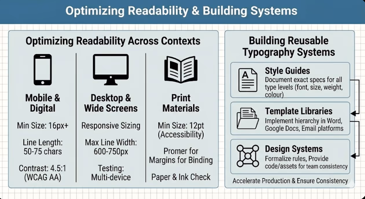
Building Reusable Typography Systems
Systematic approaches to typography hierarchy accelerate production while ensuring consistency across all marketing materials.
Style guides document hierarchy standards defining exact specifications for each type level: font family, size, weight, style, colour, line spacing, spacing before/after, and alignment. Written specifications prevent inconsistency across materials and enable delegation without constant creative review. Include visual examples showing each style in context. Update guides as standards evolve rather than allowing inconsistent drift.
Template libraries implement hierarchy systems in reusable formats. Microsoft Word, Google Docs, and page layout software support style templates applying consistent formatting across documents. Email marketing platforms enable template creation with predefined hierarchy. Presentation software allows master slide templates maintaining typography consistency. Investing time creating proper templates saves exponentially more time in production while guaranteeing consistency.
Design system documentation for larger organizations formalizes typography alongside other brand elements. Design systems specify hierarchy rules, provide code snippets or style libraries for implementation, include do's and don'ts examples, and establish governance for changes. Tools like Figma, Adobe XD, or dedicated design system platforms help teams maintain consistency as content scales.
Flexibility parameters define when deviation from standard hierarchy is acceptable. Some content types might require additional hierarchy levels. Emergency communications might use colour variations. Limited-space contexts might compress hierarchy. Documenting these exceptions prevents them from becoming inconsistent chaos while allowing necessary adaptations.
Training and onboarding ensure team members understand and apply typography systems correctly. Include hierarchy guidelines in brand training. Provide templates and tools making correct application easier than creating from scratch. Review materials periodically to catch and correct drift from standards. Celebrate examples of excellent hierarchy implementation to reinforce standards.
Evolution and refinement keeps typography systems current as brands evolve, platforms change, and accessibility standards advance. Schedule annual hierarchy reviews assessing whether current standards serve business needs and reflect current positioning. Update systems deliberately rather than allowing gradual inconsistent change. Document evolution to maintain institutional knowledge about why decisions were made.
Common Typography Hierarchy Mistakes and Solutions
Recognizing frequent errors helps Australian businesses avoid predictable pitfalls that undermine communication effectiveness.
Using too many fonts creates visual chaos rather than clear hierarchy. More than three font families in single document rarely improves communication and typically fragments visual identity. Solution: Restrict to two fonts maximum (one serif, one sans-serif) and create hierarchy through size, weight, and spacing variations within those families.
Insufficient size contrast between hierarchy levels makes structure ambiguous. When heading is only slightly larger than body text, readers may not register it as heading. Solution: Ensure minimum 1.5x size difference between adjacent hierarchy levels, larger jumps (2-3x) for non-adjacent levels.
Inconsistent hierarchy application across materials confuses audiences and dilutes brand recognition. When brochures, websites, and presentations use completely different typography treatments, each piece must rebuild recognition. Solution: Implement centralized typography standards and enforce through templates and guidelines.
Poor readability in pursuit of aesthetics undermines communication regardless of visual appeal. Decorative fonts, insufficient contrast, or tiny sizes prevent message delivery. Solution: Prioritize readability for body text levels while reserving creative expression for large headlines where legibility is easier to maintain.
Neglecting mobile optimization assumes desktop viewing when majority of digital content consumption happens on smartphones. Hierarchy that works on desktop often collapses into indistinguishable sameness on small screens. Solution: Design mobile-first or test mobile rendering early in design process, ensuring hierarchy maintains clear differentiation at small sizes.
Ignoring accessibility excludes users with vision impairments and risks non-compliance with accessibility requirements. Insufficient contrast, tiny sizes, or low-quality fonts create barriers. Solution: Test hierarchy against WCAG accessibility guidelines, use sufficient sizes and contrast, and avoid fonts with poor legibility.
Overusing emphasis by bolding, italicizing, or colouring extensively dilutes impact of emphasis. When everything is emphasized, nothing stands out. Solution: Use emphasis sparingly and strategically, reserving treatment for genuinely important concepts rather than applying liberally.
Forgetting white space by cramming maximal content into available space creates density that intimidates readers and obscures hierarchy. Solution: Embrace generous spacing as functional design element, removing content when necessary to maintain clarity and visual breathing room.
Frequently Asked Questions
How can Australian small businesses implement professional typography hierarchy without graphic design expertise or expensive design software?
Small businesses can achieve professional typography hierarchy through accessible tools and systematic approaches that don't require design expertise. Start with quality templates from platforms like Canva, Microsoft Office, or Google Workspace that incorporate professional hierarchy already. Customise these templates with your content while maintaining their typographic structure. This leverages professional designers' hierarchy decisions without requiring you to create from scratch. Learn basic hierarchy principles outlined in this guide, then apply them consistently: establish clear size differences between heading levels (minimum 1.5x between adjacent levels), use single font family varying weights for hierarchy, maintain generous spacing around headings and between sections, and limit total fonts to two maximum. Free typography tools help optimise decisions: Google Fonts provides quality free typefaces with multiple weights suitable for hierarchy. WebAIM's contrast checker ensures sufficient contrast between text and backgrounds. Typescale.com generates complete type scales from base size and ratio selection, providing exact pixel sizes for each hierarchy level. These free resources eliminate guesswork from hierarchy creation. For print materials, work with professional printers who often provide free design consultation or templates adhering to typography best practices. Many Australian print shops offer template libraries optimised for their production processes, ensuring both proper hierarchy and technical print requirements. When hiring designers for initial brand materials, request hierarchy specifications and templates you can apply to future materials independently. One design investment creates reusable system. Most importantly, consistency matters more than perfection—mediocre hierarchy applied consistently across all materials outperforms excellent hierarchy used inconsistently. Define standards (even simple ones), document them, and apply religiously. Small businesses often outperform larger competitors through superior consistency despite smaller design budgets. Study marketing materials from brands you admire, noting their hierarchy approaches. Measure heading sizes relative to body text, observe spacing patterns, and identify font combinations. Learning through observation costs nothing and builds intuitive understanding of effective hierarchy. Avoid common mistakes: never use more than two fonts, never make body text smaller than 14px digital or 10pt print, always differentiate heading sizes clearly from body text, and always include generous white space around headings. Following these negative guidelines prevents major hierarchy failures even without advanced design knowledge.
What typography hierarchy approaches work best for Australian businesses serving older demographics who may have vision challenges or reading difficulties?
Typography hierarchy for older audiences requires prioritising maximum readability while maintaining clear visual structure. Increase all font sizes significantly above standard recommendations: use minimum 18-20px for digital body text (versus typical 16px), minimum 14pt for print body text (versus typical 11-12pt). These larger base sizes accommodate declining vision that affects most people over 60. Maintain proportional hierarchy scaling, so if body text increases to 18px from 16px, increase all heading sizes proportionally. This preserves clear hierarchy while improving overall legibility. Choose fonts with excellent readability characteristics: larger x-height (the height of lowercase letters relative to capitals), open apertures (the openings in letters like 'c' and 'e'), and clear distinction between similar characters (I/l/1, O/0). Recommended fonts for older audiences include Verdana, Georgia, and Arial for digital applications, or Century Schoolbook and Palatino for print. Avoid decorative fonts, thin weights, and condensed typefaces that reduce legibility. Maximize contrast using true black (#000000) or very dark gray (#222222) on pure white or cream backgrounds. Avoid light gray text that designers often prefer aesthetically but which creates readability challenges for aging eyes. Never use light text on dark backgrounds for extended reading—reserve reverse contrast for very short headlines only. Increase line spacing beyond typical recommendations: use 1.5-1.7x font size for body text line height (versus standard 1.4-1.5x). This extra vertical space prevents lines from visually merging and makes finding line starts easier during reading. Increase spacing between paragraphs and sections generously. Visual separation helps readers maintain place and process information in digestible chunks. Implement generous margins and white space preventing crowded appearance that overwhelms and fatigues. Older readers benefit from uncluttered layouts where their attention can focus on one clear element at a time. Use clear, descriptive headings that explicitly preview following content rather than clever or abstract headlines requiring interpretation. Straightforward hierarchy aids navigation for readers who may skim content looking for specific information. Consider providing large-print versions of critical documents when serving primarily older demographics. Documents designed primarily for older audiences should start with enlarged defaults rather than requiring users to zoom or request special versions. However, maintain professional appearance—patronising or childish design that assumes reduced capabilities beyond vision offends. The goal is accessibility through thoughtful design, not simplified content that underestimates audience intelligence. Test materials with actual older users from your target demographic. Vision and reading capabilities vary enormously among older adults. Representative testing reveals which hierarchy choices work versus which create barriers. Many Australian businesses serving older demographics (healthcare, financial services, retirement communities) find that hierarchy optimised for maximum readability strengthens appeal even among younger customers by reducing reading effort and projecting customer-focused professionalism.
How should Australian businesses adapt typography hierarchy across different marketing materials including websites, print brochures, social media graphics, and email campaigns while maintaining brand consistency?
Maintain core hierarchy principles across all materials while adapting implementation for each medium's technical requirements and consumption contexts. Establish foundational typography system defining: primary font families (one serif, one sans-serif typically), core hierarchy levels (6-8 levels from largest headlines to smallest supporting text), proportional relationships between levels (using consistent scale ratio like 1.5x or golden ratio), and spacing standards (line height, paragraph spacing, section spacing). Document these specifications in brand guidelines accessible to all content creators. This foundational system ensures consistency regardless of application channel. Adapt implementation platform-by-platform while maintaining recognisable family resemblance: For websites, implement responsive typography that scales hierarchy proportionally across device sizes. Define breakpoints where hierarchy adjusts for mobile, tablet, and desktop viewing. Use CSS or similar styling to ensure exact consistency across website pages. Consider using slightly larger base sizes for body text (16-18px) than you might choose for print given screen reading challenges. For print materials, convert digital sizes to print points understanding that on-screen pixels don't directly translate to print dimensions. Test printed samples ensuring hierarchy remains clear. Print may support more subtle hierarchy distinctions than digital given higher resolution and reader-controlled viewing distance. Use same font families as digital materials for consistency, specifying print-optimised weights if needed. For social media graphics, simplify hierarchy dramatically given small viewing sizes and brief engagement. Limit to 2-3 hierarchy levels maximum (headline, subheading, caption). Use larger type sizes relative to canvas size than other materials. Maintain brand font families for recognition, choosing boldest weights for visibility. Keep colour palette and spacing rhythm consistent with broader brand even when drastically simplifying hierarchy levels. For email campaigns, implement web-safe fonts or embedded web fonts matching brand fonts as closely as possible. Email rendering varies across clients, so test extensively. Use inline CSS for hierarchy styling since external stylesheets often fail in email contexts. Opt for slightly larger sizes and higher contrast than website content given email scanning behaviour. Create consistent spacing and alignment that survives varied email client rendering. The key to cross-platform consistency is recognising which elements create brand recognition versus which are medium-specific optimisations. Font family selection, proportional relationships between hierarchy levels, colour usage, and spacing rhythm create recognition. Exact pixel sizes, number of hierarchy levels, and specific formatting techniques can vary by medium while maintaining overall brand consistency. Visual examples help enormously—create master documents showing how hierarchy system implements across all primary marketing channels. This visual reference prevents drift while demonstrating appropriate adaptations. Review materials across channels periodically ensuring family resemblance remains strong despite platform-specific optimisations. Most importantly, avoid platform-specific decisions becoming permanent inconsistencies. When creating social media template with condensed hierarchy, don't let that become new standard for other materials. Consciously return to full hierarchy system for materials supporting it.
Typography Hierarchy Transforms Communication Effectiveness
Typography hierarchy determines whether marketing materials communicate clearly or create confusion, whether audiences engage or abandon, and whether messages achieve intended impact or disappear into visual noise.
Australian businesses investing in strategic typography systems gain communication advantages that compound across every customer touchpoint. Clear hierarchy reduces reading effort, increases comprehension, and projects professionalism that elevates brand perception.
The principles underlying effective typography hierarchy aren't subjective aesthetic preferences—they're evidence-based applications of visual cognition research that predict human reading behaviour. Implementing these principles transforms marketing materials from amateur productions into professional communications that respect audiences and drive results.
Ready to develop typography hierarchy systems that create effortless reading experiences across all your Australian business communications? Maven Marketing Co. builds strategic typography frameworks that combine readability, brand consistency, and visual impact. Let's create marketing materials that guide audiences naturally toward action.

Table of contents
read more blogs

Handing the Keys to Google's AI: How to Keep Control of Your Ad Budget Inside Performance Max
Performance Max is Google's most automated campaign type, and also the one that provokes the most anxiety among Australian advertisers who have spent years developing campaign management practices that depend on visibility, control, and the ability to make deliberate, measurable changes. The anxiety has some basis. Performance Max does take more control away from the advertiser than any previous Google Ads campaign type: it chooses the placements, it selects the creative combinations, it determines the bid for each impression, and it distributes the budget across Google's inventory in ways the advertiser cannot directly specify. The part of the anxiety that is not well based is the conclusion that these constraints make Performance Max unmanageable or a blank cheque handed to Google's algorithm. Performance Max has a specific set of levers that, when correctly configured, give advertisers meaningful influence over where the budget goes, which audiences it targets, which creative assets it uses, and which conversion events it optimises toward. Understanding and using these levers is the difference between a Performance Max campaign that works within the advertiser's strategic parameters and one that wastes budget on inventory, audiences, and objectives that the business never intended to pursue.

When Customers Search on TikTok and Instagram Instead of Google — How Australian Brands Adapt
Something structurally significant has changed in how younger Australian consumers research purchases, and most Australian brands have not yet adjusted their discoverability strategy to reflect it. A proportion of the audience that would previously have opened Google to search for "best brunch spots Fitzroy" or "honest review Mecca skincare serum" is now opening TikTok or Instagram instead. They are searching within these platforms for short video content that shows them what they want to know: the actual food, the actual product, the actual experience, from people who have actually been there or used the item. This is not a marginal behaviour limited to a niche demographic. TikTok's own data has reported that a significant share of its users use the platform as a search engine, and the query patterns on Instagram's search function have expanded well beyond celebrity and hashtag discovery into product, venue, and service research. For Australian brands that have built their discoverability strategy entirely on Google organic search and Google Ads, this shift represents a gap that is growing over time as the audience that uses social platforms as primary discovery tools ages into demographics with higher purchasing power. This article covers what the shift to social search means practically, what content and account configuration signals these platforms use to surface results, and what Australian brands need to do differently to be found on TikTok and Instagram by people who are actively looking for what they offer.

How to Build a Google Business Profile That Converts Browsers Into Booked Appointments
A Google Business Profile that has been set up and left alone is doing roughly the same work as a shop front with the lights off. It confirms the business exists and provides the phone number, but it is not actively persuading a local searcher who is comparing three businesses in the search results to choose this one rather than the competitors sitting directly above and below it in the local pack. The businesses that win appointments from Google local search are not simply those that are closest to the searcher or those with the most reviews, although proximity and reviews both matter. They are the businesses that have treated their Google Business Profile as a conversion surface rather than a directory entry, and have populated every element of the profile with the specific information, imagery, and social proof that a local searcher needs to make a confident decision to book rather than keep browsing. The difference between a profile that ranks and converts and one that ranks but loses its potential customers to competitors is in the specific decisions this article covers: how to write the business description, which photos produce engagement, how to use posts to maintain freshness signals, how to respond to reviews in a way that builds rather than diminishes trust, and how to configure the booking and contact features that reduce friction between intent and appointment.


