
Key Takeaways
- Colour influences up to 90% of snap judgments about products, making strategic palette selection one of the highest-impact branding decisions affecting recognition, trust, and conversion rates
- Primary colours trigger distinct psychological responses: blue builds trust and professionalism, red creates urgency and appetite, green suggests health and sustainability, yellow radiates optimism and accessibility
- Effective brand palettes balance primary colours establishing identity with secondary and accent colours providing flexibility, using 60-30-10 rule for harmonious distribution across applications
- Cultural colour meanings vary significantly across demographics, requiring research into target audience associations particularly for multicultural Australian markets and international expansion
- Conversion optimization through colour focuses on strategic contrast for calls-to-action, consistent application building recognition, and testing validating assumptions about audience colour preferences
When Cadbury tested different coloured packaging for the same chocolate, purple versions outsold alternatives by significant margins despite identical products inside. When call-to-action buttons changed from green to red on e-commerce sites, conversion rates jumped by double-digit percentages. When banks shifted from warm colours to blue palettes, customer trust ratings increased measurably.
These aren't anomalies. They're examples of colour psychology in action, where strategic hue selection triggers subconscious responses that influence behaviour, emotion, and decision-making before rational thought engages.
Your brain processes colour 60,000 times faster than text. Within 90 seconds of initial product viewing, people make subconscious judgments, with colour accounting for 62-90% of that assessment. For Australian businesses competing for attention and trust, colour choices represent some of the most powerful branding decisions affecting everything from recognition to revenue.
The Science Behind Colour Psychology and Consumer Behaviour
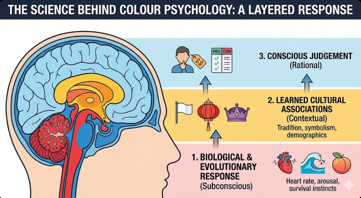
Understanding how colour influences human psychology reveals why strategic palette selection drives measurable business outcomes.
Biological colour responses occur before conscious awareness. Different wavelengths of light trigger distinct neurological reactions. Red increases heart rate and blood pressure, creating physiological arousal associated with urgency and excitement. Blue lowers blood pressure and creates calming responses, explaining its prevalence in contexts requiring trust. Yellow stimulates mental activity and metabolism. These biological responses exist across cultures, forming universal foundations for colour psychology.
Evolutionary associations connect colours to survival-relevant environmental features. Green signals vegetation, food sources, and safe environments. Blue represents water and open sky, triggering feelings of space and tranquility. Red indicates blood, fire, and ripe fruit, creating attention and appetite responses. These ancient associations persist in modern contexts, influencing how consumers respond to brand colours subconsciously.
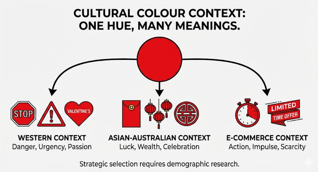
Learned cultural meanings layer additional associations onto biological responses. White suggests purity in Western contexts but represents mourning in some Asian cultures. Red signifies danger in Western traffic signals but luck and prosperity in Chinese tradition. Purple historically indicated royalty in Europe due to rare purple dye expense. These cultural meanings vary across demographics, requiring research into target audience associations.
Personal experiences create individual colour preferences that influence brand affinity. Positive childhood memories associated with specific colours create lifelong preferences. Negative experiences trigger colour aversions. While individual associations vary, demographic patterns emerge that strategic brands leverage. Research consistently shows blue as the most universally preferred colour globally, followed by green, while orange and brown typically rank lowest.
Context dependency means colour associations shift based on surrounding colours, product categories, and usage contexts. Orange suggests value and accessibility in retail contexts but adventure and energy in sports contexts. Black implies sophistication in luxury fashion but threat in warning contexts. Strategic colour selection considers both inherent colour psychology and category-specific associations.
Gender patterns show statistically significant colour preference differences, though individual variation always exceeds group trends. Research indicates men prefer bright, saturated colours while women favour softer tones. Blue, green, and black appeal broadly across genders. Purple, pink, and lavender tend to skew female in preference. Orange and brown often rank lower for female consumers. However, these patterns are tendencies, not absolutes, and shift across generations as gender norms evolve.
Primary Colour Meanings and Strategic Applications
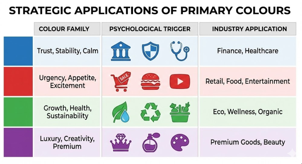
Each primary colour family triggers distinct psychological associations that brands leverage for strategic positioning.
Blue dominates corporate branding across finance, healthcare, technology, and professional services because it builds trust, stability, and competence associations. Lighter blues feel approachable and peaceful, suitable for healthcare and wellness brands. Deeper navy blues project authority and expertise, common in finance and law. Blue's universal popularity makes it safe but potentially generic choice. Australian brands like Commonwealth Bank, ANZ, and Telstra all leverage blue for trust positioning, creating differentiation challenges within categories.
Red stimulates urgency, appetite, and excitement, making it strategic for retail sales, food and beverage, and entertainment brands. Bright red increases heart rate and creates impulsiveness that drives quick purchasing decisions, explaining prevalence in clearance sales and fast food. Deeper crimson reds suggest luxury and sophistication. Red attracts attention powerfully but can overwhelm when overused. Virgin Australia uses red to convey energy and disruption versus legacy airline competitors.
Green communicates growth, health, and environmental responsibility, positioning brands as natural, fresh, or sustainable. Bright lime greens suggest innovation and vitality. Forest greens convey tradition and stability. Green's strong environmental associations make it nearly mandatory for organic, natural, or eco-focused brands. Woolworths leverages green to suggest fresh produce and value despite being full-service supermarket. However, green's environmental connotations can feel limiting for brands outside health and sustainability categories.
Yellow radiates optimism, warmth, and accessibility, creating friendly, approachable brand impressions. It's highly visible, making it excellent for capturing attention. However, yellow can trigger anxiety or caution when overused, as it's also associated with warning signs. Yellow works best as accent colour or paired with stabilizing hues. Commonwealth Bank pairs yellow with black to balance cheerfulness with professionalism. Pure yellow backgrounds strain eyes and reduce readability, limiting primary use cases.
Orange blends red's energy with yellow's friendliness, creating enthusiastic, adventurous, and affordable associations. Orange is less common in corporate branding, offering differentiation opportunities. It appeals to younger demographics and works well for creative, active, or value-oriented positioning. Jetstar uses orange to convey fun, accessible travel versus premium competitors. Orange risks appearing cheap if poorly executed, requiring thoughtful application.
Purple signifies luxury, creativity, and spirituality, historically associated with royalty due to rare purple dye expense. Purple appeals strongly to beauty, wellness, and premium product categories. It suggests imagination and unconventionality. Cadbury owns purple so distinctively that the shade itself creates brand recognition. Purple can feel feminine in some contexts, influencing demographic appeal.
Black projects sophistication, power, and timelessness, serving as foundation for luxury brands and premium positioning. Black creates maximum contrast, improving readability and visual impact. However, black can feel intimidating or inaccessible for mass-market brands emphasizing approachability. It works excellently as supporting colour even when not primary brand colour.
White suggests purity, simplicity, and modernity, essential for minimalist design approaches. White creates breathing room that enhances other colours. It feels clean and neutral. Apple's strategic white space usage demonstrates how absence can be as powerful as presence. White alone doesn't differentiate, requiring combination with distinctive accent colours.
Building Strategic Brand Colour Palettes
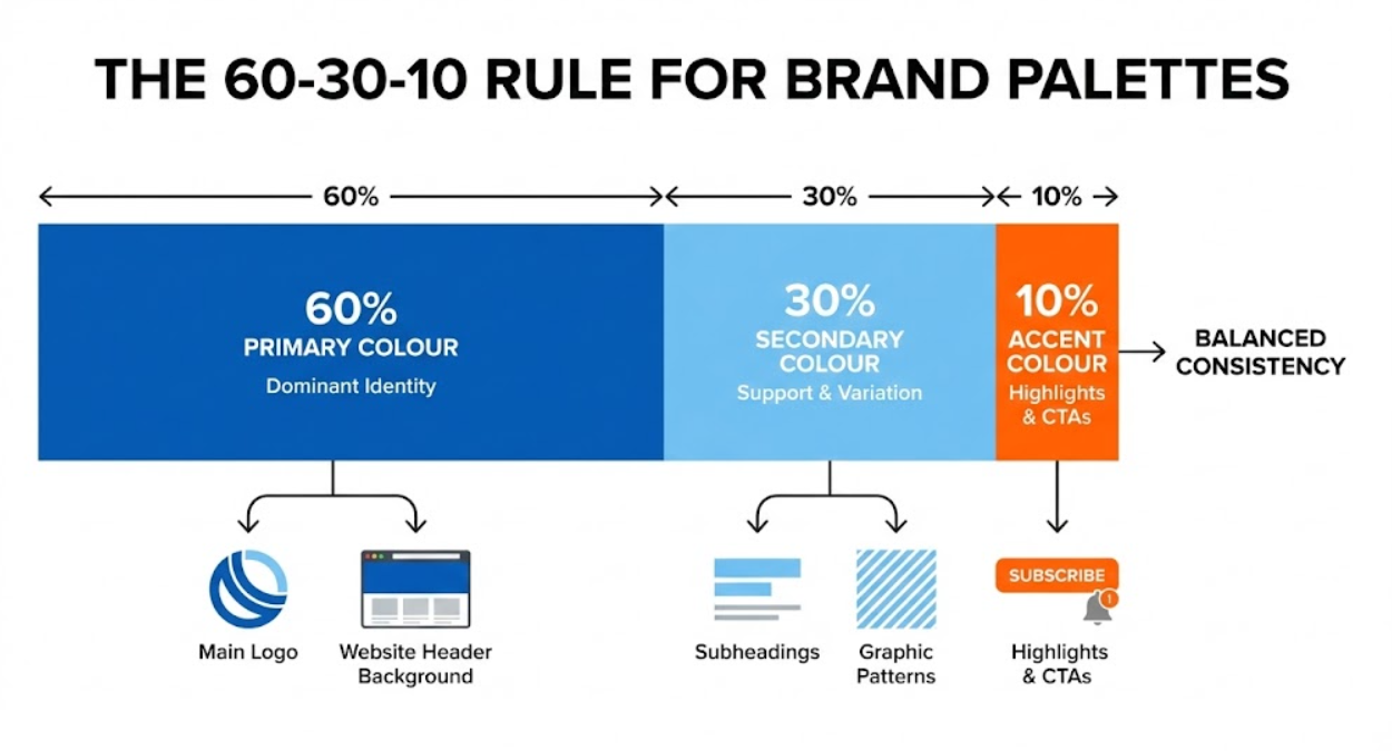
Effective brand palettes combine multiple colours in strategic proportions that create identity while providing application flexibility.
The 60-30-10 rule provides framework for balanced colour distribution. Your primary brand colour appears in approximately 60% of applications, establishing dominant identity. Secondary colour occupies 30%, providing variation and supporting primary. Accent colour fills remaining 10%, creating highlights and calls-to-action. This distribution prevents visual chaos while ensuring recognizable consistency.
Primary colour selection should align with core brand positioning and trigger desired psychological associations. Choose based on strategic goals rather than personal preference. Financial services targeting trust select blue. Health brands emphasizing natural wellness choose green. Luxury positioning leverages black, purple, or deep jewel tones. Analyse successful brands in your category and adjacent categories to understand colour conventions and differentiation opportunities.
Secondary colours complement primary while expanding palette versatility. Secondary colours might be lighter or darker variations of primary, creating tonal consistency. Alternatively, secondary colours can contrast primary through complementary relationships (opposite on colour wheel) or analogous relationships (adjacent on colour wheel). Secondary colours prevent monotony and enable visual hierarchy across applications.
Accent colours create emphasis and direct attention, particularly for calls-to-action requiring high visibility. Accent colours should contrast strongly with primary and secondary colours while remaining harmonious with overall palette. Bright, saturated accent colours work well for buttons, links, and important messages. Subtle accent colours serve for borders, backgrounds, or decorative elements.
Neutral colours (whites, grays, blacks) provide foundation and flexibility beyond core brand colours. Neutrals allow brand colours to stand out rather than competing. They create necessary white space and improve readability. Most brands use white or off-white as primary background, with black or charcoal for text. Mid-tone grays serve for borders, secondary text, or subtle backgrounds.
Colour harmony principles ensure palettes feel cohesive rather than random. Complementary schemes use opposite colour wheel colours (blue and orange, red and green) creating vibrant contrast. Analogous schemes use adjacent colours (blue, blue-green, green) creating harmonious, low-contrast palettes. Triadic schemes use three evenly spaced colours (red, yellow, blue) providing balanced variety. Monochromatic schemes use single hue in multiple shades and tints, creating sophisticated unity.
Accessibility considerations ensure colour palettes work for colour vision deficient users. Approximately 8% of men and 0.5% of women have some colour vision deficiency, most commonly red-green. Never rely solely on colour to convey meaning. Use colour plus shape, pattern, or text. Ensure sufficient contrast ratios between text and backgrounds (minimum 4.5:1 for normal text, 3:1 for large text per WCAG guidelines). Test palettes using colour blindness simulators before finalising.
Scalability across applications requires palettes that work in full colour, single colour, reversed (light on dark), and at various sizes. Logos and brand marks should remain recognizable when printed black-and-white or displayed in single colour. Complex gradients or subtle colour variations often fail in small sizes or low-quality reproduction. Test brand colours across digital screens, print materials, signage, and promotional products to ensure consistent appearance.
Cultural Colour Considerations for Australian Markets
Australia's multicultural demographics and international business connections require awareness of cultural colour associations that vary across communities.
Asian Australian communities represent significant consumer segments with distinct colour associations. Red signifies luck, prosperity, and celebration in Chinese, Vietnamese, and other Asian cultures, making it strategic for brands targeting these demographics, particularly around Lunar New Year. Gold represents wealth and prestige. White can symbolize mourning rather than purity. Purple and blue generally carry positive associations. Brands serving multicultural areas like Melbourne, Sydney, and Brisbane benefit from researching colour meanings across key demographic segments.
Indigenous Australian perspectives on colour connect to land, ceremony, and symbolism. Earth tones (ochres, browns, reds) hold significance in Aboriginal art and culture. Respectful incorporation requires genuine Indigenous collaboration rather than appropriation. Brands like Qantas have worked with Indigenous artists to integrate culturally appropriate design elements including colour usage.
European Australian heritage influences colour associations through Western cultural traditions. White weddings, black funerals, red warnings, green environmental consciousness represent inherited colour meanings. These Western associations dominate mainstream Australian culture but don't represent complete picture in multicultural society.
International expansion considerations require researching target market colour preferences before entering new countries. Colours successful in Australia might confuse or offend elsewhere. Green represents Islam in many Middle Eastern countries. Purple suggests mourning in Brazil. Yellow indicates courage in Japan but cowardice in some Western contexts. Research cultural colour psychology specific to expansion markets rather than assuming universal meanings.
Generational differences influence colour preferences within Australian markets. Baby Boomers tend toward traditional colour associations and classic palettes. Generation X appreciates bold, saturated colours from their youth. Millennials favour muted, sophisticated palettes influenced by minimalist design trends. Gen Z embraces vibrant, eclectic colour combinations. Consider target demographic age ranges when selecting brand palettes.
Gender evolution means traditional pink-for-girls, blue-for-boys associations are weakening, particularly among younger demographics. Brands targeting progressive audiences can challenge gender colour stereotypes. However, traditional associations persist in some demographics and categories. Research specific target audience rather than assuming colour-gender connections or complete neutrality.
Colour Strategy for Conversion Optimization
Strategic colour application directly influences conversion rates through psychological triggers and visual hierarchy that guides user behaviour.
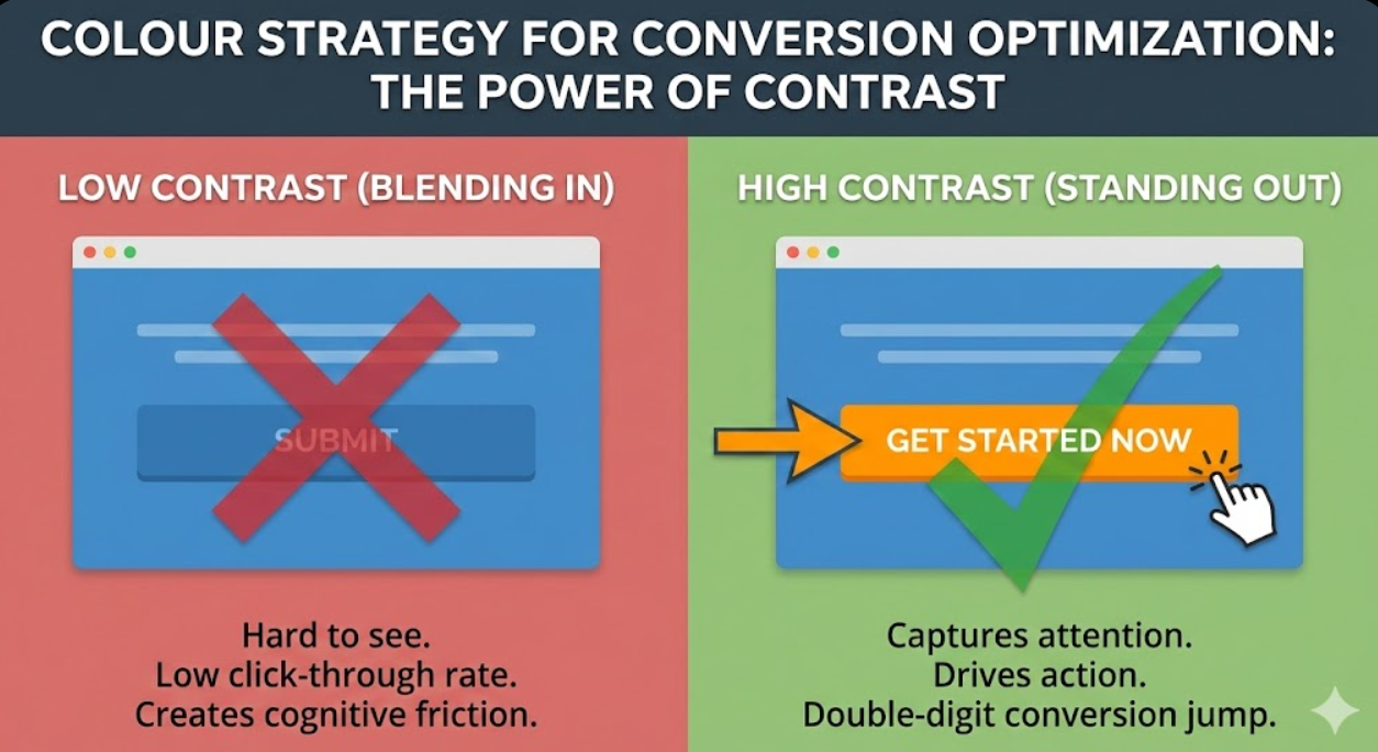
Call-to-action colour selection dramatically impacts click-through and conversion rates. CTAs require high contrast against surrounding elements to attract attention. Red and orange buttons often outperform other colours in A/B tests due to urgency associations, though effectiveness depends on overall colour scheme context. The key is contrast and visibility rather than specific hue. If your site is predominantly blue, orange CTA buttons will outperform blue ones regardless of colour psychology because they stand out visually.
Contrast ratios determine whether calls-to-action capture attention effectively. Measure colour difference between CTA elements and backgrounds using contrast checking tools. Insufficient contrast causes CTAs to blend into pages rather than commanding attention. Maximum contrast creates impossible-to-miss visibility that drives action. However, extremely jarring contrast can feel aggressive rather than inviting, requiring balance.
Consistency builds recognition that reduces cognitive friction in purchase journeys. When primary CTA colour remains consistent across website, emails, ads, and checkout process, users learn to associate that colour with action-taking. Inconsistent CTA colours create confusion about where to click or what actions to take. Establish standard CTA colour and apply religiously across all digital touchpoints.
Urgency and scarcity intensify through warm colours (red, orange, yellow) that trigger arousal and quick decision-making. Limited-time offers, low-stock warnings, and countdown timers benefit from warm colour schemes that create psychological pressure. However, overuse desensitizes users to urgency tactics, requiring restraint. Reserve urgent colour treatments for genuinely time-sensitive situations rather than constant artificial scarcity.
Trust and security during checkout leverage cool colours (blue, green) that reduce anxiety and increase confidence. Payment pages benefit from blue or green accents that subconsciously reassure customers their transactions are safe. Security badges, guarantees, and trust signals amplify impact through association with trust-building colours.
A/B testing validates assumptions about colour psychology effectiveness with your specific audience. General colour psychology principles provide direction, but individual brand contexts, target demographics, and existing colour schemes create variables that testing resolves. Test CTA colour variations, heading colours, background hues, and accent applications. Measure impact on click-through rates, conversion rates, and revenue per visitor. Some findings may contradict conventional wisdom, but data-driven decisions outperform assumptions.
Colour consistency across customer journey prevents brand recognition gaps that create uncertainty. From social media ads through landing pages to checkout and post-purchase communications, consistent colour usage creates seamless brand experience. Dramatic colour changes between touchpoints make users question whether they're still interacting with same brand, creating friction that reduces conversion.
Common Colour Psychology Mistakes Australian Brands Make
Avoiding predictable colour selection errors improves brand effectiveness and prevents costly rebranding.
Choosing colours based on personal preference rather than strategic positioning represents the most common mistake. Your favourite colour might be purple, but if launching logistics company targeting corporate clients, purple's creative and unconventional associations work against professional positioning. Separate personal taste from strategic brand decisions.
Copying competitor colour schemes ensures you blend into category rather than stand out. If every competitor uses blue, adding another blue brand creates recognition challenges. Strategic differentiation often means choosing psychological opposite of category norms. However, radically departing from category colours risks confusing consumers about category membership. Balance differentiation with category appropriateness.
Ignoring cultural colour meanings when serving multicultural markets or expanding internationally creates avoidable missteps. What seems neutral in Australian Anglo context might carry strong negative connotations for significant customer segments. Research colour associations across key demographics before finalizing palettes.
Using too many colours creates visual chaos that dilutes brand recognition. Brands attempting to be everything to everyone by including six or seven core colours rarely achieve strong identity. Restrain palettes to 3-4 core colours plus neutrals for maximum impact. Additional colours can supplement for specific campaigns or sub-brands but shouldn't appear in primary brand identity.
Insufficient contrast particularly between text and backgrounds reduces readability and accessibility. Beautiful colour combinations that fail contrast ratio requirements exclude users with vision impairments and create strain for all users. Prioritize legibility over aesthetics when conflict arises.
Trend chasing over timeless principles guarantees dated appearance within 2-3 years. Millennial pink, ultra-violet, and living coral each dominated design trends briefly before feeling stale. Core brand colours should transcend temporary aesthetic fashions through psychology-based selection that remains relevant regardless of passing trends. Reserve trendy colours for seasonal campaigns rather than permanent brand identity.
Failing to test colour reproduction across materials creates inconsistency that undermines recognition. RGB colours on screens don't match CMYK printed colours exactly. Different screen types display colours differently. Fabrics, plastics, and other materials affect colour appearance. Specify exact colour values in multiple colour spaces (RGB, CMYK, Pantone) and test physical samples before mass production.
Overcomplicating colour usage through gradients, shadows, and effects reduces reproduction reliability and increases production costs. Simple, flat colour application reproduces consistently across platforms and maintains integrity at any size. Save effects for specific applications rather than building them into core brand colours.
Testing and Validating Colour Palette Effectiveness
Strategic colour selection requires validation through testing and measurement rather than relying solely on theory or instinct.
Audience preference surveys reveal whether colour choices resonate with target demographics. Show palette options to representative audience samples and gather feedback on emotional responses, brand fit, and purchase influence. Ask which colours make brands feel trustworthy, exciting, premium, or accessible depending on positioning goals. Qualitative feedback reveals associations that quantitative metrics miss.
A/B split testing on digital platforms measures colour impact on conversion rates, click-through rates, and engagement. Test variations of CTA colours, headline colours, background hues, and accent applications. Most A/B testing platforms allow colour variation testing without code changes. Measure impact on business metrics rather than aesthetic preferences. Colour that performs best statistically might not be colour that looks best subjectively.
Eye-tracking studies reveal where colour draws attention in websites, packaging, or advertisements. Heat maps show which colour elements capture focus versus which get overlooked. This data informs strategic colour placement that guides users through intended journey rather than allowing random attention patterns.
Brand recognition testing measures how quickly and accurately people identify your brand based on colour cues alone. Show brand colours without logos or names and track recognition rates. Strong colour-brand associations create recognition even when other brand elements aren't visible. This recognition builds over time through consistent application.
Competitor comparison analysis evaluates how your colour palette differentiates within competitive set. View your brand colours alongside top 5-10 competitors. Do you stand out or blend in? Distinctiveness drives recognition advantages while excessive similarity creates confusion. Adjust palettes to maximize differentiation while maintaining category appropriateness.
Cultural sensitivity review by representatives from key demographic segments identifies unintended colour associations. Before launching in new markets or targeting new demographic groups, consult cultural experts or community representatives about colour palette implications. This investment prevents expensive rebrands or market rejection.
Application stress testing ensures colours work across required media and contexts. Print colour samples, create digital mockups, photograph products with brand colours, and assess appearance in various lighting. Colours that work beautifully on screens may reproduce poorly in print or look different in outdoor versus indoor lighting. Identify issues before full-scale production.
Longitudinal performance tracking measures whether colour choices support business objectives over time. Monitor brand awareness, consideration, preference, and sales metrics before and after colour palette implementation or changes. Correlation doesn't prove causation, but consistent improvement following palette changes suggests positive impact.
Frequently Asked Questions
How should Australian businesses select brand colours when operating across multiple demographic segments with different cultural colour associations and preferences?
Businesses serving diverse demographics should identify core brand colour representing shared values across all segments, then supplement with flexible accent colours adapting to specific cultural contexts when appropriate. Start by researching colour associations across all key demographic segments you serve. Identify colours that carry positive or neutral associations across groups while avoiding those with strong negative connotations for any significant segment. Blue, green, and certain purples generally work well across cultures, while red, white, and yellow require more careful consideration given varying meanings. For primary brand colour establishing overall identity, choose hue with broadly positive or neutral associations that aligns with brand positioning. This creates foundational recognition across all demographics. Then develop secondary and accent colours that can flex for specific cultural contexts, campaigns, or locations. For example, a brand might use blue as primary colour (universal trust associations) while incorporating red accent colours for Lunar New Year campaigns targeting Asian Australian communities (luck and prosperity associations) and green accents for environmental campaigns (sustainability associations global). This approach maintains core brand consistency while demonstrating cultural awareness. Avoid trying to make primary brand palette equally meaningful to all cultures simultaneously, as this often results in generic, forgettable colour schemes. Instead, establish strong core identity, then adapt applications thoughtfully. Package designs, retail locations, and marketing materials can incorporate culturally appropriate secondary colours while maintaining recognizable primary brand colour. Test colour palettes with representative samples from each key demographic segment before finalizing. Focus groups or surveys revealing that colours offend, confuse, or hold strong negative associations for any significant customer segment indicate necessary adjustments. Most Australian metropolitan markets contain sufficient demographic diversity that testing locally captures multicultural perspectives. When expanding internationally, repeat testing in new markets rather than assuming Australian multicultural research translates. Colour meanings vary not just by ethnicity but by national culture, regional preferences, and local competitive contexts. The Chinese diaspora in Melbourne may respond differently to colours than consumers in Shanghai due to varying cultural influences and market contexts.
What evidence demonstrates that strategic brand colour selection actually influences conversion rates and purchase decisions beyond aesthetic preference, and how can Australian businesses measure this impact?
Substantial research validates colour psychology's business impact beyond aesthetics. Studies published in Management Decision journal found that colour increases brand recognition by up to 80%, with consistent colour usage across platforms improving recognition by additional 40%. Research in Marketing Letters demonstrated that colour appropriateness for brand personality influences purchase intent more than favourite colours, meaning red works better for exciting brands regardless of whether red is customer's preferred colour. Academic studies using eye-tracking technology show that strategic colour contrast directs attention to calls-to-action, with high-contrast CTA buttons receiving 60% more visual attention than low-contrast alternatives. Case studies from major e-commerce platforms consistently report conversion rate increases of 10-30% from CTA colour optimization alone, though specific results vary by industry, audience, and existing colour scheme context. HubSpot's extensive A/B testing across thousands of campaigns found that red CTA buttons outperformed green by 21% in their specific context, not due to inherent red superiority but because red contrasted more against their predominantly green and blue site design. Australian businesses can measure colour psychology impact through systematic testing and measurement. Implement these approaches: Establish baseline performance metrics before colour changes including conversion rates, click-through rates, average order value, and brand awareness measures through surveys. Make isolated colour changes to specific elements (CTA buttons, headlines, backgrounds) rather than comprehensive redesigns, enabling attribution of performance changes to colour modifications. Run controlled A/B tests where identical pages, emails, or ads vary only in colour scheme, splitting traffic evenly between versions. Measure statistical significance of performance differences, requiring sufficient sample sizes (typically thousands of visitors minimum) for reliable results. For brand-level colour strategy, track longitudinal metrics over 6-12 months following palette changes, including brand awareness, unaided recall, consideration rates, and customer acquisition costs. Survey customers about brand perception attributes (trustworthy, exciting, premium, approachable) before and after colour changes to measure psychological association shifts. For retail businesses, test colour changes in subset of locations while maintaining original colours in control locations, comparing sales performance. Document testing methodology, sample sizes, and results systematically to build institutional knowledge about which colour strategies work for your specific brand, audience, and context. Many findings will be context-specific—what works for one Australian business won't necessarily work for another due to different existing colour schemes, target demographics, and competitive landscapes. Generic colour psychology principles provide directional guidance, but empirical testing in your specific context produces actionable insights. Most businesses discover that colour psychology effects are real and measurable but often more subtle than dramatic. Expect colour optimization to improve conversion rates by 5-25% rather than doubling performance overnight. These incremental improvements compound significantly over time across all customer touchpoints.
Should Australian small businesses invest in comprehensive brand colour strategy and palette development or is this level of colour psychology consideration only necessary for large enterprises with significant brand budgets?
Strategic colour selection delivers disproportionate value for small businesses relative to investment required, making it high-priority branding decision regardless of budget. Large enterprises can partially overcome poor colour choices through massive advertising spending that builds awareness despite suboptimal palettes. Small businesses lack this luxury, making every branding decision including colour selection more critical to success. Effective brand colours require strategic thinking rather than large budgets. The investment involves research time understanding colour psychology principles, competitive analysis evaluating category colour usage, demographic research into target audience preferences and cultural associations, and testing planned palettes through surveys or mockups before committing. This process requires 10-20 hours of thoughtful work but minimal financial investment. Working with experienced brand consultants accelerates process and ensures professional results, typically costing $1,000-$5,000 for comprehensive colour strategy as part of broader brand identity development. This investment pays returns indefinitely through improved recognition, appropriate psychological associations, and conversion optimization. Many small businesses make expensive colour mistakes by choosing palettes that contradict positioning (playful colours for serious professional services, aggressive colours for caring service businesses), blend into competitive landscape creating recognition challenges, or require frequent changes due to trend-chasing rather than strategic selection. These mistakes cost far more through poor brand performance and eventual rebranding expenses than strategic palette development investment. Small businesses should prioritize colour strategy during initial brand development, before significant investment in printed materials, signage, packaging, or digital assets. Changing colours post-launch wastes previous material investments and confuses early customers. Get colours right initially through strategic process rather than fixing mistakes later. However, small businesses can simplify the strategic process by focusing on core principles: Choose primary colour aligning with positioning that differentiates from direct competitors. Select 1-2 complementary secondary/accent colours that work harmoniously with primary. Ensure sufficient contrast for accessibility and visibility. Test palette with 10-15 target customers for feedback before committing. Verify colours reproduce consistently across digital and print applications. This streamlined approach captures most colour psychology benefits without enterprise-level investment. Resources available to small businesses include free online colour palette generators testing combinations, free contrast checking tools ensuring accessibility, demographic research through local chambers of commerce or census data, and small-scale testing through social media posts comparing colour variations. Many successful Australian small businesses built strong brands on modest budgets through thoughtful colour strategy that large competitors with bigger budgets but less strategic thinking couldn't match. Colour represents equalizer where small business attention to strategic detail can create advantages over larger but less thoughtful competitors.
Strategic Colour Selection Builds Brand Equity
Brand colours represent one of the highest-leverage branding decisions Australian businesses make, influencing recognition, trust, emotional associations, and conversion rates through psychological principles that operate subconsciously before rational evaluation begins.
Strategic palette selection based on positioning objectives, cultural awareness, psychological research, and empirical testing creates competitive advantages that compound over time through consistent application building instant recognition and appropriate brand associations.
Your brand colours work 24/7 communicating values, triggering emotions, and influencing decisions. Making those psychological triggers work for rather than against your business objectives transforms colour from aesthetic choice into strategic asset driving measurable business results.
Ready to develop a strategically optimized colour palette that leverages psychology to drive recognition, trust, and conversions for your Australian brand? Maven Marketing Co. combines colour psychology research, competitive analysis, and conversion optimization to create brand palettes that perform. Let's build your strategic colour advantage.


