.svg)
.svg)
.svg)


%201.svg)

Key Takeaways
- Effective packaging design balances immediate shelf impact with functional requirements, using strategic colour psychology, typography hierarchy, and visual simplicity to capture attention within 3-second decision windows
- Sustainability has shifted from trend to requirement in Australian retail, with consumers actively seeking recyclable, compostable, and minimal packaging that demonstrates environmental responsibility without compromising product protection
- Differentiation strategies leverage unexpected colour choices, distinctive structural formats, premium materials, and authentic storytelling that position products against category conventions rather than mimicking competitor approaches
- Regulatory compliance including ingredient declarations, nutritional panels, country-of-origin labeling, and recycling information must integrate seamlessly into design without overwhelming visual communication
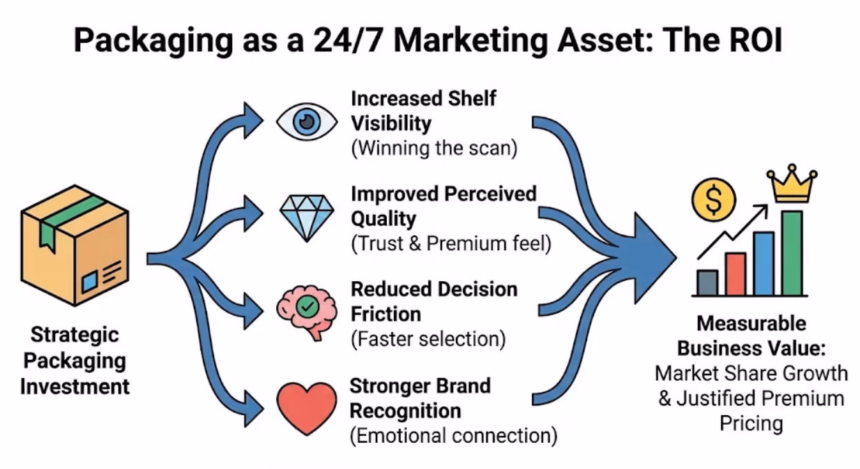
- Strategic packaging creates measurable business value through increased shelf visibility, improved perceived quality, reduced decision friction, stronger brand recognition, and justified premium pricing in competitive Australian markets
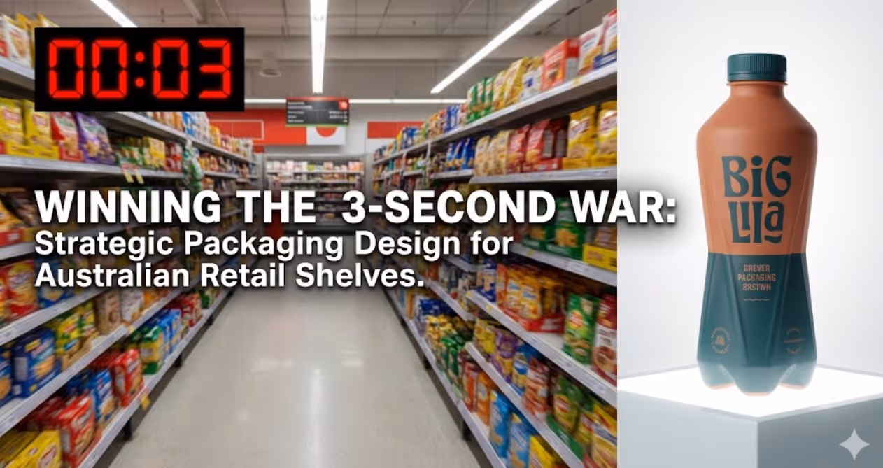
Walk into any Coles or Woolworths and you're confronted with overwhelming choice. The average Australian supermarket stocks 30,000 individual products. Consumers spend an average of 3 seconds looking at each product before deciding whether to consider it further or move on. In those three seconds, your packaging must capture attention, communicate value, trigger emotional connection, and overcome objections.
Most Australian businesses fail this test. Their packaging blends into category conventions, communicates features customers don't care about, and misses opportunities to differentiate strategically. They treat packaging as a necessary container rather than a critical marketing asset that works 24/7 selling their product.
The brands winning on Australian shelves understand that packaging design is strategic investment. They leverage colour psychology, structural innovation, sustainability messaging, and cultural authenticity to stand out, command attention, and drive purchase decisions that build category-leading market share.
The Psychology of Shelf Impact: How Consumers Actually Shop
Understanding consumer behaviour in retail environments reveals why certain packaging design approaches dramatically outperform others. Shopping psychology differs significantly from how consumers engage with advertising or digital content.
The consideration funnel narrows instantly on retail shelves. Online shoppers might review dozens of options. Shelf shoppers typically consider 2-3 products maximum before deciding. Your packaging must earn consideration in the initial scan or you're eliminated immediately. Research from the Point of Purchase Advertising International found that 76% of purchase decisions happen at shelf, making packaging your most critical marketing touchpoint.
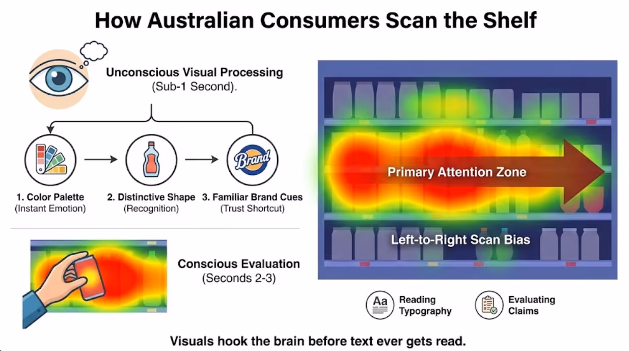
Visual processing happens unconsciously before rational evaluation begins. Consumers don't read packaging left to right, top to bottom. Their eyes jump to high-contrast elements, bold typography, distinctive shapes, and familiar brand cues. Only after visual elements capture attention does conscious reading begin. Packaging designed for linear reading fails because it assumes engagement that hasn't been earned.
Category scanning follows predictable patterns based on shelf position and product type. Eye-tracking studies reveal that middle shelves at eye level receive most attention. Products placed on top or bottom shelves must work harder visually to capture notice. Left-to-right scanning dominates in Western markets, giving left-positioned products within each shelf section slight advantage.
Colour triggers instant emotional associations before consumers read a single word. Blue suggests trust and reliability, making it dominant in healthcare and finance-related products. Green implies natural, healthy, or environmentally friendly, explaining its prevalence in organic and wellness categories. Red creates urgency and appetite, common in food and sale-oriented packaging. Strategic colour choice either aligns with or deliberately contrasts category conventions based on positioning strategy.
Shape recognition activates faster than text processing. Distinctive package shapes create instant recognition even when consumers can't yet read brand names or product descriptions. The Toblerone triangle, Coca-Cola contour bottle, and Pringles canister demonstrate how structural distinctiveness builds recognition that transcends visual identity alone.
Familiarity competes with novelty in complex ways. Established brands benefit from recognition that shortcuts decision-making. New products must balance enough familiarity to feel safe and credible with sufficient distinctiveness to capture attention. Too similar to category leaders and you blend in. Too different and you trigger skepticism about whether you belong in the category.
Sustainability as Design Imperative in Australian Packaging
Australian consumers increasingly demand environmentally responsible packaging, making sustainability a competitive necessity rather than nice-to-have differentiator. However, sustainability messaging must be authentic and substantive rather than superficial greenwashing.
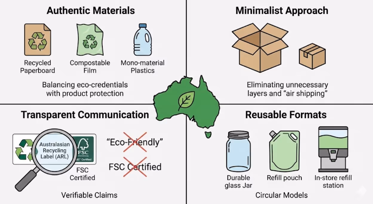
Material choices signal environmental commitment. Recyclable plastics, compostable materials, recycled paperboard, and renewable resources demonstrate responsibility. However, material selection must balance sustainability with product protection. Spoiled products due to inadequate packaging create larger environmental impact than protective packaging prevents. Research from the Australian Packaging Covenant shows that 83% of Australian consumers consider packaging sustainability when making purchase decisions, with 67% willing to pay premium prices for sustainably packaged products.
Minimal packaging appeals to waste-conscious consumers. Eliminating unnecessary layers, reducing package size to match product size, and avoiding decorative elements that serve no functional purpose demonstrate respect for environmental impact. Brands like Aesop and Ethique exemplify minimalist approaches that reduce waste while maintaining premium positioning through material quality and design sophistication.
Transparent sustainability communication builds trust when specific and verifiable. "100% recyclable PET plastic" communicates more credibly than vague "eco-friendly packaging" claims. Including recycling instructions and certifications (Australian Recycling Label, FSC certification for paper products) helps consumers properly dispose of packaging while validating environmental claims.
Refillable and reusable formats create differentiation in categories dominated by single-use packaging. Concentrated products in minimal packaging that consumers dilute at home, refill stations for liquid products, and durable containers designed for multiple uses address sustainability while potentially reducing per-unit packaging costs over time.
Local sourcing and manufacturing reduces transportation environmental impact while appealing to buy-local sentiment. Packaging manufactured in Australia from Australian materials creates multiple selling points—environmental responsibility, local economic support, and quality associations with Australian manufacturing standards.
Avoiding greenwashing prevents backlash from increasingly sophisticated consumers. Claims must be substantiated and specific. Using green colours and natural imagery while packaging remains fundamentally unsustainable creates cynicism that damages brand credibility. Authenticity matters more than perfection—acknowledging sustainability challenges while demonstrating progress builds more trust than overstated environmental claims.
Current Design Trends Reshaping Australian Retail Shelves
Several distinct aesthetic and strategic approaches currently dominate successful packaging design across Australian retail categories.
Bold minimalism strips designs to essential elements, using generous white space, limited colour palettes, and clean typography. This approach projects premium quality, modern sophistication, and product confidence. Brands like Thankyou and Who Gives A Crap demonstrate how minimalist packaging captures attention through simplicity in cluttered retail environments. The key is balancing simplicity with sufficient visual interest—truly minimal packaging can read as generic rather than intentional.
Maximum transparency showcases products through clear packaging materials or prominent product photography. Consumers increasingly want to see exactly what they're buying, particularly for food and beauty products. Transparent packaging builds trust while allowing product quality to sell itself. However, this approach requires products that look appealing and packaging that protects product appearance during shelf life.
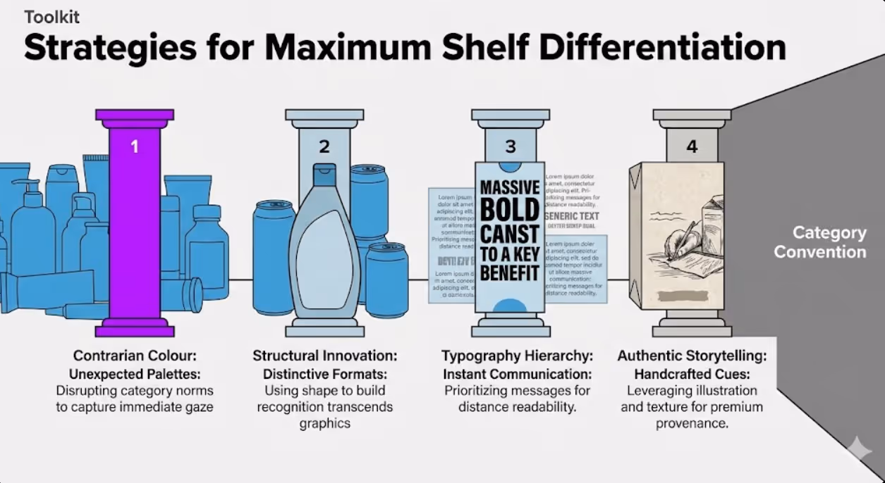
Handcrafted authenticity uses illustrations, hand-drawn typography, textured materials, and artisanal aesthetic cues to communicate small-batch quality and authentic origins. This trend particularly dominates craft beverages, specialty foods, and natural beauty products where artisanal positioning justifies premium pricing. The challenge is maintaining handcrafted feel at scale without looking amateurish or inconsistent.
Retro revival leverages nostalgia through vintage typography, heritage colour palettes, and classic design references. Established brands refresh heritage packaging to reconnect with legacy while attracting consumers seeking authenticity and proven quality. New brands adopt retro aesthetics to borrow timeless quality associations. Smith's chips and Vegemite successfully balance heritage preservation with contemporary relevance.
Pattern and texture maximalism creates shelf impact through bold patterns, metallic finishes, embossing, and tactile elements that beg to be picked up and examined. This approach particularly suits gift products, premium offerings, and categories where sensory experience drives purchase decisions. The risk is overwhelming consumers or appearing garish rather than sophisticated.
Illustration over photography provides flexibility, distinctiveness, and storytelling capability that photography struggles to match. Custom illustrations create ownable visual language that photographs of similar products can't replicate. Brands like KeepCup and Australian skincare line Sukin use distinctive illustration styles that build instant recognition while communicating brand personality.
Interactive and functional design adds utility beyond basic containment. Resealable closures, portion control features, dual-use packaging, and integrated serving implements create functional advantages that influence purchase decisions. Dollar Shave Club's simple cardboard packaging includes clear usage instructions and disposal guidance printed inside, extending brand interaction beyond initial purchase.
Colour Strategy for Maximum Shelf Differentiation
Strategic colour selection creates competitive advantage by either aligning with or deliberately contrasting category conventions based on positioning goals.
Category colour conventions establish consumer expectations. Health supplements cluster around whites, greens, and blues suggesting purity and wellness. Cleaning products favor blues and greens implying freshness and efficacy. Children's products use bright primary colours indicating fun and energy. Understanding category colour norms reveals opportunities for strategic differentiation.
Contrarian colour choices capture attention in homogeneous categories. When every protein powder uses black packaging suggesting performance and masculinity, a brand using soft pastels or vibrant unconventional colours stands out immediately. The risk is confusing consumers about category membership or seeming inappropriate for product type. The reward is instant shelf visibility and memorable distinctiveness.
Colour psychology influences purchase decisions through subconscious associations. Orange suggests value and accessibility, making it popular for budget-friendly products. Purple implies luxury and sophistication, common in premium beauty and confectionery. Yellow creates optimism and energy, used extensively in products targeting families or emphasizing natural ingredients. Strategic colour selection reinforces positioning messages without requiring words.
Cultural colour meanings matter in multicultural Australian markets. Red signifies luck and prosperity in Chinese culture, making it strategic for products targeting Asian Australian consumers during festivals. White suggests purity in Western contexts but can represent mourning in some Asian cultures. Research colour associations across your key demographic segments to avoid unintended negative messages.
Colour consistency builds brand recognition faster than any other visual element. Cadbury purple, Tiffany blue, and Vegemite's distinctive palette demonstrate how ownable colours create instant recognition that transcends logo visibility. However, colour ownership requires consistent application across products, touchpoints, and time—inconsistent colour usage fragments recognition.
Finish and texture affect colour perception. Matte finishes create sophisticated, tactile appeal. Gloss finishes appear more vibrant and eye-catching from distance. Metallic accents suggest premium quality. The same colour in different finishes communicates different messages—matte black feels artisanal and considered, while gloss black reads as sleek and modern.
Typography and Hierarchy for Instant Communication
Effective packaging typography balances impact, readability, and information hierarchy to communicate essential messages within seconds.
Primary headline typography must capture attention and communicate product identity instantly. Sans-serif fonts typically read more clearly from distance, making them common for product names and key benefits. However, distinctive serif or script fonts create personality and premiumness when readability is maintained. Size matters enormously—if your product name isn't immediately legible from typical shopping distance (approximately 1-2 metres), it's too small.
Information hierarchy guides scanning from most to least important content. Product name dominates, followed by key differentiator or primary benefit, with supporting information and required regulatory content appropriately subordinated. Many Australian packaging designs fail by giving equal visual weight to all content, creating cluttered confusion rather than clear communication.
Readability requirements vary based on package size and typical shopping distance. Small packages like cosmetics or supplements examined at close range can use smaller typography than products selected from several metres away like cereal boxes or cleaning products. Test packaging readability at actual shopping distances in typical retail lighting conditions—what reads beautifully on your computer screen may disappear on shelf.
Font personality reinforces positioning. Geometric sans-serifs feel modern and efficient. Rounded sans-serifs appear friendly and approachable. Classical serifs suggest tradition and quality. Script fonts communicate elegance or handcrafted authenticity. Typography choices should align with brand personality and target demographic preferences—premium beauty products might use elegant serifs while children's snacks need playful rounded fonts.
Contrast creates hierarchy. Varying font weights (light, regular, bold, heavy), sizes, and colours establishes clear information levels. However, using too many typographic variations creates visual chaos. Limit yourself to 2-3 font families maximum and create hierarchy through size, weight, and colour rather than introducing additional typefaces.
Text positioning exploits natural scanning. Upper portions of packaging typically receive more attention than lower areas. Left alignment suits Western reading patterns. Centered text feels more formal and premium. Right-aligned text creates visual tension that can capture attention but reduces readability. Position critical messages where eyes naturally land first.
Structural Innovation and Format Differentiation
Package shape and structure create differentiation that colour and graphics alone can't achieve, while potentially providing functional advantages that justify premium positioning.
Unconventional shapes disrupt category conventions and demand attention. Hexagonal jars, triangular boxes, or asymmetric bottles stand out on rectangular-dominated shelves. However, unusual shapes increase manufacturing costs, create shipping inefficiencies, and may waste retail shelf space. The differentiation value must justify these practical challenges. Method cleaning products use distinctive teardrop bottles that capture attention while communicating design-forward brand positioning worth premium pricing.
Sustainable structural solutions address environmental concerns while differentiating functionally. Concentrated products in smaller packaging reduce material usage and transportation impact. Flat-pack designs minimize shipping volume. Mono-material construction simplifies recycling. These structural approaches create talking points that sales teams and marketing can leverage beyond visual differentiation.
Multi-functional packaging adds value beyond containment. Jars designed for reuse, boxes that convert to organizers, or packaging with integrated measuring tools create functional differentiation that influences purchase decisions. Australian honey brand Capilano uses jars designed for pantry storage, encouraging consumers to keep visible brand presence in their homes long after purchase.
Premium material signals communicate quality through structural choices. Glass over plastic suggests purity and premium positioning. Heavy paperboard implies substantial quality. Soft-touch coatings create tactile luxury. Structural material choices must align with positioning—discount brands using premium materials confuse positioning, while premium brands using cheap materials undermine value perception.
Window cuts and product visibility allow consumers to inspect products before purchase, building confidence particularly for food, beauty, and craft products. Strategic windowing shows product while maintaining structural integrity and protecting from contamination or tampering. The visibility must showcase attractive products—showing mediocre-looking products defeats the purpose.
Right-sizing eliminates waste while potentially reducing costs. Many products ship in packages significantly larger than contents require, creating environmental waste and shelf inefficiency. Minimal packaging that fits products precisely demonstrates environmental consciousness while potentially reducing material costs. However, package size influences perceived value—sometimes slightly larger packaging justifies higher pricing through premium perception.
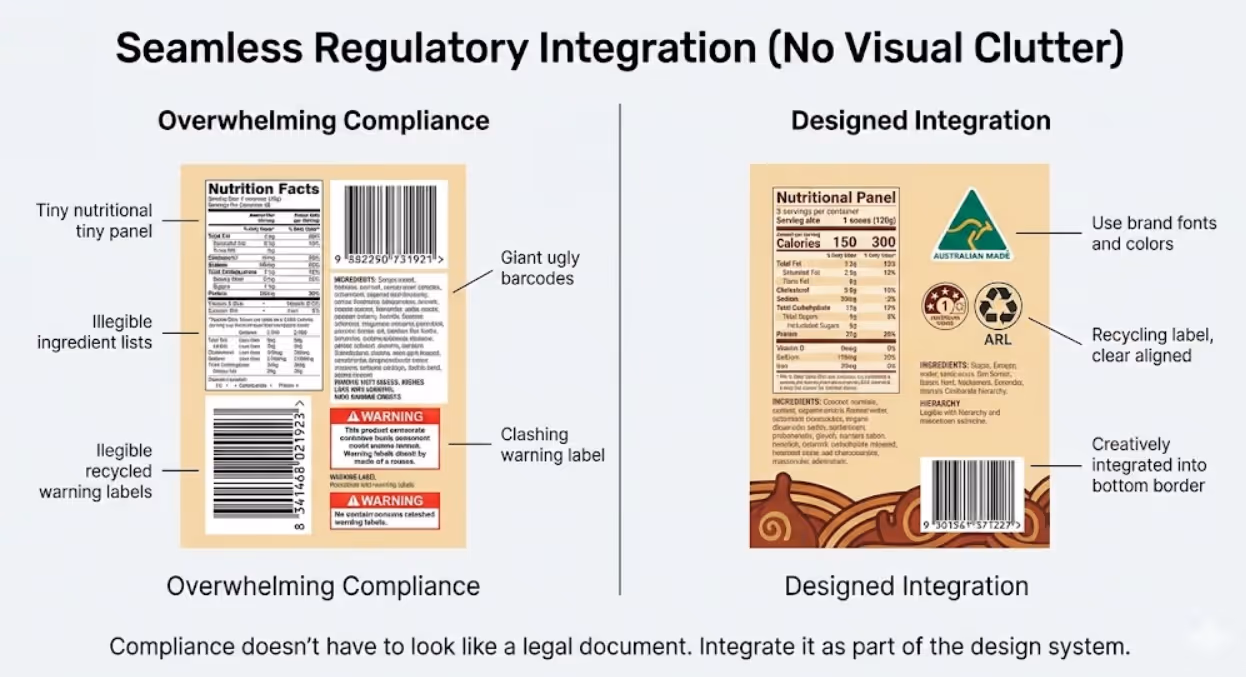
Regulatory Compliance Without Compromising Design
Australian packaging faces extensive regulatory requirements that must integrate seamlessly into design without overwhelming visual communication or appearing as afterthought.
Ingredient declarations must meet Food Standards Australia New Zealand requirements for placement, font size, and content. Rather than treating these as legal burden to minimize, strategic brands integrate ingredient lists into overall design using typography, placement, and formatting that maintains legibility while supporting aesthetic coherence.
Nutritional information panels require specific formatting and minimum text sizes under Australian Consumer Law. Many brands relegate these to back panels in tiny text, missing opportunities to leverage positive nutritional attributes. Products with strong nutritional profiles can feature highlights prominently as selling points while maintaining full panel compliance.
Country of origin labeling uses standardized formats and kangaroo logo indicating Australian content percentages. This requirement became mandatory across most food products, offering opportunities for Australian-made products to feature provenance prominently. Research from Roy Morgan shows 89% of Australian consumers prefer buying Australian-made products when quality and price are comparable, making origin labeling valuable marketing asset rather than mere compliance requirement.
Recyclability and disposal information using Australian Recycling Label system helps consumers properly dispose packaging while demonstrating environmental responsibility. Rather than minimizing this information, leading brands integrate it into visual design using clear iconography and colour coding that reinforces sustainability messaging.
Warning labels and cautionary statements required for certain product categories (alcohol, medicines, choking hazards) must meet specific size and placement requirements. Creative integration using design elements like banners, badges, or dedicated panels maintains compliance while preventing these elements from dominating overall aesthetic.
Barcode placement requires sufficient white space and positioning for scanner readability. Many designs treat barcodes as unsightly necessities to hide. Strategic placement on package bottom, side panels, or integration into overall design using creative backgrounds prevents barcodes from disrupting primary display faces.
Testing and Validation Before Production
Packaging investments are substantial and mistakes costly. Strategic testing validates design effectiveness before committing to production runs.
Shelf simulation studies place prototype packaging alongside competitors in mock retail environments, tracking which packages capture attention, communicate effectively, and drive selection. Eye-tracking technology reveals exactly where attention flows and what elements get noticed versus ignored. These studies identify design elements working as intended versus those failing to register with consumers.
Consumer perception research presents packaging concepts to target demographics, gathering feedback on purchase intent, perceived value, brand alignment, and emotional response. Qualitative interviews reveal what packaging communicates versus what designers intended, uncovering misalignments before production. Quantitative testing with larger samples validates whether reactions represent broader market sentiment or individual preferences.
Competitor benchmarking evaluates your packaging against category leaders and emerging challengers across objective criteria: shelf visibility, information clarity, perceived quality, sustainability messaging, and brand distinctiveness. Understanding relative strengths and weaknesses guides refinements that improve competitive positioning.
Technical testing validates structural integrity, material suitability, print quality, and functional performance. Does packaging protect products through distribution and shelf life? Do closures reseal effectively? Does printing maintain quality across expected package life? Does packaging perform under temperature variations and handling stress? Technical failures undermine even brilliant design.
Regulatory review by specialists ensures compliance across all applicable requirements before production. Legal issues discovered post-production require expensive corrections and potential recalls. Proactive compliance review prevents costly mistakes while potentially identifying opportunities to leverage required information as marketing assets.
Small-scale production tests before full runs reveal manufacturing issues, colour accuracy differences between proofs and production, and real-world handling characteristics. The packaging that looks perfect on screen may reveal flaws in physical form—print colours shifting, structural weaknesses appearing, or finishes not meeting expectations.
Frequently Asked Questions
How can Australian small businesses create distinctive packaging that stands out on retail shelves without the budgets that major brands invest in custom structural designs and premium materials?
Small businesses can achieve shelf impact through strategic design choices that don't require massive budgets. Focus resources on exceptional graphic design rather than expensive structural innovation. Bold colour choices, distinctive illustration styles, and clear typography hierarchy cost the same to print whether generic or brilliant. Many successful small Australian brands use standard package formats (stock bottles, jars, boxes) but differentiate completely through graphics, creating memorable shelf presence at fraction of custom structural costs. Consider what design elements are actually visible on shelf. If your product sits face-out, invest heavily in front panel design excellence while simplifying side and back panels to control costs. If it shelves spine-out like books, prioritize spine design that captures attention in tight spaces. Leverage sustainable materials as premium positioning without premium costs. Recycled paperboard, minimal packaging, and simple mono-material solutions often cost less than complex multi-material packaging while communicating values that Australian consumers reward with loyalty and premium pricing acceptance. Partner with talented emerging designers through platforms like Behance or local design schools where students seek portfolio projects. Many exceptional designers early in careers deliver outstanding work at accessible rates. Focus on ownable colour combinations rather than expensive finishes. Strategic colour differentiation (using unexpected hues that competitors avoid) creates instant distinctiveness without metallic foils or spot varnishes. Tell authentic stories through packaging copy and imagery. Small brands often have compelling origin stories, maker personalities, and local connections that resonate emotionally. This storytelling costs nothing but creates differentiation that generic brands struggle to match. Test concepts cheaply before committing. Print mockups on home printers, place them on actual retail shelves (take photos during low-traffic times), and evaluate shelf impact honestly. Digital design that fails in physical retail context wastes production investment. Remember that small production runs cost more per unit but allow iteration and refinement. Many successful brands launch with simple, cost-effective packaging, then reinvest early profits into packaging upgrades as volume scales. Perfect packaging isn't prerequisite for launch—good-enough packaging that ships product and communicates clearly allows you to enter market, learn, and improve iteratively.
What packaging design approaches work best for Australian products expanding into international markets where design preferences and regulatory requirements differ significantly?
International expansion requires packaging that balances global consistency with local relevance. Start by identifying which brand elements must remain constant globally versus which can flex for local markets. Core brand assets (logo, primary colours, key messaging) should typically remain consistent for recognition and efficiency. Variable elements (secondary colours, imagery, language, cultural references) can adapt to local preferences. Research regulatory requirements early for target markets. Many countries have stricter or different labeling requirements than Australia regarding ingredients, nutritional information, warnings, and language. Design packaging architecture that accommodates required information for different markets without requiring complete redesign. Modular panel systems where regulatory content appears in designated areas allow core design to remain consistent while local requirements populate specific panels. Consider cultural colour associations across target markets. Colours conveying positive messages in Australia may have negative connotations elsewhere. White suggests purity in Western markets but represents mourning in parts of Asia. Red is lucky in Chinese culture but aggressive in some Middle Eastern contexts. Research from Euromonitor International demonstrates that colour missteps cause 23% of international product launch failures. Test imagery and symbols for cultural appropriateness. Gestures, animals, or symbols that seem neutral in Australian context may offend or confuse in other markets. Hand gestures particularly vary in meaning—thumbs up is positive in Australia but offensive in parts of Middle East. Work with local cultural consultants before finalizing designs for unfamiliar markets. Language localization extends beyond translation to cultural adaptation. Direct translation often misses idioms, cultural references, or tonal appropriateness. Professional localization adapts messaging to resonate authentically with local audiences rather than sounding awkwardly foreign. Consider whether premium positioning in Australia translates to target markets. Australian-made status commands premium in some markets (particularly Asia-Pacific) but means nothing or even creates skepticism in others. Adjust positioning messaging accordingly while maintaining consistent brand personality. Production strategy influences packaging decisions. Global brands might maintain single packaging produced centrally with market-specific stickers or sleeves adding localized information. This approach maximizes efficiency but limits local customization. Alternatively, regional production using localized packaging designs provides flexibility but increases complexity and costs. Choose based on volume, market diversity, and positioning requirements. Start international expansion focused on markets with similar cultural and regulatory environments (New Zealand, UK, Canada) before tackling radically different markets. This staged approach allows packaging refinement through manageable iterations rather than attempting simultaneous optimization across dramatically different requirements.
How should Australian businesses approach the tension between sustainability imperatives and the protective packaging requirements that prevent product damage and waste during distribution and shelf life?
The sustainability versus protection tension requires strategic thinking that balances environmental responsibility with practical product preservation. Start by calculating total environmental impact rather than focusing solely on packaging materials. A damaged product due to inadequate packaging creates larger environmental waste than protective packaging prevents. Fresh food spoilage, broken fragile items requiring replacement production, or contaminated products needing disposal all generate significant environmental impact. Right-sized protective packaging often represents the environmentally superior choice. Optimize packaging for actual protection needs rather than over-engineering. Many products ship in excessive packaging based on worst-case scenarios rather than typical conditions. Analyze your actual damage rates, return reasons, and distribution stresses to determine minimum protection requirements. Use this data to reduce packaging to adequate levels rather than gold-plated overkill. Explore protective sustainable materials. Mushroom-based packaging, seaweed alternatives, molded fiber cushioning, and cornstarch peanuts provide protection using renewable, compostable materials. These innovations increasingly match traditional protective materials in performance while offering environmental advantages. Research from the Australian Institute of Packaging shows sustainable protective materials now achieve comparable protection to traditional options in 80% of applications at only 10-15% cost premium. Design products themselves for reduced packaging needs. More durable product construction, protective internal structures, or concentrated formats requiring less packaging address sustainability at source. Dish soap concentrates, powder-to-liquid cosmetics, and tablet formats reduce both product size and protective packaging requirements compared to liquid equivalents. Communicate protection rationale transparently. Consumers understand that glass jars need protective packaging or fresh food requires sealed containers. Explain why packaging choices were made and how they balance protection with environmental responsibility. "We use more packaging here to prevent damage waste, but we've eliminated it here where it wasn't needed" demonstrates thoughtful approach rather than greenwashing. Consider reusable protective packaging systems. Durable shipping containers customers return for reuse, deposit systems for substantial packaging, or mail-back programs for specialty packaging reduce single-use protective materials while potentially lowering long-term costs. Optimize for intended distribution channel. Direct-to-consumer shipment requires different protection than wholesale distribution to retail stores. Products sold online need robust shipping protection, while store-delivered products might use minimal individual packaging with bulk shipping protection. Channel-specific packaging strategies reduce total material usage. Test sustainable alternatives rigorously before adopting. Well-intentioned switches to sustainable packaging that fail to protect products create customer disappointment, return logistics waste, and brand damage. Pilot sustainable packaging with limited runs, monitor damage rates carefully, and validate performance before full transition. Partner with logistics providers on packaging optimization. Many distributors offer packaging consulting identifying protection requirements based on their handling systems and damage data. This expertise prevents both over and under-packaging.
Strategic Packaging Drives Competitive Advantage
Packaging design represents far more than attractive containers—it's strategic asset that influences purchase decisions, commands premium pricing, builds brand recognition, and creates competitive differentiation that transforms retail performance.
Australian businesses that approach packaging strategically rather than tactically gain advantages that compound over time. Every retail interaction reinforces brand identity, communicates value, and influences not just immediate purchase but ongoing brand relationships that drive lifetime customer value.
Your packaging competes for attention, consideration, and selection every moment it appears on retail shelves. Making that competition work in your favor requires understanding consumer psychology, leveraging design principles, respecting sustainability imperatives, and executing with excellence that turns casual browsers into loyal customers.
Ready to develop packaging that captures attention and drives sales on Australian retail shelves? Maven Marketing Co. specializes in strategic packaging design that balances shelf impact, sustainability, regulatory compliance, and brand building. Let's create packaging that transforms your product into retail standout.

Table of contents
read more blogs

Handing the Keys to Google's AI: How to Keep Control of Your Ad Budget Inside Performance Max
Performance Max is Google's most automated campaign type, and also the one that provokes the most anxiety among Australian advertisers who have spent years developing campaign management practices that depend on visibility, control, and the ability to make deliberate, measurable changes. The anxiety has some basis. Performance Max does take more control away from the advertiser than any previous Google Ads campaign type: it chooses the placements, it selects the creative combinations, it determines the bid for each impression, and it distributes the budget across Google's inventory in ways the advertiser cannot directly specify. The part of the anxiety that is not well based is the conclusion that these constraints make Performance Max unmanageable or a blank cheque handed to Google's algorithm. Performance Max has a specific set of levers that, when correctly configured, give advertisers meaningful influence over where the budget goes, which audiences it targets, which creative assets it uses, and which conversion events it optimises toward. Understanding and using these levers is the difference between a Performance Max campaign that works within the advertiser's strategic parameters and one that wastes budget on inventory, audiences, and objectives that the business never intended to pursue.

When Customers Search on TikTok and Instagram Instead of Google — How Australian Brands Adapt
Something structurally significant has changed in how younger Australian consumers research purchases, and most Australian brands have not yet adjusted their discoverability strategy to reflect it. A proportion of the audience that would previously have opened Google to search for "best brunch spots Fitzroy" or "honest review Mecca skincare serum" is now opening TikTok or Instagram instead. They are searching within these platforms for short video content that shows them what they want to know: the actual food, the actual product, the actual experience, from people who have actually been there or used the item. This is not a marginal behaviour limited to a niche demographic. TikTok's own data has reported that a significant share of its users use the platform as a search engine, and the query patterns on Instagram's search function have expanded well beyond celebrity and hashtag discovery into product, venue, and service research. For Australian brands that have built their discoverability strategy entirely on Google organic search and Google Ads, this shift represents a gap that is growing over time as the audience that uses social platforms as primary discovery tools ages into demographics with higher purchasing power. This article covers what the shift to social search means practically, what content and account configuration signals these platforms use to surface results, and what Australian brands need to do differently to be found on TikTok and Instagram by people who are actively looking for what they offer.

How to Build a Google Business Profile That Converts Browsers Into Booked Appointments
A Google Business Profile that has been set up and left alone is doing roughly the same work as a shop front with the lights off. It confirms the business exists and provides the phone number, but it is not actively persuading a local searcher who is comparing three businesses in the search results to choose this one rather than the competitors sitting directly above and below it in the local pack. The businesses that win appointments from Google local search are not simply those that are closest to the searcher or those with the most reviews, although proximity and reviews both matter. They are the businesses that have treated their Google Business Profile as a conversion surface rather than a directory entry, and have populated every element of the profile with the specific information, imagery, and social proof that a local searcher needs to make a confident decision to book rather than keep browsing. The difference between a profile that ranks and converts and one that ranks but loses its potential customers to competitors is in the specific decisions this article covers: how to write the business description, which photos produce engagement, how to use posts to maintain freshness signals, how to respond to reviews in a way that builds rather than diminishes trust, and how to configure the booking and contact features that reduce friction between intent and appointment.


