.svg)
.svg)
.svg)


%201.svg)

Key Takeaways
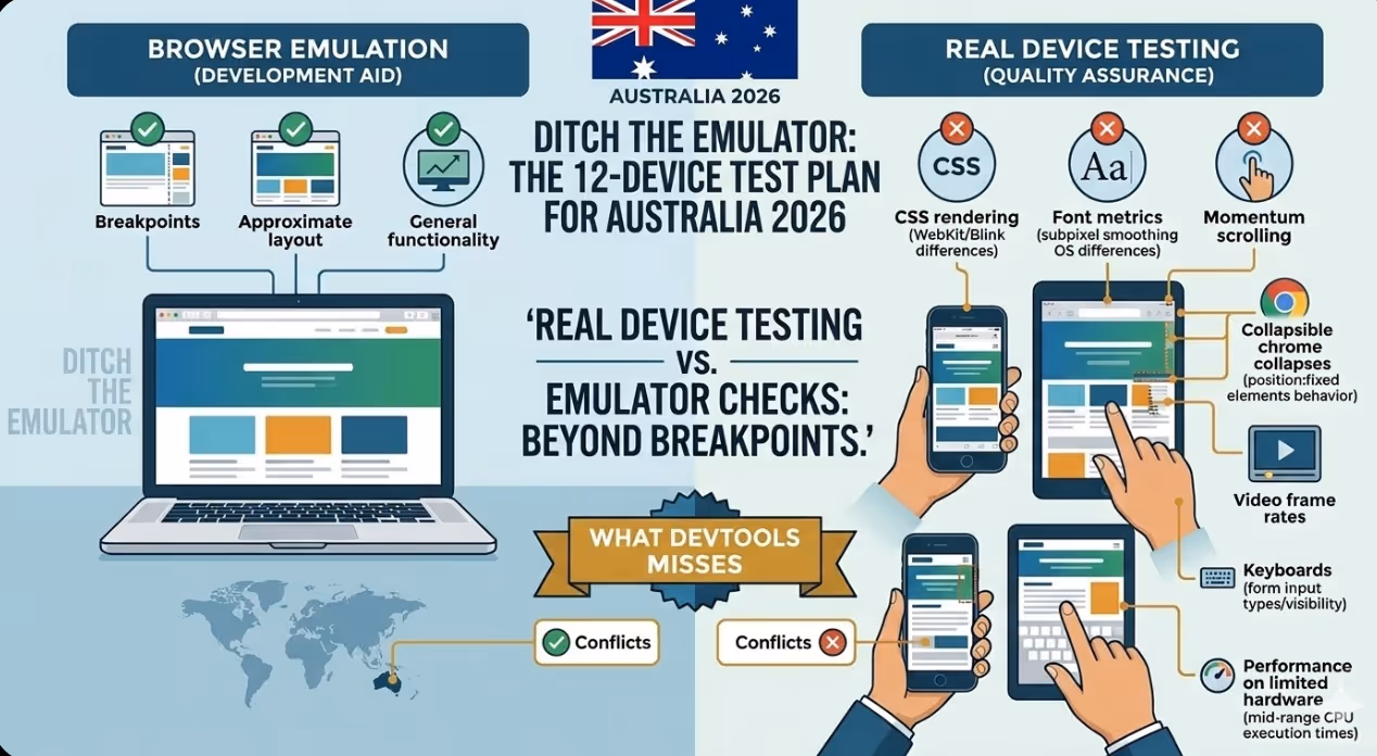
- Device emulation in browser developer tools is a development aid, not a quality gate to use before launch. Real devices produce different rendering, font metrics, scroll behaviour, and touch handling than emulators.
- iOS Safari and Android Chrome are the two most important browser engines for Australian mobile traffic in 2026, but they behave differently enough that passing on one does not guarantee passing on the other.
- Small screen devices, those with physical widths below 375 pixels, are still in active use in Australia and commonly expose layout overflows, text truncation problems, and breakages caused by elements with a fixed width that wider test devices do not surface.
- Tablet testing is neglected in most testing processes before launch. The 768-pixel to 1024-pixel range produces layout behaviours that are neither mobile nor desktop and often fall between the breakpoints the design system was built for.
- Performance testing on an Android device in that bracket provides a more representative view of actual performance for Australian website visitors than testing on a flagship device, because the flagship's superior CPU and memory hide performance problems that hardware in that segment exposes.
- Touch interaction testing must go beyond confirming that tappable elements respond to taps. It should verify that tap targets meet the minimum size requirements, that hover states do not create stuck or inaccessible states on touch devices, and that scroll and swipe interactions on carousels and modals behave correctly.
- Form testing on mobile devices deserves dedicated attention. The keyboard type summoned by each input field, the autocomplete and autofill behaviour, the visibility of form fields above the keyboard, and the behaviour of date and select inputs vary significantly across device and OS combinations.
Why Real Device Testing Cannot Be Replaced
The argument for skipping physical device testing almost always comes down to time and cost. Device testing takes longer than emulator checks, requires access to physical hardware, and adds a step to the launch process that feels like it can be deferred until issues emerge in the wild. The argument against skipping it is the cost of those issues: a layout break on a device used by a meaningful percentage of the site's audience, discovered after launch, requires a fix cycle that is slower and more disruptive than catching the same problem before the site goes live.
Chrome DevTools device emulation is built into the browser and works well for checking breakpoints and approximate layout during development. What it does not replicate includes the actual CSS rendering behaviour of WebKit (iOS Safari), the font rendering and subpixel smoothing differences between operating systems, the behaviour of position: fixed elements when the browser chrome collapses on scroll, the rendering of videos and animated elements at device frame rates, the behaviour of form inputs including the type of keyboard summoned and the positioning of the viewport above the keyboard, the performance profile of the JavaScript running on limited hardware, and the way the operating system's own UI elements interact with the page content.
These are not edge cases. Every category in the list above contains problems that appear on real devices but not in emulation, and several of them are failures that are immediately visible to users notice immediately.
The 12-Device Testing Set
Device 1: iPhone 15 or iPhone 16 (iOS Safari, Current OS)
The most current flagship iPhone running the most current iOS version tests the reference implementation of WebKit on the most capable hardware in the Apple ecosystem. This device establishes the baseline for iOS Safari behaviour, including the handling of the safe area insets on notch and Dynamic Island models, the behaviour of position: fixed elements when the browser chrome collapses, the rendering of custom fonts at Retina resolution, and the performance characteristics of interactions with heavy JavaScript on Apple Silicon.
Common failures found here: Safe area padding not applied correctly causing content to be obscured by the Dynamic Island or home indicator; CSS min-height: 100vh not accounting for the collapsible Safari chrome correctly; custom scroll behaviour conflicts with Safari's native momentum scrolling.
Device 2: iPhone SE (3rd generation or equivalent small screen iPhone)
The iPhone SE has a 4.7-inch screen with a 375-pixel logical width, the narrowest viewport in the current Apple lineup. Testing on this device surfaces layout problems that do not appear on the 390-pixel and wider viewports of current flagship iPhones. Many responsive layouts are designed and tested primarily at 390 pixels and above, leaving the narrower viewport unvalidated.
Common failures found here: Navigation elements overflowing or wrapping unexpectedly at 375 pixels; hero text that looks correct at 390 pixels becoming uncomfortably large at 375; card and grid layouts that break at the narrower viewport width.
Device 3: Android Flagship (Samsung Galaxy S23 or equivalent — Chrome)
The Android flagship running Chrome tests the Blink engine on capable hardware and provides the reference implementation for Android Chrome behaviour. Chrome on Android handles certain CSS features differently from Safari, including the behaviour of 100svh, the rendering of backdrop filters, and the treatment of some flexbox edge cases.
Common failures found here: CSS features that are supported in Safari but behave differently or not at all in Chrome on Android; video autoplay differences between the two engines; font rendering differences that require size adjustments.
Device 4: Mid-Range Android (Samsung Galaxy A54 or Pixel 6a equivalent)
An Android device in the affordable to mainstream price bracket with a processor of mainstream grade and 4 to 6 gigabytes of RAM provides the most commercially important performance test in the set. Google's own research consistently shows that the median Android device in markets including Australia is not a flagship, and the performance profile of a device in this segment exposes JavaScript execution times, main thread blocking, and Cumulative Layout Shift issues that a flagship masks.
Common failures found here: Slow JavaScript interactions that are imperceptible on flagship hardware but noticeably delayed on CPUs in this device class; animations that run at full frame rate on a flagship but drop frames on a device in this class; layout shifts occurring on slower resource loading.
Device 5: Older Android (Android 11 or 12 on a device 2 to 3 years old)
Australia has a long tail of older Android devices still in active use. Testing on a device running an older Android version and an older Chrome build catches rendering regressions, JavaScript API compatibility issues, and CSS feature support gaps that current hardware and software do not surface.
Common failures found here: CSS properties with insufficient browser support for the installed browser version; JavaScript features not available in older V8 engine versions without polyfills; rendering differences in how older Chrome handles certain animation and transition implementations.
Device 6: iPad (Standard 10th generation — Safari)
The standard iPad running iPadOS Safari tests the tablet viewport, a range that most responsive designs handle awkwardly. At approximately 810 pixels wide in portrait orientation, the iPad sits above mobile breakpoints but below the desktop breakpoints most designs are optimised for. Content that has been designed for a single column on mobile or a layout with multiple columns on desktop often looks unintentionally sparse or cluttered in the tablet range.
Common failures found here: Two-column grid layouts that look too wide at tablet viewport widths; navigation patterns designed for mobile or desktop that do not adapt gracefully to the tablet middle range; typography scales that jump too dramatically between mobile and desktop without a tablet-specific intermediate step.
Device 7: iPad Pro (12.9-inch — Safari)
The large iPad Pro in landscape orientation produces a viewport close to 1366 pixels wide, which falls within the desktop breakpoint range for most responsive designs. This device tests how the site behaves when a mobile browser engine (WebKit) renders what the CSS framework treats as a desktop layout, and it surfaces Safari-specific rendering issues that only appear at wider viewports.
Common failures found here: Desktop layouts that assume a mouse cursor for hover states, creating inaccessible interactions on a touch device at a desktop viewport width; sticky headers that behave differently on large touch screens; complex CSS grid implementations that render incorrectly in Safari at wide viewports.
Device 8: Android Tablet (Samsung Galaxy Tab S8 or equivalent — Chrome)
An Android tablet running Chrome tests the same tablet viewport range as the iPad but with the Blink engine rather than WebKit. Comparing results between Device 6 (iPad Safari) and this device isolates rendering differences specific to each engine at tablet viewports and confirms that layout adaptations at this breakpoint range work correctly across both major mobile engines.
Common failures found here: The same tablet range layout issues as the iPad, plus any Chrome-specific rendering differences at tablet viewports that do not appear on the iPad.
Device 9: iPhone on Low Bandwidth (iPhone with network throttling or on actual 3G/4G network)
Network performance testing on a real device under realistic network conditions is meaningfully different from Lighthouse scores measured on a fast desktop connection. Australian mobile users outside capital cities, in areas with congested networks, or during peak usage periods experience load times that desktop testing does not replicate.
Common failures found here: Critical rendering path issues that are not visible on fast connections; font loading and flash of invisible text problems at lower bandwidth; lazy loading implementations that cause layout shifts or interaction delays that fast connections mask.
Device 10: Samsung Internet Browser (on a Samsung Android device)
Samsung Internet is the default browser that comes installed on Samsung devices and has a meaningful share of Australian mobile browser traffic, particularly among users who have never changed their default browser. It uses its own fork of the Blink engine with some differences in CSS feature support, extension behaviour, and content blocking that produce occasional rendering and functionality differences compared to standard Chrome.
Common failures found here: Extensions and content blocking enabled by default in Samsung Internet affecting loading of scripts from third parties; minor rendering differences in how the Samsung Internet fork handles certain CSS selectors and animations; differences in how the browser handles payment and form autofill APIs.
Device 11: Firefox for Android
Firefox for Android uses the Gecko engine, the only major mobile browser engine that is neither WebKit nor Blink. While Firefox's share of Australian mobile traffic is small, testing on Gecko catches CSS and JavaScript issues specific to that engine and is particularly valuable for sites with a audience focused on technology where Firefox adoption is higher than average.
Common failures found here: CSS features supported in WebKit and Blink but with different behaviour in Gecko; JavaScript APIs with implementation differences specific to each engine; layout discrepancies specific to Gecko's rendering of flexbox, grid, or custom properties in certain configurations.
Device 12: A Device With Accessibility Features Enabled (VoiceOver on iOS or TalkBack on Android)
Testing with a screen reader active on a real device is qualitatively different from running automated accessibility checks or using accessibility inspection tools that run in the browser. It reveals how the site actually sounds and behaves when navigated by a screen reader user: whether interactive elements have meaningful labels, whether the reading order follows the visual layout as expected, whether modals and overlays trap focus correctly, and whether dynamic content updates are announced appropriately.
Common failures found here: Interactive elements with no accessible name; images with missing or meaningless alt text; modals that open but do not trap focus, allowing the screen reader to navigate behind the overlay; tab order that does not match the visual layout; dynamic content updates that are not announced via ARIA live regions.
FAQs
How should the device testing set be prioritised if time constraints require testing on fewer than 12 devices before launch?If the full set cannot be tested, the prioritisation should be based on the site's likely audience composition and the risk profile of each device category. The mandatory minimum is: one current iOS Safari device (iPhone 15 or equivalent), one Android Chrome device from the affordable to mainstream bracket (the most commercially important performance test), one tablet (iPad standard), and the screen reader test on whichever platform the project team has access to. The iOS Safari and testing on an Android Chrome device from this segment alone will catch the majority of rendering and performance issues, and the tablet test catches the category most commonly skipped by development teams. The screen reader test is essential for any publicly accessible Australian website given the legal obligations under the Disability Discrimination Act 1992 and the technical standard referenced by it.
Are there automated testing tools that can reduce the need for manual physical device testing?Automated tools including BrowserStack, Sauce Labs, and LambdaTest provide access to real device clouds where tests can be run remotely on physical hardware. For functional and visual regression testing, these platforms can cover a broad device set more efficiently than maintaining a physical device inventory. The limitation is that automated tools are more effective at catching specific known regressions than at discovering the unexpected interaction and rendering issues that manual testing on physical hardware tends to surface. The recommended approach for Australian web development teams is to use automated device cloud testing for regression coverage across a wide device set, supplemented by manual testing on the eight to twelve most important devices for quality assurance aimed at discovering new issues before launch. Manual testing cannot be fully replaced by automation for the screen reader test, for performance assessment under actual network conditions, or for the subjective assessment of interaction feel and visual quality that experienced testers provide.
How should Australian development teams document and track issues found during device testing?Device testing findings should be logged in the project's issue tracker with the device name, operating system version, browser and version, a clear description of the visual or functional problem, a screenshot or screen recording, and a severity classification that indicates whether the issue is a blocker (preventing the site from launching), a high priority fix to be resolved before launch, or a item to be addressed after launch in the first sprint after going live. Severity classification prevents device testing from becoming a source of endless scope creep before launch: not every rendering difference is a blocker, and the ability to distinguish between a cosmetic inconsistency and a functional failure that impedes user completion of key tasks is an important part of a disciplined testing process before launch. All identified issues should be retested on the same device after the fix is applied, both to confirm resolution and to check that the fix has not introduced new problems on other devices in the set.
The Devices That Matter Are the Ones Your Audience Uses
A testing set is only valuable to the extent that it represents the actual device distribution of the site's audience. The twelve devices described in this article cover the major operating systems, browser engines, screen sizes, performance tiers, and accessibility use cases relevant to the Australian market in 2026. For sites with known audience characteristics that differ significantly from the general Australian market, the testing set should be adjusted accordingly. A government service site may need to add older Windows tablets and devices at the lower end of the market to the set. A luxury ecommerce site may find the flagship device testing more commercially important than the performance typical of more affordable hardware. The principle is the same regardless of the specific devices: test on the hardware and software that the audience actually uses, before launch rather than after.
Maven Marketing Co includes structured physical device testing as part of every web development project, covering the full 12-device set described in this article before every site launch.
Talk to the team at Maven Marketing Co →

Table of contents
read more blogs

Handing the Keys to Google's AI: How to Keep Control of Your Ad Budget Inside Performance Max
Performance Max is Google's most automated campaign type, and also the one that provokes the most anxiety among Australian advertisers who have spent years developing campaign management practices that depend on visibility, control, and the ability to make deliberate, measurable changes. The anxiety has some basis. Performance Max does take more control away from the advertiser than any previous Google Ads campaign type: it chooses the placements, it selects the creative combinations, it determines the bid for each impression, and it distributes the budget across Google's inventory in ways the advertiser cannot directly specify. The part of the anxiety that is not well based is the conclusion that these constraints make Performance Max unmanageable or a blank cheque handed to Google's algorithm. Performance Max has a specific set of levers that, when correctly configured, give advertisers meaningful influence over where the budget goes, which audiences it targets, which creative assets it uses, and which conversion events it optimises toward. Understanding and using these levers is the difference between a Performance Max campaign that works within the advertiser's strategic parameters and one that wastes budget on inventory, audiences, and objectives that the business never intended to pursue.

When Customers Search on TikTok and Instagram Instead of Google — How Australian Brands Adapt
Something structurally significant has changed in how younger Australian consumers research purchases, and most Australian brands have not yet adjusted their discoverability strategy to reflect it. A proportion of the audience that would previously have opened Google to search for "best brunch spots Fitzroy" or "honest review Mecca skincare serum" is now opening TikTok or Instagram instead. They are searching within these platforms for short video content that shows them what they want to know: the actual food, the actual product, the actual experience, from people who have actually been there or used the item. This is not a marginal behaviour limited to a niche demographic. TikTok's own data has reported that a significant share of its users use the platform as a search engine, and the query patterns on Instagram's search function have expanded well beyond celebrity and hashtag discovery into product, venue, and service research. For Australian brands that have built their discoverability strategy entirely on Google organic search and Google Ads, this shift represents a gap that is growing over time as the audience that uses social platforms as primary discovery tools ages into demographics with higher purchasing power. This article covers what the shift to social search means practically, what content and account configuration signals these platforms use to surface results, and what Australian brands need to do differently to be found on TikTok and Instagram by people who are actively looking for what they offer.

How to Build a Google Business Profile That Converts Browsers Into Booked Appointments
A Google Business Profile that has been set up and left alone is doing roughly the same work as a shop front with the lights off. It confirms the business exists and provides the phone number, but it is not actively persuading a local searcher who is comparing three businesses in the search results to choose this one rather than the competitors sitting directly above and below it in the local pack. The businesses that win appointments from Google local search are not simply those that are closest to the searcher or those with the most reviews, although proximity and reviews both matter. They are the businesses that have treated their Google Business Profile as a conversion surface rather than a directory entry, and have populated every element of the profile with the specific information, imagery, and social proof that a local searcher needs to make a confident decision to book rather than keep browsing. The difference between a profile that ranks and converts and one that ranks but loses its potential customers to competitors is in the specific decisions this article covers: how to write the business description, which photos produce engagement, how to use posts to maintain freshness signals, how to respond to reviews in a way that builds rather than diminishes trust, and how to configure the booking and contact features that reduce friction between intent and appointment.


