.svg)
.svg)
.svg)


%201.svg)
In the aggressive landscape of Australian digital marketing, the desktop monitor is no longer the main event—it is the spectator section. The real action, the revenue-generating clicks, and the critical "near me" searches are happening in the palm of your hand.
For years, "mobile-friendly" was a checkbox—a nice-to-have feature that web developers tackled after the "real" site was built. Today, that hierarchy has flipped completely. With Google’s rigorous enforcement of mobile-first indexing and Australian smartphone penetration hitting near-saturation levels, building for mobile isn’t just a design choice; it is the fundamental baseline of digital survival.
If your website treats mobile users as second-class citizens, you aren’t just annoying your customers; you are actively telling search engines to de-rank you.
As a seasoned SEO specialist, I have witnessed countless Australian businesses—from boutique retailers in Fitzroy to heavy-duty tradies in Western Sydney—bleed revenue because their glossy, high-resolution desktop sites transform into unusable, slow-loading disasters on a 6-inch screen. This comprehensive guide will walk you through the philosophy, technical execution, and strategic necessity of mobile-first development.
.avif)
The Australian Mobile Context: Why It Matters Down Under
To understand why mobile-first is non-negotiable, you have to look at the numbers. Australia is one of the most smartphone-dependent nations globally. According to the Australian Communications and Media Authority (ACMA), over 92% of adult Australians own a smartphone, and for a significant portion of the population, it is their primary device for banking, shopping, and navigating the internet.
This shift has profound implications for local SEO. Whether a user is searching for an emergency plumber in Parramatta or booking a table in Brisbane’s CBD, the journey almost always begins on a mobile device.
The Connectivity ChallengeUnlike markets with ubiquitous, lightning-fast fibre in every corner, Australia faces unique connectivity challenges. While our 5G rollout is robust in capital cities, regional and rural connectivity can be inconsistent. A mobile-first approach respects these limitations. By prioritising lightweight code and optimised assets, you ensure your site loads quickly whether the user is on high-speed Wi-Fi in Sydney or a patchy 4G connection in regional New South Wales.
Defining Mobile-First: It’s Not Just "Responsive"
There is a critical distinction between "responsive design" and "mobile-first development," and understanding it is key to SEO success.
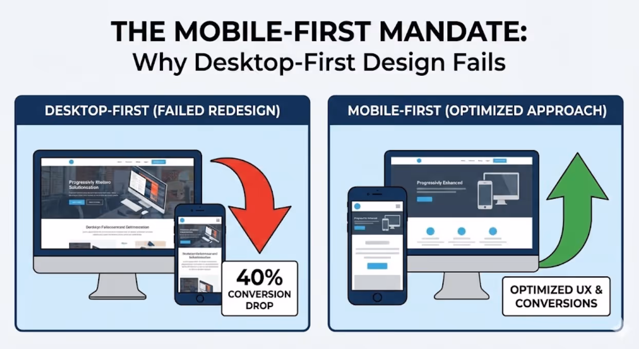
- Graceful Degradation (Desktop-First): Traditionally, developers built the full desktop site first—complete with massive hero images and heavy scripts. They then used CSS media queries to "shrink" and hide elements for smaller screens. This often resulted in mobile sites that looked okay but were bloated with hidden code, leading to slow load times.
- Progressive Enhancement (Mobile-First): This approach flips the workflow. You design and code for the smallest screen first. You focus on the core content and functionality that is absolutely essential. As the screen size increases (tablet, laptop, desktop), you progressively enhance the experience by adding more features.
Why does this matter for SEO?Since 2019, Google has defaulted to Mobile-First Indexing. This means Google predominantly uses the mobile version of your content for indexing and ranking. If your mobile site is a watered-down version of your desktop site, or if it hides critical content behind "read more" tabs that aren't crawlable, your rankings will suffer across all devices.
Reference: Google Search Central - Mobile-first Indexing Best Practices
.avif)
Core Web Vitals and Technical Performance
In the mobile-first era, speed is the currency of engagement. Google’s Core Web Vitals explicitly measure user experience metrics that are critical for mobile users. Failing these metrics can result in a direct ranking penalty.
1. Largest Contentful Paint (LCP)
This measures loading performance. On a mobile device, users expect the main content (like a product image or headline) to load in under 2.5 seconds.
- The Fix: Optimise images relentlessly. Use next-gen formats like WebP, which offer superior compression compared to JPEGs without quality loss. Implement "lazy loading" so that images further down the page don't load until the user scrolls near them.
2. Interaction to Next Paint (INP)
Replacing First Input Delay (FID), INP measures responsiveness. Have you ever tapped a button on a mobile site and nothing happened for two seconds? That is a poor INP score. It frustrates users and leads to "rage clicks."
- The Fix: Minimise JavaScript execution time. Break up long tasks and defer non-essential scripts (like third-party chat widgets or tracking pixels) until after the main content has loaded.
3. Cumulative Layout Shift (CLS)
This measures visual stability. We’ve all experienced the frustration of trying to tap a link, only for an ad to pop up and push the content down, causing us to click the wrong thing. On mobile, where screen real estate is precious, this is a cardinal sin.
- The Fix: Always specify width and height attributes for images and video elements. Reserve space for dynamic content (like ads) so the page layout doesn't jump around as it loads.
UX/UI Engineering for "Fat Fingers"
Mobile-first development is as much about biology as it is about technology. The mouse pointer is a precise instrument; the human thumb is not.
The Thumb Zone
Research suggests that users hold their phones in a variety of ways, but the "thumb zone"—the area of the screen easily reachable with a single thumb—is where your most critical interactive elements must live.
- Strategy: Place primary navigation bars, "Add to Cart" buttons, and key calls-to-action (CTAs) in the bottom third of the screen. Avoid placing critical menus at the top-left corner, which is the hardest point for a right-handed user to reach on a large smartphone.
Touch Targets & Spacing
A "fat finger" error occurs when touch targets are too small or too close together.
- Standard: Google and Apple guidelines recommend a minimum touch target size of 48x48 pixels (roughly 9mm physical size).
- Spacing: Ensure there is adequate padding between clickable elements. If a user tries to tap "Terms of Service" and accidentally hits "Cancel Order," you have created a friction point that could cost you a sale.
Navigation and Menus
The days of the mega-menu are over for mobile.
- Hamburger Menus: While ubiquitous, ensure they are easily accessible and clearly labelled.
- Accordions: Use collapsible headers to organise dense content. This reduces the need for excessive scrolling while keeping all information accessible. Crucially, ensure the content within these accordions is visible to search engine crawlers (using proper HTML5 semantic tags).
Content Strategy: Writing for the Scan
Mobile users are hunting, not reading. They are looking for specific information—a price, an address, a phone number. They do not have the patience to wade through walls of text.
Front-Loading ValueAdopt the "inverted pyramid" style of journalism. Put the most important information—the conclusion, the offer, or the answer—at the very top of the page.
Typography and Readability
- Font Size: Tiny text forces users to pinch-to-zoom, which is a major usability failure. Base font size should be at least 16px for body text.
- Line Height: Increase line spacing to improve readability.
- Contrast: Ensure high contrast between text and background. Mobile screens are often viewed in direct Australian sunlight, which can wash out subtle grey-on-grey designs.
Reference: W3C Web Content Accessibility Guidelines (WCAG) 2.1
.avif)
Local SEO and the "Near Me" Phenomenon
For Australian businesses with a physical presence, mobile-first development is intrinsically linked to Local SEO.
Mobile searches for "____ near me" have exploded in recent years. When a user searches for "coffee shop near me" or "emergency electrician," Google relies on the mobile-friendliness of your site, your proximity, and your load speed to determine if you deserve the click.
- Click-to-Call: Ensure your phone number is a clickable link (
<a href="tel:0412345678">). - Map Integration: Embed a responsive Google Map that opens directly in the user’s map app when tapped.
- Schema Markup: Use LocalBusiness schema to help Google understand your operating hours, address, and reviews, increasing the chances of appearing in the coveted "Local Pack."
5 Key Takeaways
- Mobile-First Indexing is the Rule, Not the Exception: Google now crawls and indexes the mobile version of your site primarily. If your mobile content is sparse or your site is slow, your rankings will tank on desktop too.
- Performance Equals Revenue: Australian users, often on fluctuating 4G/5G connections, demand speed. Optimising Core Web Vitals (LCP, INP, CLS) is critical to reducing bounce rates and improving conversion.
- Design for the Thumb: Usability is biological. Keep key interactions in the "thumb zone" (bottom third of the screen) and ensure touch targets are at least 48x48 pixels to prevent frustration.
- Local SEO is Mobile SEO: Optimise for "near me" intent by using LocalBusiness schema, ensuring NAP (Name, Address, Phone) consistency, and implementing click-to-call functionality.
- Test on Real Hardware: Emulators are useful, but insufficient. You must test your site on actual devices in direct sunlight and on varying network speeds to understand the true Australian user experience.
Frequently Asked Questions (FAQs)
1. Does "Mobile-First" mean I don't need a desktop site?No. It means you start the design process with the mobile experience to ensure the essentials are prioritised. The desktop version is then "progressively enhanced" to utilise the larger screen space. However, the content and core functionality should be equivalent across both.
2. My desktop site has a lot of content. Should I hide some of it on mobile to save space?Be very careful with this. If you hide content on mobile that is present on desktop, Google’s mobile-first index may not count that content towards your rankings. Instead of removing it, use UI elements like accordions or "read more" expanders to keep the page clean while keeping the text accessible to crawlers.
3. How does mobile page speed affect my Google Ads performance?Significantly. Google Quality Score considers landing page experience. If your mobile page loads slowly, your Quality Score drops, meaning you pay a higher Cost Per Click (CPC) for a lower ad position. A fast mobile site literally lowers your advertising costs.
Conclusion: Future-Proofing Your Australian Business
The transition to mobile-first is not a trend; it is the maturation of the internet. For Australian businesses, the message is clear: your customers are mobile, your competitors are adapting, and Google is watching.
A truly responsive, mobile-first website builds trust. It tells the user that you value their time and understand their needs. Whether you are a local tradie or a national retailer, the friction-free experience of a polished mobile site is often the deciding factor between a bounce and a conversion.
If you are unsure where your site stands or need a comprehensive audit of your mobile performance, it is time to bring in the experts. We specialise in turning sluggish sites into high-speed conversion engines.
Ready to dominate the mobile search results? Visit us at Maven Marketing Co. and let's get your digital presence up to speed.

Table of contents
read more blogs

Handing the Keys to Google's AI: How to Keep Control of Your Ad Budget Inside Performance Max
Performance Max is Google's most automated campaign type, and also the one that provokes the most anxiety among Australian advertisers who have spent years developing campaign management practices that depend on visibility, control, and the ability to make deliberate, measurable changes. The anxiety has some basis. Performance Max does take more control away from the advertiser than any previous Google Ads campaign type: it chooses the placements, it selects the creative combinations, it determines the bid for each impression, and it distributes the budget across Google's inventory in ways the advertiser cannot directly specify. The part of the anxiety that is not well based is the conclusion that these constraints make Performance Max unmanageable or a blank cheque handed to Google's algorithm. Performance Max has a specific set of levers that, when correctly configured, give advertisers meaningful influence over where the budget goes, which audiences it targets, which creative assets it uses, and which conversion events it optimises toward. Understanding and using these levers is the difference between a Performance Max campaign that works within the advertiser's strategic parameters and one that wastes budget on inventory, audiences, and objectives that the business never intended to pursue.

When Customers Search on TikTok and Instagram Instead of Google — How Australian Brands Adapt
Something structurally significant has changed in how younger Australian consumers research purchases, and most Australian brands have not yet adjusted their discoverability strategy to reflect it. A proportion of the audience that would previously have opened Google to search for "best brunch spots Fitzroy" or "honest review Mecca skincare serum" is now opening TikTok or Instagram instead. They are searching within these platforms for short video content that shows them what they want to know: the actual food, the actual product, the actual experience, from people who have actually been there or used the item. This is not a marginal behaviour limited to a niche demographic. TikTok's own data has reported that a significant share of its users use the platform as a search engine, and the query patterns on Instagram's search function have expanded well beyond celebrity and hashtag discovery into product, venue, and service research. For Australian brands that have built their discoverability strategy entirely on Google organic search and Google Ads, this shift represents a gap that is growing over time as the audience that uses social platforms as primary discovery tools ages into demographics with higher purchasing power. This article covers what the shift to social search means practically, what content and account configuration signals these platforms use to surface results, and what Australian brands need to do differently to be found on TikTok and Instagram by people who are actively looking for what they offer.

How to Build a Google Business Profile That Converts Browsers Into Booked Appointments
A Google Business Profile that has been set up and left alone is doing roughly the same work as a shop front with the lights off. It confirms the business exists and provides the phone number, but it is not actively persuading a local searcher who is comparing three businesses in the search results to choose this one rather than the competitors sitting directly above and below it in the local pack. The businesses that win appointments from Google local search are not simply those that are closest to the searcher or those with the most reviews, although proximity and reviews both matter. They are the businesses that have treated their Google Business Profile as a conversion surface rather than a directory entry, and have populated every element of the profile with the specific information, imagery, and social proof that a local searcher needs to make a confident decision to book rather than keep browsing. The difference between a profile that ranks and converts and one that ranks but loses its potential customers to competitors is in the specific decisions this article covers: how to write the business description, which photos produce engagement, how to use posts to maintain freshness signals, how to respond to reviews in a way that builds rather than diminishes trust, and how to configure the booking and contact features that reduce friction between intent and appointment.


