.svg)
.svg)
.svg)


%201.svg)
Key Takeaways
- Logo design psychology leverages how the human brain processes visual information, using colour associations, shape meanings, and symbolic elements to create instant emotional responses and brand perceptions that influence consumer behaviour
- Colour choices trigger specific psychological and cultural responses, with red stimulating urgency and appetite, blue building trust and professionalism, green suggesting growth and sustainability, and yellow conveying optimism and accessibility across Australian markets
- Shapes communicate fundamental brand characteristics through geometric psychology, with circles suggesting community and protection, squares conveying stability and reliability, triangles implying innovation and direction, and organic shapes expressing creativity and approachability
- Effective logo design balances psychological principles with practical considerations including scalability across applications, cultural appropriateness for diverse Australian audiences, competitive differentiation within your industry, and timeless appeal that transcends short-term trends
- Strategic logo psychology creates measurable business advantages through faster brand recognition, stronger emotional connections, improved recall in purchase decisions, and higher perceived brand value compared to logos designed without psychological foundations
The Commonwealth Bank's yellow and black logo instantly triggers recognition across Australia. Qantas's red kangaroo evokes national pride and reliability. Woolworths's fresh green apple suggests health and value. These aren't aesthetic accidents—they're carefully constructed psychological triggers designed to influence how you feel about these brands before conscious thought kicks in.
Your brain processes images 60,000 times faster than text. Within 50 milliseconds of seeing a logo, you've already formed a subconscious impression. That impression influences whether you trust the brand, remember it later, and ultimately choose it over competitors.
Most Australian small businesses treat logo design as a purely aesthetic exercise, choosing colours they personally like and shapes that feel modern. They're missing the strategic opportunity to leverage psychological principles that drive brand recognition and preference.
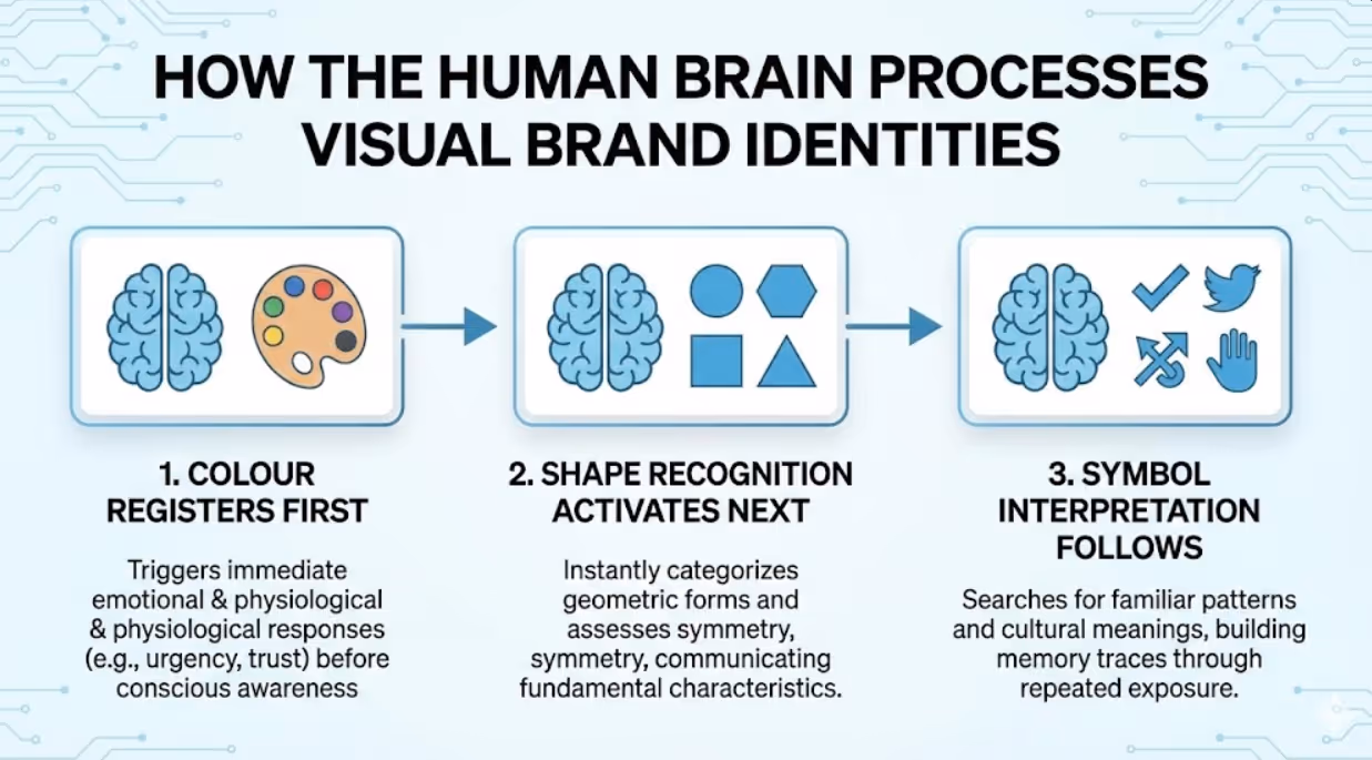
How the Human Brain Processes Visual Brand Identities
Understanding logo psychology starts with understanding visual processing. Your brain's visual cortex dedicates significant resources to pattern recognition, colour differentiation, and symbol interpretation. These systems evolved to help humans quickly identify opportunities and threats, and they still activate when you encounter brand identities.
Visual processing follows a predictable hierarchy. Colour registers first, triggering immediate emotional and physiological responses before conscious awareness. Shape recognition activates next, with your brain instantly categorizing geometric forms and assessing symmetry. Symbol interpretation follows, as your mind searches for familiar patterns and cultural meanings.
According to research published in the Journal of Consumer Psychology, people make subconscious judgments about products within 90 seconds of initial viewing, and up to 90% of that assessment is based on colour alone. This explains why colour choice represents one of the most critical decisions in logo design.
Memory formation for visual identities happens through repeated exposure and emotional connection. Logos that trigger stronger emotional responses—whether positive feelings of trust and excitement or negative associations of caution—create more durable memory traces. This is why psychologically strategic logos build brand recognition faster than aesthetically pleasing but emotionally neutral designs.
The principle of visual salience determines which elements capture attention. High contrast, unusual shapes, and unexpected colour combinations increase salience, making logos more noticeable in crowded environments. However, too much complexity reduces processing fluency—the ease with which your brain interprets visual information. The sweet spot balances distinctiveness with simplicity.
The Psychology of Colour in Logo Design
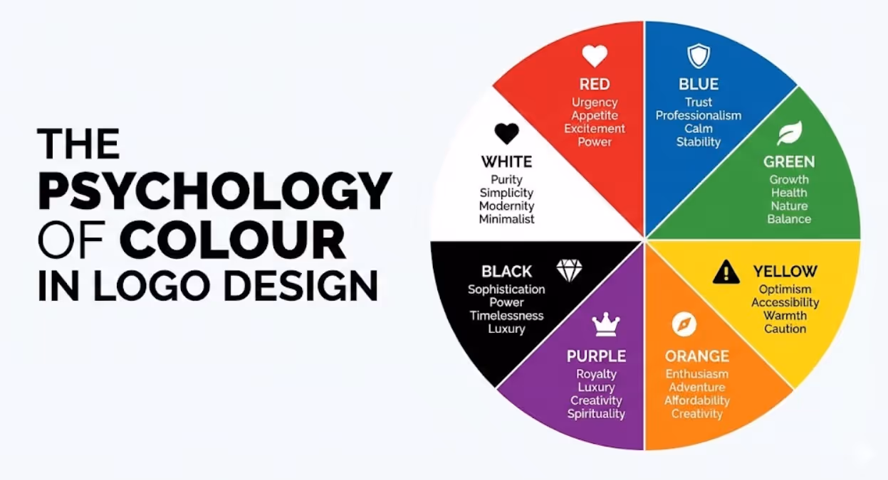
Colour psychology represents the most researched area of logo design, and for good reason. Different wavelengths of light trigger distinct neurological and hormonal responses that influence mood, energy, and decision-making.
Red stimulates urgency, appetite, and excitement. It increases heart rate and creates a sense of immediacy, which explains its prevalence in fast food logos (McDonald's, KFC, Red Rooster) and sale signage. Red also signals importance and power, making it effective for brands positioning themselves as bold or passionate. However, red can trigger aggression or anxiety in some contexts, making it less suitable for brands emphasizing calm or careful decision-making.
Blue builds trust, professionalism, and calm. It's the most universally liked colour across cultures and demographics, which explains why it dominates corporate logos (Commonwealth Bank, ANZ, Ford, IBM). Blue suggests stability and reliability, ideal for financial services, healthcare, and technology brands. Lighter blues convey approachability and peace, while darker blues project authority and expertise. The downside? Blue's popularity means it offers less differentiation in many industries.
Green communicates growth, health, and environmental consciousness. It's psychologically restorative, reducing stress and promoting balance. Australian brands like Woolworths leverage green to suggest freshness and natural quality. Different shades carry distinct associations—bright lime green suggests innovation and energy, while forest green conveys tradition and stability. Research from the University of British Columbia found that green enhances creative performance, making it particularly effective for brands positioning around innovation.
Yellow radiates optimism, accessibility, and warmth. It's the most visible colour in daylight, making it excellent for capturing attention. Commonwealth Bank pairs yellow with black to balance cheerfulness with professionalism. However, yellow can trigger anxiety or caution when overused, as it's also associated with warning signs. It works best as an accent colour or when paired with stabilizing hues.
Orange blends red's energy with yellow's friendliness, creating associations with enthusiasm, adventure, and affordability. It's less common in corporate logos, offering differentiation opportunities. Fanta, Nickelodeon, and Amazon leverage orange to convey approachability and value. Orange appeals particularly to younger demographics and works well for brands emphasizing fun or creativity.
Purple historically signified royalty and luxury due to the rarity of purple dyes. It retains associations with premium quality, creativity, and spirituality. Purple appeals strongly to female consumers and works well for beauty, wellness, and creative industry brands. Cadbury's use of purple creates distinct shelf presence in the confectionery category.
Black projects sophistication, power, and timelessness. It's the colour of luxury brands (Chanel, Prada) and premium products. Black creates strong contrast, improving readability and impact. However, it can feel intimidating or inaccessible for brands targeting mass markets or emphasizing approachability.
White suggests purity, simplicity, and modernity. It's essential for minimalist design approaches and creates the breathing room that improves visual processing. Apple's strategic use of white space around its mark exemplifies how absence can be as powerful as presence.
Shape Psychology and What Geometric Forms Communicate
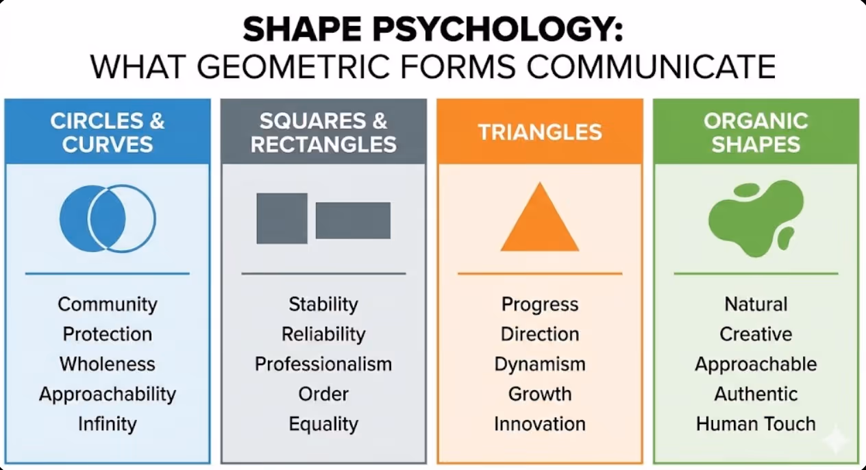
Shapes carry meaning through both learned associations and innate psychological responses. The human brain assigns characteristics to different geometric forms, influencing how we perceive the brands that use them.
Circles and curves suggest completeness, community, and protection. The absence of sharp edges creates feelings of softness and approachability. Circular logos feel friendly and inclusive, making them popular for community-focused brands and social platforms. Target's bullseye uses circles to suggest focus and centrality. The continuous nature of circles also implies infinity and eternal quality, explaining their use by brands emphasizing longevity or continuity.
Squares and rectangles convey stability, reliability, and professionalism. Right angles suggest order and structure, making geometric logos appropriate for financial institutions, technology companies, and professional services. Microsoft's window squares communicate systematic organization. The balanced proportions of squares create feelings of equality and fairness, valuable associations for brands emphasizing transparency or consistent service.
Triangles point toward progress, direction, and dynamism. The inherent directionality of triangles creates visual movement and suggests forward momentum. Upward-pointing triangles imply growth and ambition, while inverted triangles can suggest stability or foundation. Triangle shapes feel more masculine and aggressive than circles, making them common in industries like automotive, technology, and sports. The unequal sides create visual tension that captures attention and suggests innovation.
Horizontal lines suggest calm, stability, and tranquility. They evoke horizons and landscape, creating peaceful associations. Brands emphasizing reliability and groundedness often incorporate horizontal elements. However, too much horizontal emphasis can feel static or passive.
Vertical lines imply strength, growth, and aspiration. They draw the eye upward and suggest upward movement or elevation. Architecture and corporate brands often use vertical elements to convey ambition and stature. Vertical orientation can also feel more formal and authoritative than horizontal compositions.
Diagonal lines create energy and movement. They're the most dynamic orientation, suggesting action and change. Sports brands and companies emphasizing innovation frequently incorporate diagonal elements. However, diagonals can feel unstable if not properly balanced, potentially creating subtle anxiety.
Organic shapes feel natural, creative, and approachable. Irregular, flowing forms suggest authenticity and human touch. They work particularly well for brands in wellness, creativity, food, and lifestyle categories. The BP flower and Twitter bird use organic shapes to feel less corporate and more personable.
Symbolic Elements and Cultural Associations
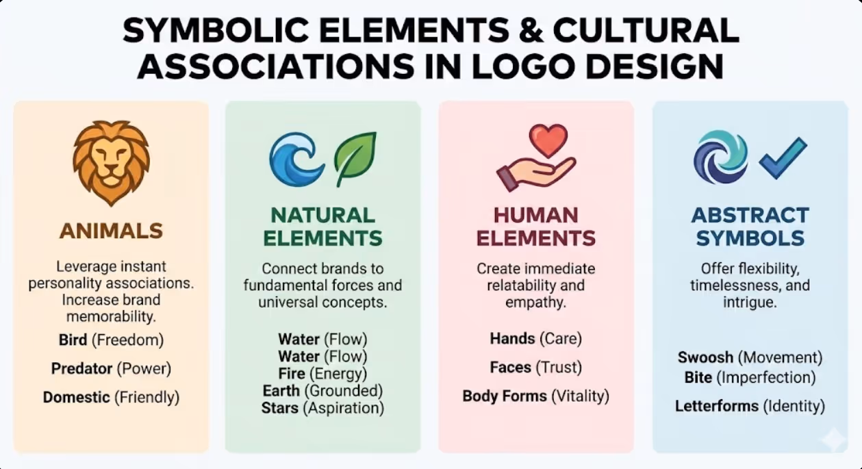
Symbols carry layered meanings shaped by cultural context, historical usage, and universal archetypes. Strategic symbol selection taps into established associations while creating unique brand identities.
Animals leverage instant personality associations. Birds suggest freedom and aspiration (Twitter, Qantas). Predators convey power and speed (Puma, Jaguar). Domestic animals feel friendly and loyal (Black Dog Institute). According to brand psychology research, animal symbols increase brand memorability by up to 35% compared to abstract marks because they activate richer networks of associations in consumer memory.
Natural elements connect brands to fundamental forces. Water suggests flow, purity, and life. Fire implies energy and transformation. Earth conveys groundedness and growth. Stars represent aspiration and excellence. The Southern Cross appears in countless Australian brand marks, leveraging national identity and navigation metaphors.
Human elements create immediate relatability. Hands suggest care and service. Faces build trust through social recognition systems. Body forms in motion convey vitality and progress. Even simplified human silhouettes trigger mirror neurons that create empathetic responses.
Abstract symbols offer flexibility and timelessness. The Nike swoosh suggests movement without literal representation. The Apple bite creates intrigue and imperfection. Abstract marks require more repetition to build meaning but offer freedom from literal constraints and cultural translation challenges.
Letterforms and wordmarks turn typography into symbol. The distinctive script of Coca-Cola or the precise geometry of Google's letters become recognizable symbols themselves. Typography-based logos work particularly well for service brands where the name itself carries meaning, and for industries where visual metaphors feel limiting or clichéd.
Cultural Considerations for Australian Logo Design
Cultural context shapes how colours, shapes, and symbols resonate. What works in one market may confuse or offend in another. Australian logo design must navigate both global influences and local cultural nuances.
Indigenous symbolism requires careful, respectful consideration. Dot patterns, earth tones, and natural imagery connect to Australia's Aboriginal heritage, but appropriation concerns demand either authentic Indigenous collaboration or avoidance. Brands like Australia Post have worked with Indigenous artists to create culturally respectful applications.
Multicultural sensitivity matters in Australia's diverse markets. Colours carry different meanings across cultures—white suggests purity in Western contexts but mourning in some Asian cultures. Red means luck in Chinese tradition but danger in Western contexts. If your Australian business serves diverse communities in Melbourne, Sydney, or Brisbane, research colour associations across your key demographic segments.
National symbols like the Southern Cross, kangaroos, wattles, and the colour green and gold create instant Australian recognition. These work well for tourism, export, and nationally-focused brands but can feel limiting for businesses with global ambitions or those wanting to emphasize modernity over tradition.
Sport and outdoor associations run deep in Australian culture. Active, outdoor imagery resonates strongly, explaining the prevalence of natural elements and movement in Australian brand identities. This creates both opportunities for alignment with cultural values and challenges in achieving differentiation.
Informality and approachability characterize Australian communication styles. Logos that feel too corporate or formal can seem out of step with Australian preferences for down-to-earth authenticity. This explains why many successful Australian brands use friendlier colours, softer shapes, and more casual typography than their international counterparts.
Combining Psychological Elements for Maximum Impact
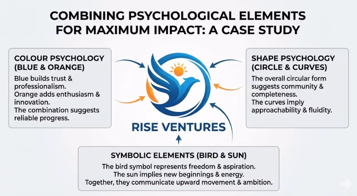
The most effective logos don't just use colour, shape, and symbol—they strategically combine these elements to create cohesive psychological messages that reinforce brand positioning.
Alignment between elements creates psychological coherence. A children's brand using soft curves, bright primary colours, and playful symbols sends a consistent message of fun and safety. A legal firm using navy blue, strong verticals, and classical typography communicates unified professionalism and authority. When elements contradict—playful colours with rigid geometry, for example—the logo creates cognitive dissonance that reduces effectiveness.
Contrast creates memorability within the consistent framework. The FedEx arrow hidden in negative space between letters creates a discovery moment that enhances recall. The Amazon smile connecting A to Z communicates comprehensive service with subtle cleverness. These thoughtful details reward attention and create talking points that amplify brand awareness.
Simplicity enables processing fluency. The human brain prefers patterns it can quickly process and categorize. Overly complex logos require more cognitive effort, reducing the likelihood of accurate recall. The most iconic logos—Apple, Nike, Shell—achieve maximum meaning with minimum elements. If you need to explain your logo, it's working too hard.
Scalability across applications represents a practical psychological consideration. Logos must maintain impact from massive billboards to tiny mobile icons. Details that enhance a design at large scale can create muddy confusion at small sizes, reducing recognition. Test your logo at the smallest size it will appear to ensure psychological impact survives reduction.
Timelessness versus trendiness presents a strategic tension. Following current design trends creates contemporary appeal but risks rapid dating. Truly effective logos transcend trends, using psychological principles that remain constant regardless of aesthetic fashions. The Coca-Cola script has remained essentially unchanged since 1887 because it taps into timeless associations rather than temporary aesthetics.
Common Logo Psychology Mistakes That Undermine Brand Effectiveness
Many Australian businesses sabotage their brand identities through predictable psychological missteps. The most common error is choosing colours based on personal preference rather than strategic psychology. Your favourite colour might be purple, but if you're launching a financial services firm targeting conservative investors, purple's creative and unconventional associations work against your positioning.
Another frequent mistake is following competitor conventions too closely. If every logo in your industry uses blue, adding another blue logo ensures you blend into the category rather than stand out. Strategic differentiation often means choosing the psychological opposite of category norms—think orange in a sea of blue, or curves in a field of angles.
Overly literal symbolism limits strategic flexibility and feels unsophisticated. The plumbing business using a wrench, the bakery with a wheat stalk, the tech company with a circuit board—these literal symbols fail to differentiate and can feel limiting as businesses evolve. More abstract approaches that suggest brand values rather than literal services create room for growth.
Complexity for complexity's sake reduces effectiveness. Gradients, shadows, fine details, and multiple colours might look impressive in a designer's portfolio but create reproduction challenges and processing difficulty. The test of a strong logo is whether it works in single colour, at small scale, and after a brief glance.
Ignoring negative space represents a missed opportunity. The area around and between logo elements can reinforce meaning, create hidden symbols, or improve visual balance. The FedEx arrow, the Toblerone bear, and the Baskin-Robbins "31" demonstrate how negative space creates memorable discovery moments.
Following trends over timeless principles guarantees your logo will feel dated quickly. Minimalist flat design, geometric animal heads, overlapping transparency effects—each trend creates a cohort of similar-looking logos that quickly feel stale. Psychological principles like colour associations and shape meanings remain constant while aesthetic trends cycle.
Testing Logo Psychology Before Launch
Before committing to a logo, test whether it creates the psychological responses you intend. Show logo options to target audience segments without context and ask what feelings, industries, or qualities the marks suggest. If your accounting firm's logo makes people think "creative agency" or your children's brand suggests "corporate professionalism," the psychology isn't aligned with positioning.
Conduct recognition tests by showing logos briefly and then testing recall. Which elements do people remember? Can they accurately redraw the basic composition? Logos with strong psychological foundations create clearer memory traces.
Test across applications and sizes. View your logo on business cards, websites, social media profiles, signage, and packaging mockups. Does it maintain impact? Does it remain recognizable? Psychological effectiveness requires technical robustness.
Evaluate competitive context by placing your logo alongside competitors. Does it stand out? Does it convey appropriate positioning? Does it feel like it belongs in the category while still differentiating? This competitive context test reveals whether your psychological approach creates strategic advantage.
Consider cultural testing if serving diverse markets. Show designs to representative samples from key demographic groups and note any unexpected associations or negative reactions. What seems neutral in one cultural context might carry unwanted meaning in another.
Frequently Asked Questions
How do you choose logo colours that appeal to both male and female Australian consumers without stereotyping or limiting your market reach?
Choosing gender-inclusive logo colours requires moving beyond outdated pink-for-women, blue-for-men stereotypes while acknowledging research showing some colour preference patterns across demographics. Studies from the University of Rochester found that colour preferences relate more to personal experiences and cultural associations than biological sex. Focus on colours that align with your brand values and psychological goals rather than gender targeting. Colours like green, purple, teal, and orange show relatively balanced appeal across genders. When your brand naturally skews toward one demographic, use colour psychology to reinforce your positioning rather than force artificial balance. If serving a predominantly female market for beauty products, leveraging purple or rose gold makes strategic sense. If targeting male-dominated tradies, navy or charcoal creates appropriate associations. The key is choosing colours based on psychological fit with your brand promise rather than simplistic gender assumptions. Test colour options with actual representatives of your target market rather than relying on generalizations. Many successful Australian brands like Bunnings (green/red), Telstra (blue), and Woolworths (green) achieve broad appeal through colours associated with universal values like reliability, growth, and friendliness rather than gender-specific targeting.
What psychological principles should Australian startups and small businesses prioritize when they cannot afford extensive logo design research and testing?
Resource-constrained businesses should focus on three high-impact psychological principles that deliver results without extensive research. First, prioritize colour psychology by choosing one or two colours that genuinely align with your core brand promise and avoid colours that contradict your positioning. A sustainability-focused business should embrace green or earth tones; a professional services firm should lean toward blue or charcoal. This singular decision drives up to 90% of immediate brand perception. Second, embrace simplicity over complexity. Logos with fewer elements process faster, reproduce more reliably, and cost less to apply across materials. Simple doesn't mean simplistic—the Nike swoosh and Apple mark prove that minimal can be powerful. Third, ensure your logo differentiates from direct competitors through shape, orientation, or colour choices. Study the five businesses you compete against most directly and deliberately choose a different psychological direction. If they all use circles, use angles. If they all use cool colours, use warm. This competitor contrast analysis costs nothing but dramatically improves recognition. Skip expensive focus groups and instead show logo options to 10 to 15 people from your actual target market—customers, prospects, or demographic matches. Ask what feelings and qualities the logo suggests. This informal testing reveals psychological alignment or misalignment without research budgets. Many successful Australian small businesses built strong brands with psychologically strategic logos created affordably by talented designers who understood these core principles.
How often should Australian businesses update their logos to stay relevant and do psychological principles change over time requiring redesigns?
Core psychological principles underlying effective logo design remain remarkably stable over time. Colour associations, shape meanings, and fundamental visual processing haven't changed significantly in decades, which explains why logos like Coca-Cola, Shell, and Qantas have maintained essentially the same psychological foundations for 50 to 100-plus years. The primary reasons to update logos are business evolution (mergers, repositioning, new markets), technical requirements (digital applications, new media), or aesthetic freshness (removing dated styling without changing psychological core). Most psychologically sound logos benefit from evolution rather than revolution. Commonwealth Bank has refined its yellow and black mark multiple times while maintaining the core psychological elements that drive recognition. Qantas has modernized its kangaroo periodically while preserving the symbolic meaning. Plan logo reviews every 7 to 10 years to assess whether aesthetic execution feels current, but resist changing core psychological elements (primary colour, basic shape, symbolic meaning) unless strategic positioning has fundamentally shifted. Minor refinements to improve digital reproduction, adjust proportions, or update typography often achieve freshness without sacrificing brand equity. Research from Siegel+Gale found that the most valuable brands maintain consistent visual identities over decades, making only subtle evolutionary changes. Australian businesses often update logos too frequently, chasing trends rather than building enduring psychological associations. Unless your business fundamentally changes, your psychologically strategic logo should evolve gradually rather than restart repeatedly.
Transform Visual Identity Into Strategic Advantage
Logo design psychology isn't about manipulation—it's about alignment. When your visual identity authentically reflects your brand values and strategically triggers the associations you want customers to make, you're creating honest communication that works with how human brains actually process information.
The difference between logos that build lasting brand equity and those that simply mark materials lies in psychological intentionality. Every colour, shape, and symbol in your logo either reinforces your strategic positioning or works against it.
Your logo appears on every touchpoint, creates thousands of impressions, and shapes how Australian consumers perceive and remember your business. Making those psychological principles work for rather than against you transforms your brand identity from decoration into strategic asset.
Ready to create a logo that leverages psychological principles to drive recognition, trust, and preference? Maven Marketing Co. specializes in strategic brand identity development grounded in design psychology and market research. Let's build a visual identity that resonates.

Table of contents
read more blogs

Handing the Keys to Google's AI: How to Keep Control of Your Ad Budget Inside Performance Max
Performance Max is Google's most automated campaign type, and also the one that provokes the most anxiety among Australian advertisers who have spent years developing campaign management practices that depend on visibility, control, and the ability to make deliberate, measurable changes. The anxiety has some basis. Performance Max does take more control away from the advertiser than any previous Google Ads campaign type: it chooses the placements, it selects the creative combinations, it determines the bid for each impression, and it distributes the budget across Google's inventory in ways the advertiser cannot directly specify. The part of the anxiety that is not well based is the conclusion that these constraints make Performance Max unmanageable or a blank cheque handed to Google's algorithm. Performance Max has a specific set of levers that, when correctly configured, give advertisers meaningful influence over where the budget goes, which audiences it targets, which creative assets it uses, and which conversion events it optimises toward. Understanding and using these levers is the difference between a Performance Max campaign that works within the advertiser's strategic parameters and one that wastes budget on inventory, audiences, and objectives that the business never intended to pursue.

When Customers Search on TikTok and Instagram Instead of Google — How Australian Brands Adapt
Something structurally significant has changed in how younger Australian consumers research purchases, and most Australian brands have not yet adjusted their discoverability strategy to reflect it. A proportion of the audience that would previously have opened Google to search for "best brunch spots Fitzroy" or "honest review Mecca skincare serum" is now opening TikTok or Instagram instead. They are searching within these platforms for short video content that shows them what they want to know: the actual food, the actual product, the actual experience, from people who have actually been there or used the item. This is not a marginal behaviour limited to a niche demographic. TikTok's own data has reported that a significant share of its users use the platform as a search engine, and the query patterns on Instagram's search function have expanded well beyond celebrity and hashtag discovery into product, venue, and service research. For Australian brands that have built their discoverability strategy entirely on Google organic search and Google Ads, this shift represents a gap that is growing over time as the audience that uses social platforms as primary discovery tools ages into demographics with higher purchasing power. This article covers what the shift to social search means practically, what content and account configuration signals these platforms use to surface results, and what Australian brands need to do differently to be found on TikTok and Instagram by people who are actively looking for what they offer.

How to Build a Google Business Profile That Converts Browsers Into Booked Appointments
A Google Business Profile that has been set up and left alone is doing roughly the same work as a shop front with the lights off. It confirms the business exists and provides the phone number, but it is not actively persuading a local searcher who is comparing three businesses in the search results to choose this one rather than the competitors sitting directly above and below it in the local pack. The businesses that win appointments from Google local search are not simply those that are closest to the searcher or those with the most reviews, although proximity and reviews both matter. They are the businesses that have treated their Google Business Profile as a conversion surface rather than a directory entry, and have populated every element of the profile with the specific information, imagery, and social proof that a local searcher needs to make a confident decision to book rather than keep browsing. The difference between a profile that ranks and converts and one that ranks but loses its potential customers to competitors is in the specific decisions this article covers: how to write the business description, which photos produce engagement, how to use posts to maintain freshness signals, how to respond to reviews in a way that builds rather than diminishes trust, and how to configure the booking and contact features that reduce friction between intent and appointment.


