.svg)
.svg)
.svg)


%201.svg)
Key Takeaways
- Lazy loading defers the downloading of images, videos, and embedded iframes until they are near or within the visible viewport, reducing initial page weight and improving time to interactive.
- The native HTML loading="lazy" attribute provides lazy loading at the browser level for images and iframes without any JavaScript dependency, and is supported by all major browsers in 2026.
- Lazy loading images below the fold typically reduces initial page weight by 30 to 60 percent on pages with rich content, with corresponding improvements to First Contentful Paint and Largest Contentful Paint.
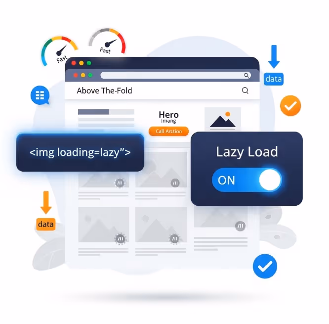
- Images in the initial viewport should never be lazy loaded. Applying lazy loading to images in the initial viewport is one of the most common implementation errors and directly worsens LCP scores.
- Video lazy loading requires a different approach from images, using the preload="none" attribute to prevent automatic buffering and a poster image to maintain visual presence before playback begins.
- Iframes including embedded maps, social media widgets, and third party forms carry significant loading overhead. Facade patterns that replace heavy iframes with lightweight placeholder images are the most effective approach for embeds that are not essential.
- Intersection Observer API-based lazy loading provides more precise control over load triggers than native lazy loading, but for most Australian websites the native approach is sufficient and preferred for its simplicity and reliability.
The Default Loading Problem
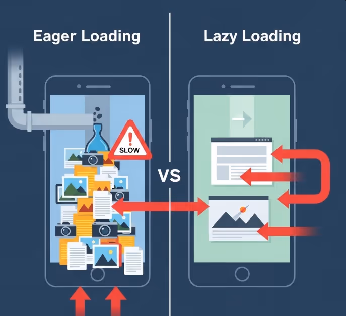
Browsers are eager by default. When a browser parses the HTML of a web page, it begins fetching every external resource it encounters as quickly as possible: stylesheets, scripts, fonts, images, and embedded content. This eagerness is generally a useful behaviour for resources the user needs immediately, but it becomes a significant performance problem for resources that are far below the visible area of the page.
Consider a standard Australian ecommerce category page. It might display sixty product thumbnails across multiple rows, a promotional banner, a set of embedded social proof widgets, and a map showing nearby stores at the bottom of the page. When a user arrives on that page, their browser fetches all sixty images, all the widget content, and the map data simultaneously, competing for bandwidth on whatever connection the user has available. The user may scroll past ten products before leaving, but the browser has already downloaded all sixty product images and everything else on the page.
The excess bandwidth consumed by this behaviour costs the user data, costs the business in CDN and server bandwidth, and most consequentially, slows the loading of the resources the user actually needs first. When a browser is simultaneously downloading sixty images, the ten that appear in the initial viewport must compete for bandwidth with the fifty the user cannot yet see. The result is a slower initial render and a poorer experience on the resources that matter most.
Lazy loading solves this by instructing the browser to skip resources outside the viewport during initial load and retrieve them only when the user is approaching them through scrolling. The initial page load delivers only the resources needed for the current view, and subsequent resources load progressively as they become needed.
Native Lazy Loading: The HTML Attribute Approach
The simplest and most robust lazy loading implementation for images and iframes uses the loading attribute introduced natively in HTML. The attribute accepts two values: lazy and eager. Adding loading="lazy" to an image or iframe element tells the browser to defer loading that resource until it is near the viewport. No JavaScript is required.
html
<img src="product-image.jpg" alt="Product name" width="600" height="400" loading="lazy">
html
<iframe src="https://www.google.com/maps/embed?..." loading="lazy" width="600" height="450"></iframe>
Browser support for the loading attribute is comprehensive in 2026. Chrome has supported it since version 76 (2019). Firefox since version 75 (2020). Safari since version 15.4 (2022). Edge supports it throughout its modern history. The remaining gap in support is limited to older browser versions with a collectively negligible share of Australian web traffic.
The width and height attributes on the img element serve a critical function alongside lazy loading. When the browser defers loading an image, it still needs to reserve the correct amount of space in the page layout for that image, so that the page does not shift when the image eventually loads. Without explicit width and height attributes, the browser cannot reserve the correct space and the page will shift as lazy-loaded images load in, generating Cumulative Layout Shift and worsening the CLS score within Core Web Vitals. Including width and height on every lazily loaded image is not optional if CLS performance is a concern, and for most Australian commercial websites it should be.
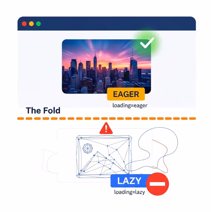
The Critical Mistake: Lazy Loading Above-the-Fold Content
The most damaging implementation error in lazy loading projects is applying loading="lazy" to images that appear within the initial viewport. This error is more common than it should be, often occurring when developers apply lazy loading globally to all images on a page as a blanket optimisation without distinguishing between images that are immediately visible and those that are not.
When a browser encounters an image with loading="lazy" that is in the initial viewport, it still loads it, but with a slight delay compared to a standard eager image. The browser must first determine the image's position relative to the viewport before deciding whether to load it, and this assessment introduces a small but measurable delay in the loading of images in the initial viewport. For images that form part of the Largest Contentful Paint element on a page, this delay directly worsens the LCP score.
The correct approach is to apply loading="lazy" only to images that are reliably below the fold on all target device sizes. Images in the hero area, the navigation, the first content section, and anywhere else visible without scrolling should use loading="eager" (or simply omit the loading attribute, since eager is the browser default). Only images in the second screen and below should receive loading="lazy".
For Australian websites using a CMS or ecommerce platform where image attributes are set programmatically, this distinction may require custom logic to identify which images are likely to appear above the fold and exclude them from the lazy loading rule. The effort is worthwhile: applying lazy loading incorrectly to images in the initial viewport while trying to improve performance can actually worsen the Core Web Vitals metrics the implementation is intended to help.
Video Lazy Loading
Video elements require a different approach from images because the loading attribute does not apply to the HTML video element in the same way it does to images and iframes. Instead, video lazy loading is managed through the preload attribute and the behaviour of the video element in combination with JavaScript visibility detection.
The preload attribute on a video element controls how much of the video the browser fetches before the user initiates playback. Setting preload="none" tells the browser not to download any video data until the user explicitly requests it. This is the recommended starting point for any video that is not immediately visible and not essential for the initial user experience.
html
<video preload="none" poster="video-thumbnail.jpg" controls>
  <source src="product-demo.mp4" type="video/mp4">
</video>
The poster attribute serves both a user experience and a performance function. It provides a static image displayed in place of the video before playback begins, maintaining visual presence without requiring the video data to be loaded. For Australian websites serving product demonstration videos, brand videos, or testimonial content, a carefully chosen poster image keeps the page visually complete while the video data remains unloaded until needed.
For videos that should begin loading when the user scrolls near them, rather than only when they click play, the Intersection Observer API provides the mechanism. When the video element enters the defined intersection threshold, a JavaScript callback can update the src attribute and trigger loading. This pattern is more complex to implement than the native image loading attribute but provides the closest equivalent of lazy loading for video content.
Autoplay videos present specific performance considerations. Videos set to autoplay must preload enough data to begin playing immediately when they enter the viewport, which conflicts with a strict lazy loading approach. For Australian websites using autoplay background videos, the recommended approach is to load a lightweight compressed version of the video and accept some preloading overhead rather than attempting to defer loading entirely.
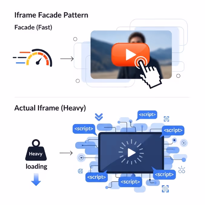
Iframe Facades: The Most Effective Approach for Heavy Embeds
Standard iframes for Google Maps, YouTube videos, social media posts, and third party forms often carry a substantial loading overhead that goes well beyond the iframe element itself. A single embedded YouTube video, for example, loads multiple external JavaScript files, stylesheets, and tracking pixels as part of the embed, adding hundreds of kilobytes and multiple additional HTTP requests to the page. A Google Maps embed similarly triggers a cascade of resource requests that can add one to two seconds to page load times on mobile connections.
The facade pattern addresses this more aggressively than simple lazy loading. Rather than deferring an iframe until it is near the viewport, a facade replaces the iframe entirely with a static image that looks identical to the loaded version of the embed. The actual iframe is only loaded when the user interacts with the facade by clicking or tapping on it.
For YouTube embeds, the facade pattern typically uses the YouTube thumbnail image as the placeholder, with a play button overlay rendered in CSS. When the user clicks the thumbnail, JavaScript replaces the facade with the actual YouTube iframe. The user receives the same experience they would from the standard embed, but the page loads without any of YouTube's JavaScript, stylesheets, or tracking until the user demonstrates intent to watch the video.
Google's web.dev guidance on third party facades documents this pattern in detail, including specific implementations for YouTube, Google Maps, and several other commonly embedded services, and is the recommended starting point for Australian developers implementing facade patterns for the first time.
The performance gains from replacing autoloading iframes with facades are among the most dramatic available for pages that use embedded content. PageSpeed Insights specifically recommends facade patterns for YouTube embeds and other heavy third party content, and the estimated time savings shown in its audit reports are typically among the largest on the page for sites that have not yet implemented them.
Intersection Observer API: When You Need More Control
Native lazy loading with the loading attribute works well for the majority of Australian website use cases. For situations requiring more precise control over when loading triggers, or for implementing lazy loading on resource types not covered by the native attribute, the Intersection Observer API provides a solution using the JavaScript API.
The Intersection Observer API allows a script to observe one or more elements and receive a callback when those elements enter or exit a specified intersection threshold relative to the viewport or a containing element. The threshold determines how far into the viewport the element must travel before the callback fires, expressed as a proportion of the element's height. A threshold of 0.1 means the callback fires when ten percent of the element is visible. A threshold of 0 means the callback fires the moment any part of the element enters the viewport.
For lazy loading images, the typical pattern involves rendering img elements with a data-src attribute instead of a standard src attribute, preventing the browser from loading the image on parse. The Intersection Observer watches these images and swaps the data-src value into the src attribute when the element approaches the viewport, triggering the load at that point.
This pattern is more complex to implement and maintain than the native loading attribute approach and should only be chosen when the native attribute is genuinely insufficient for the use case. Common reasons include the need for custom load distance thresholds, integration with specific animation or transition effects triggered on element entry, or lazy loading of custom elements not natively supported by the loading attribute.
For Australian web development teams evaluating whether to use the native attribute or Intersection Observer, the practical recommendation is to start with the native attribute and only introduce Intersection Observer where specific requirements cannot be met natively.
Platform Implementation: WordPress, Shopify, and Beyond
For Australian websites on managed platforms, lazy loading implementation follows paths specific to each platform rather than direct HTML attribute management.
WordPress. WordPress has supported native lazy loading for images since version 5.5, automatically adding loading="lazy" to images inserted through the media library and the block editor. The implementation includes logic to exclude the first image on a page from lazy loading, addressing the concern about the initial viewport for hero images in standard WordPress layouts. For WordPress sites with images injected at the theme level or generated through plugins that fall outside the block editor, additional configuration or a dedicated plugin such as Smush or ShortPixel may be needed to extend lazy loading coverage.
Shopify. Shopify's themes include lazy loading for product images in collection and product page templates as a standard feature in recent theme versions. Merchants on older themes or using theme code built from scratch should audit whether lazy loading is active and correctly applied. The Shopify PageSpeed report in the admin interface flags missing lazy loading as a performance issue when it is detected, making it straightforward to identify gaps.
Squarespace and Wix. Both platforms implement lazy loading through their own rendering infrastructure for standard content blocks. The primary consideration for sites on these platforms is ensuring that any custom code blocks or embedded content, particularly third party iframes, are handled with appropriate loading deferrals where the platform's native handling does not cover them.
Testing the Implementation
Validating that lazy loading is working correctly requires testing that goes beyond simply checking whether the loading attribute is present in the HTML.
Chrome DevTools provides the most direct testing environment. Opening the Network tab, reloading the page, and observing which images are fetched during the initial load shows whether lazy loading is deferring images below the fold as expected. Images with loading="lazy" should not appear in the network waterfall until the user scrolls toward them.
PageSpeed Insights and Lighthouse both audit lazy loading implementation and will flag issues including images that should be lazy loaded but are not, and critically, will also flag images in the initial viewport that have been incorrectly marked as lazy. The defer offscreen images audit in Lighthouse estimates the potential savings from lazy loading images that are currently loading eagerly below the fold.
Google's web.dev documentation on browser-level image lazy loading provides implementation guidance and testing methodology that is directly applicable to Australian website implementations, and should be referenced alongside any active lazy loading project to ensure the implementation aligns with current best practice.
WebPageTest's filmstrip view provides a visual rendering frame by frame sequence that makes it straightforward to identify whether content in the initial viewport is rendering at the expected time and whether any lazily loaded resources are interfering with initial render performance.
FAQs
Does lazy loading affect SEO for Australian websites?Google's crawlers support lazy loading and have done so for several years. Googlebot uses a rendering engine based on Chromium and processes lazily loaded images in the same way a modern browser would, scrolling through the page during indexing and triggering lazy loaded resources. For standard native lazy loading implementations, there is no SEO penalty. The important caveat is that images used as the primary content signal for a page, particularly those that carry context Googlebot needs to understand the page topic, should be reliably discoverable by the crawler. If lazy loading is implemented in a way that prevents images from loading during Googlebot's rendering pass, those images may not be indexed. Native HTML lazy loading does not have this problem. Custom JavaScript dependent lazy loading implementations should be tested with Google's URL Inspection tool to confirm that images are loading correctly during crawling.
How much of a performance improvement should Australian websites expect from implementing lazy loading?The improvement depends heavily on how many resources below the fold the page currently loads eagerly and how large those resources are. For pages with rich content such as blog posts with multiple inline images, ecommerce category pages, and portfolio pages, initial page weight reductions of 30 to 60 percent are commonly achieved, with corresponding reductions in data transfer and improvements in time to interactive. For pages with minimal media content below the fold, the improvement will be smaller. The most reliable way to estimate the potential gain before implementation is to run a Lighthouse audit and review the defer offscreen images opportunity, which estimates the total bytes that could be saved from deferring currently eager-loaded images below the fold.
Should lazy loading be applied to all images on every page, or only certain page types?The highest return applications of lazy loading are on pages with the most image content below the fold: product category pages, blog index pages, portfolio and gallery pages, and article pages with long form content with many inline images. Pages with minimal media content below the fold gain relatively little from lazy loading and the implementation effort is correspondingly less worthwhile. For Australian websites using a CMS where lazy loading can be enabled globally with a single configuration change, enabling it globally and then ensuring images in the initial viewport are correctly excluded is the recommended approach. For sites where each page type requires individual configuration, prioritising the most page templates with the most images first produces the best return on implementation effort.
Load Less, Load Faster
Every resource a browser does not need to load immediately is a resource that is not competing for bandwidth with the content the user can actually see. Lazy loading is not a trick or a workaround. It is a correction to a browser default that makes no distinction between what is visible and what is not, and applying it correctly is one of the most straightforward improvements available to Australian websites looking to meaningfully improve their Core Web Vitals scores and user experience.
Maven Marketing Co helps Australian businesses audit their web performance and implement the technical improvements that translate into measurable gains in rankings, load times, and conversion rates.
Talk to the team at Maven Marketing Co →

Table of contents
read more blogs

Handing the Keys to Google's AI: How to Keep Control of Your Ad Budget Inside Performance Max
Performance Max is Google's most automated campaign type, and also the one that provokes the most anxiety among Australian advertisers who have spent years developing campaign management practices that depend on visibility, control, and the ability to make deliberate, measurable changes. The anxiety has some basis. Performance Max does take more control away from the advertiser than any previous Google Ads campaign type: it chooses the placements, it selects the creative combinations, it determines the bid for each impression, and it distributes the budget across Google's inventory in ways the advertiser cannot directly specify. The part of the anxiety that is not well based is the conclusion that these constraints make Performance Max unmanageable or a blank cheque handed to Google's algorithm. Performance Max has a specific set of levers that, when correctly configured, give advertisers meaningful influence over where the budget goes, which audiences it targets, which creative assets it uses, and which conversion events it optimises toward. Understanding and using these levers is the difference between a Performance Max campaign that works within the advertiser's strategic parameters and one that wastes budget on inventory, audiences, and objectives that the business never intended to pursue.

When Customers Search on TikTok and Instagram Instead of Google — How Australian Brands Adapt
Something structurally significant has changed in how younger Australian consumers research purchases, and most Australian brands have not yet adjusted their discoverability strategy to reflect it. A proportion of the audience that would previously have opened Google to search for "best brunch spots Fitzroy" or "honest review Mecca skincare serum" is now opening TikTok or Instagram instead. They are searching within these platforms for short video content that shows them what they want to know: the actual food, the actual product, the actual experience, from people who have actually been there or used the item. This is not a marginal behaviour limited to a niche demographic. TikTok's own data has reported that a significant share of its users use the platform as a search engine, and the query patterns on Instagram's search function have expanded well beyond celebrity and hashtag discovery into product, venue, and service research. For Australian brands that have built their discoverability strategy entirely on Google organic search and Google Ads, this shift represents a gap that is growing over time as the audience that uses social platforms as primary discovery tools ages into demographics with higher purchasing power. This article covers what the shift to social search means practically, what content and account configuration signals these platforms use to surface results, and what Australian brands need to do differently to be found on TikTok and Instagram by people who are actively looking for what they offer.

How to Build a Google Business Profile That Converts Browsers Into Booked Appointments
A Google Business Profile that has been set up and left alone is doing roughly the same work as a shop front with the lights off. It confirms the business exists and provides the phone number, but it is not actively persuading a local searcher who is comparing three businesses in the search results to choose this one rather than the competitors sitting directly above and below it in the local pack. The businesses that win appointments from Google local search are not simply those that are closest to the searcher or those with the most reviews, although proximity and reviews both matter. They are the businesses that have treated their Google Business Profile as a conversion surface rather than a directory entry, and have populated every element of the profile with the specific information, imagery, and social proof that a local searcher needs to make a confident decision to book rather than keep browsing. The difference between a profile that ranks and converts and one that ranks but loses its potential customers to competitors is in the specific decisions this article covers: how to write the business description, which photos produce engagement, how to use posts to maintain freshness signals, how to respond to reviews in a way that builds rather than diminishes trust, and how to configure the booking and contact features that reduce friction between intent and appointment.


