.svg)
.svg)
.svg)


%201.svg)
Key Takeaways
- Effective infographic design starts with a clear narrative structure that guides viewers through information logically, using visual hierarchy to emphasize key messages and maintain attention from headline through conclusion
- Colour psychology and strategic palette selection enhance comprehension and engagement, with contrasting colours highlighting important data points, complementary schemes creating visual harmony, and consistent colour coding improving information retention
- Typography hierarchy establishes clear information levels through font size, weight, and style variations, ensuring headlines capture attention, subheadings organize content, and body text remains readable at various sizes and distances
- Data visualization choices must match information types, with bar charts comparing quantities, line graphs showing trends over time, pie charts illustrating proportions, and custom illustrations making abstract concepts tangible and memorable
- Successful infographics balance information density with white space, avoiding clutter while providing sufficient detail, and optimize for specific distribution channels including social media dimensions, website layouts, and print applications
Scroll through your LinkedIn feed and you'll notice something. Text-heavy posts get polite scrolls. Video content earns brief glances. But well-designed infographics stop thumbs mid-scroll. They get saved, shared, and referenced in ways that other content formats simply don't achieve.
The human brain processes visual information 60,000 times faster than text. We retain 65% of visual information three days later, compared to just 10% of information we hear. These aren't trivial statistics for Australian businesses competing for attention in saturated digital markets.
Yet most infographics fail. They cram spreadsheet data into colourful charts without narrative structure. They use seventeen different fonts in clashing colours. They prioritize decoration over communication, leaving viewers confused about what they're supposed to learn or do.
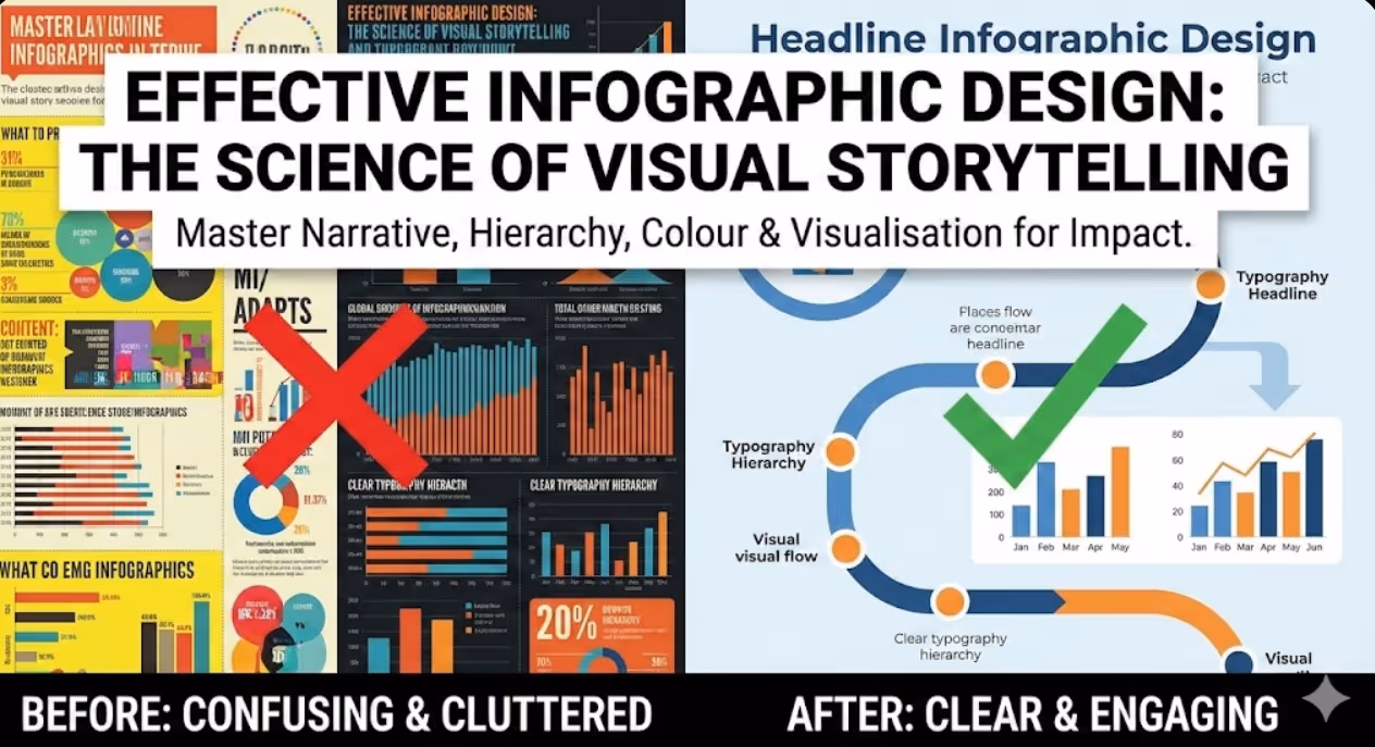
The infographics that actually drive engagement follow specific design principles rooted in visual perception psychology and information design theory. These aren't subjective aesthetic preferences—they're proven frameworks that determine whether your audience understands, remembers, and acts on your message.
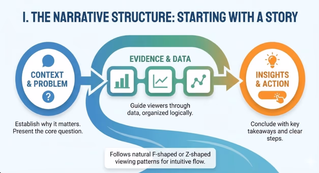
Starting With Story: Why Narrative Structure Matters More Than Visual Polish
Before touching design software, exceptional infographics begin with clear narrative architecture. What story does your data tell? What's the single most important insight you want viewers to remember? What action should they take after viewing?
Research from the Nielsen Norman Group demonstrates that users follow predictable viewing patterns, typically scanning content in F-shaped or Z-shaped patterns. Strategic infographic design leverages these natural eye movements, placing critical information where attention naturally flows.
Your infographic narrative should follow a logical progression. Start with context that establishes why the information matters. Present the problem or question your data addresses. Guide viewers through evidence, organized from most to least important or following a chronological sequence. Conclude with insights, implications, or clear calls to action.
Think of your infographic as a visual elevator pitch. Within seconds, viewers should grasp the topic, understand why it matters to them, and recognize the key takeaway. If you can't articulate your infographic's core message in a single sentence, your narrative structure needs refinement before visual design begins.
The most shareable infographics tell stories that resonate emotionally while informing intellectually. Compare "Australian Housing Price Data 2024" to "Why First Home Buyers Need $150,000 More Than Five Years Ago." Both could present identical statistics, but the second frames data within a narrative that creates emotional connection and perceived relevance.
Establishing Visual Hierarchy: Guiding the Eye Through Information
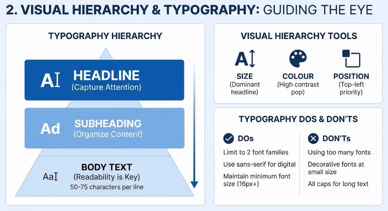
Visual hierarchy determines what viewers notice first, second, and third. Without clear hierarchy, every element competes for attention equally, creating cognitive overload that causes viewers to simply move on.
Size represents the most powerful hierarchy tool. Your headline should dominate, immediately communicating topic and drawing viewers in. Primary data points or key statistics deserve prominent sizing that reflects their importance. Supporting details and context can appear smaller, available for interested viewers without overwhelming the casual scroller.
Colour creates hierarchy through contrast and saturation. High-contrast elements attract attention first. If your background is white, dark bold text commands focus. Bright, saturated colours pop against muted backgrounds, directing eyes to specific data points or insights. Use colour strategically to highlight what matters most, not decoratively across every element.
Position influences perceived importance. Western readers scan left to right, top to bottom, giving upper-left positioning natural priority. Place your most critical message where eyes land first. Use the natural flow to guide viewers through your narrative sequence logically.
Typography weight and style create hierarchy within text elements. Bold, heavy fonts signal importance. Light weights recede visually, appropriate for supporting details. ALL CAPS draws attention but fatigues readers quickly—use sparingly for short headlines or labels. Italic and oblique styles work for emphasis or attribution but become difficult to read in large quantities.
White space acts as hierarchy through absence. Generous spacing around important elements makes them stand out. Crowded, cluttered areas signal less importance. Strategic emptiness draws focus and provides visual rest points that prevent overwhelming complexity.
Colour Theory for Information Design: Psychology Meets Practicality
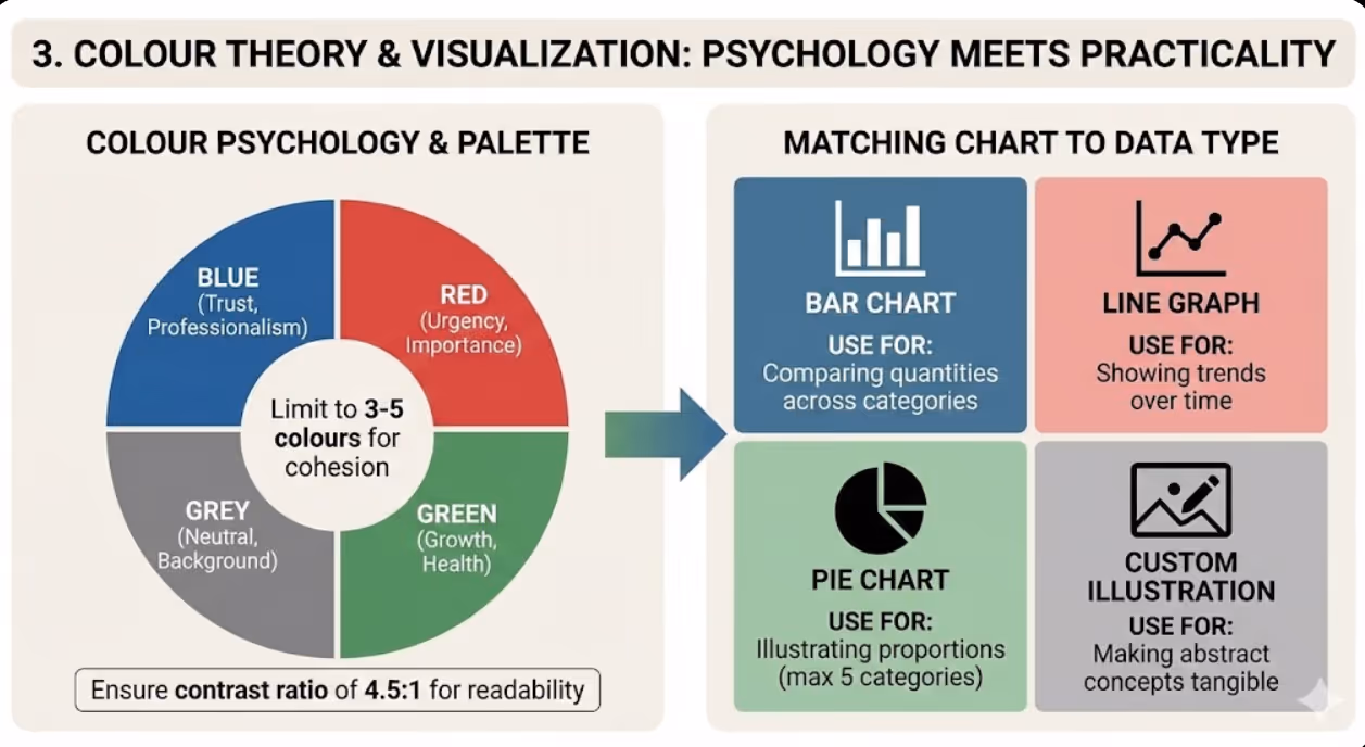
Colour in infographics serves three distinct functions: attracting attention, conveying meaning, and improving comprehension. Strategic colour selection requires balancing all three purposes.
Limit your palette to three to five colours maximum. This constraint forces intentionality, reduces visual noise, and creates cohesive design. One dominant colour establishes brand identity or thematic consistency. One or two accent colours highlight key data or create visual interest. Neutral colours (greys, off-whites) provide backgrounds and supporting elements without competing for attention.
Research from the University of Winnipeg found that colour increases brand recognition by up to 80%. For Australian businesses, consistent colour usage across infographics and other brand materials reinforces identity and improves recall. If your brand palette includes specific colours, incorporate them as primary or accent choices.
Ensure sufficient contrast between text and background. The Web Content Accessibility Guidelines recommend a contrast ratio of at least 4.5:1 for normal text and 3:1 for large text. Poor contrast makes infographics difficult to read, particularly on mobile devices or when shared as compressed images on social platforms.
Consider colour associations and cultural meanings. Red suggests urgency, danger, or importance in Western contexts—effective for highlighting concerning statistics or critical calls to action. Blue conveys trust and professionalism, appropriate for financial or healthcare data. Green implies growth, health, or environmental themes. Be mindful that approximately 8% of men and 0.5% of women have some form of colour vision deficiency. Avoid relying solely on red-green distinctions to convey meaning.
Use colour consistently to aid comprehension. If blue represents one category in a chart, it should represent that same category throughout your infographic. Inconsistent colour coding forces viewers to relearn meanings repeatedly, increasing cognitive load and reducing understanding.
Typography That Works: Readability Over Decoration
Font choices dramatically impact whether people actually read your infographic or just glance at pretty colours. Typography decisions should prioritize legibility and hierarchy over aesthetic novelty.
Limit yourself to two font families maximum—one for headlines and one for body text. Using more creates visual chaos that distracts from content. Many effective infographics use a single versatile font family, creating hierarchy through size, weight, and style variations rather than switching typefaces.
Choose fonts appropriate for digital distribution. Decorative, overly stylized fonts become illegible when infographics are compressed for social media or viewed on small screens. Sans-serif fonts (like Arial, Helvetica, or Open Sans) typically render more clearly than serif fonts at small sizes in digital contexts. However, readable serif fonts can add sophistication for print-focused infographics or large-scale applications.
Maintain minimum font sizes that remain legible across platforms. For social media infographics, nothing should be smaller than 16-18 pixels. Remember that your beautifully detailed infographic might be viewed as a tiny Instagram thumbnail—if key text disappears at that scale, simplify or enlarge.
Mind your line length and spacing. Optimal reading comfort occurs with 50-75 characters per line. Shorter lines suit narrow infographic columns. Longer lines benefit from increased line spacing (leading) to prevent eyes from losing their place. Line spacing of 120-150% of font size typically enhances readability.
Use alignment deliberately. Left-aligned text is easiest to read for Western audiences. Centred text works for headlines and short elements but becomes difficult for longer passages. Right-aligned and justified text rarely suit infographic contexts. Consistent alignment creates cleaner, more professional appearance.
Choosing the Right Visualization: Matching Chart Type to Data Type
Not all data visualizations are created equal. The wrong chart type obscures meaning and frustrates viewers. The right choice makes insights instantly obvious.
Bar charts compare quantities across categories. Use them when showing differences between distinct groups or items. Horizontal bars work better than vertical when category labels are long or when comparing many items. Bar charts excel at making size differences visually obvious—longer bars clearly represent larger quantities.
Line graphs reveal trends over time. The continuous line emphasizes progression and change, making patterns and trajectories visible. Multiple lines on one graph enable comparison of different trend lines, but limit to three or four to prevent confusion. Line graphs work poorly for discrete categories without logical sequence.
Pie charts show parts of a whole, but use them sparingly. The human eye struggles to accurately compare angle sizes, making subtle differences between slices difficult to perceive. Limit pie charts to situations where you have five or fewer categories and where showing proportion of a total is specifically meaningful. According to data visualization research, bar charts almost always communicate the same information more effectively than pie charts.
Area charts function like line graphs but emphasize volume or magnitude of change. Stacked area charts show multiple data series comprising a total, revealing both individual trends and cumulative totals. However, stacked area charts make it difficult to compare non-baseline series, as upper layers don't share a common reference line.
Scatter plots reveal correlations and relationships between two variables. Each point represents an observation, with position determined by values on X and Y axes. Clusters, outliers, and correlation patterns become visually apparent. Scatter plots suit audience comfortable with data interpretation but can overwhelm general audiences.
Custom illustrations and icons make abstract concepts tangible. Instead of showing "30% increase in coffee consumption" as numbers, show three coffee cups with one highlighted. Pictorial representations aid memory and make statistics more relatable. However, ensure illustrations accurately represent quantities—using images of different sizes to show proportions requires careful execution to avoid misleading viewers.
Layout Principles: Creating Flow and Preventing Cognitive Overload
Effective layout guides viewers through information logically while maintaining visual interest. Poor layout creates confusion about where to look next and what matters most.
Grid systems provide underlying structure that creates alignment, proportion, and visual harmony. Divide your infographic into columns (typically 3, 4, or 6) and use grid lines to position elements. Alignment to grid creates organized appearance even when varying element sizes and types. Don't be enslaved to the grid—intentional breaks create emphasis and interest—but use it as your default organizing principle.
Information chunking prevents overwhelming viewers with data density. Group related information into distinct sections separated by white space, colour blocks, or visual dividers. Each chunk should feel digestible on its own. The human brain comfortably processes three to five chunks of information simultaneously. Exceeding this capacity creates cognitive strain that reduces comprehension and retention.
The rule of thirds applies to infographic composition as it does to photography. Position key elements at intersection points of imaginary lines dividing your canvas into horizontal and vertical thirds. These positions naturally draw the eye and create balanced, dynamic composition.
Z-pattern and F-pattern layouts align with natural viewing behaviour. For vertical scrolling infographics, Z-pattern (top left, across to top right, diagonal to bottom left, across to bottom right) guides viewers through content logically. F-pattern (across top, down left side with occasional rightward movement) suits text-heavy infographics where viewers scan for relevant sections.
Directional cues guide attention through your narrative. Arrows, lines, and pointed shapes direct eyes from one element to the next. Human and animal images naturally draw attention to faces and especially eyes—position these elements looking toward content you want emphasized. Curved lines and flowing shapes create movement and suggest progression through your story.
White space isn't wasted space—it's a design element providing visual breathing room. Generous margins frame content. Space between sections signals topic shifts. Emptiness around important statistics makes them stand out. Cluttered infographics signal desperation to include everything, while confident use of white space suggests thoughtful curation of what matters most.
Common Infographic Design Mistakes That Kill Engagement
Learning what not to do accelerates your path to effective infographic design. These mistakes appear repeatedly in failed infographics across Australian businesses.
Information overload tops the list. Trying to cram every data point into one infographic creates overwhelming complexity. Effective infographics are ruthlessly selective, presenting only information essential to the core narrative. If your infographic requires extensive study to understand, you've defeated the purpose of visual communication. Consider creating a series of focused infographics rather than one comprehensive mess.
Misleading visualizations damage credibility even when unintentional. Truncated Y-axes exaggerate differences. Inconsistent scales prevent accurate comparison. Three-dimensional charts distort perception of size. Area-based visualizations using height or width alone create squared distortion. Always ensure your visualizations represent data accurately and fairly.
Decorative elements without purpose waste attention and space. Every visual element should serve communication goals—reinforcing narrative, aiding comprehension, or guiding viewers through information. Clip art, decorative borders, or random illustrations that don't connect to content dilute your message and look unprofessional.
Poor source citation undermines trust. Australian audiences increasingly scrutinize data sources amid misinformation concerns. Include clear source attribution for all data, placed prominently enough to find easily but not so large as to dominate design. Linking to sources in digital infographics enables verification and increases credibility.
Ignoring mobile optimization limits reach. Over 60% of social media usage happens on mobile devices. Infographics designed exclusively for desktop viewing become illegible on smartphones. Test your infographics on mobile screens and adjust text sizes, element spacing, and overall dimensions accordingly. Consider creating mobile-specific versions for critical campaigns.
Inconsistent branding represents missed opportunities. Infographics should reinforce brand identity through consistent use of brand colours, fonts, and logo placement. However, branding should enhance rather than dominate—your logo doesn't need to be the largest element, and every colour in your brand palette doesn't require inclusion.
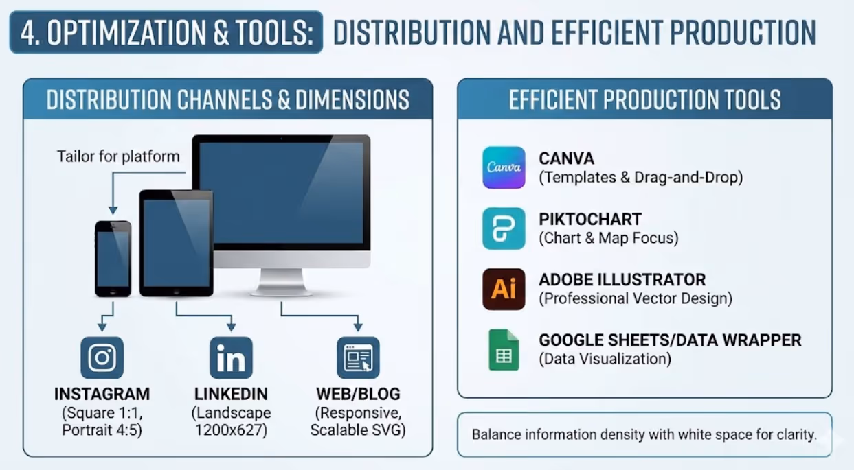
Optimizing Infographics for Different Distribution Channels
Where your infographic appears determines ideal dimensions, file formats, and design considerations. Optimization for distribution channels dramatically impacts engagement rates.
Social media platforms each have preferred dimensions. Instagram feed posts work best at 1080x1080 pixels (square) or 1080x1350 pixels (portrait). Instagram Stories require 1080x1920 pixels (9:16 ratio). LinkedIn posts favour 1200x627 pixels. Pinterest thrives on tall formats—1000x1500 pixels or 1000x2000 pixels. Twitter supports 1024x512 pixels optimally. Design for your primary distribution channel first, then adapt for secondary platforms.
Blog and website embedding benefits from responsive design that adapts to screen sizes. Save infographics as SVG files when possible for infinite scalability without quality loss. If using raster formats like PNG or JPEG, create versions at least 1500-2000 pixels wide to maintain quality on high-resolution displays. Consider breaking complex infographics into sections that load progressively on web pages.
Email marketing demands special consideration. Many email clients block images by default, requiring alternative text descriptions. Keep file sizes under 1MB to prevent slow loading or blocking. Design with narrow widths (600-800 pixels) appropriate for email column constraints. Front-load key messages that remain visible even if recipients don't scroll.
Print applications require high resolution—300 DPI minimum. Convert to CMYK colour mode rather than RGB to ensure colour accuracy in printing. Account for bleed areas and safe zones if infographics will be trimmed. Consider paper quality and finish when selecting colours and design elements—glossy stock enhances vibrant colours while matte finish suits softer palettes.
Presentation slides work best with landscape orientation and simple, bold elements readable from distance. Avoid tiny text that disappears when projected. Use high contrast to ensure visibility in varied lighting conditions. Consider whether infographics will be animated in presentation software or displayed statically.
Tools and Workflows for Efficient Infographic Production
Professional infographic creation doesn't require expensive software or design expertise, though both help. Modern tools democratize infographic design while maintaining quality standards.
Canva offers Australian users extensive infographic templates, drag-and-drop simplicity, and brand kit functionality for consistent design. Its library of icons, images, and charts suits most business needs. Free and paid tiers both deliver professional results, with Pro version unlocking additional templates and features. Canva's collaboration features enable team input and approval workflows.
Piktochart specializes specifically in infographic creation with templates organized by purpose and industry. Its chart and map tools integrate data easily. The platform emphasizes customization while providing structural frameworks that prevent common design mistakes. Particularly strong for data-heavy business infographics.
Adobe Illustrator remains the professional standard for custom infographic design. Vector-based workflow ensures infinite scalability. Complete design control allows precise execution of unique visions. However, steep learning curve and subscription cost make it less accessible for occasional infographic creators. Worth investment for businesses producing infographics regularly or requiring maximum customization.
Venngage targets business users with templates designed around common business communication needs—proposals, reports, presentations. Strong data visualization tools simplify chart creation. Collaboration and brand management features suit team environments. Australian businesses appreciate the business-focused template library.
Visme combines infographic design with presentation and document creation. Animated infographic capabilities suit digital distribution. Extensive asset libraries and brand management tools support consistent output. Interactive infographic features enable click-through experiences beyond static images.
Google Sheets and Data Wrapper excel at turning spreadsheet data into clean, accurate charts and visualizations. While not full infographic platforms, they create publication-ready data visualizations you can incorporate into designs built elsewhere. Free and accessible, with collaborative spreadsheet functionality familiar to most business users.
Frequently Asked Questions
What infographic dimensions and formats work best for Australian business audiences across LinkedIn, Instagram, and company websites simultaneously?
Creating infographics that perform well across multiple channels requires strategic planning and often platform-specific versions. For maximum versatility, start with a portrait orientation at 1200x1800 pixels or similar 2:3 ratio. This format works reasonably well on Instagram (can be cropped to 4:5), appears professional on LinkedIn (though slightly tall), and embeds nicely in website blog posts. However, for optimal performance on each platform, consider creating adapted versions rather than forcing one size everywhere. Design your master infographic at high resolution (at least 2400x3600 pixels), then create platform-specific exports: 1080x1350 pixels for Instagram feed, 1200x627 pixels for LinkedIn, and 1500-2000 pixel width for website embedding. The content hierarchy should remain consistent across versions, but element sizing and spacing can adjust for each format. According to Venngage research, infographics optimized for specific platforms receive 3x more engagement than generic one-size-fits-all versions. For maximum efficiency, design with a flexible grid system that allows rearrangement without complete redesign. Save source files in layers so you can quickly adjust layouts for different aspect ratios. Australian businesses often underestimate the value of platform optimization, but creating two or three targeted versions of important infographics significantly improves performance across channels without proportionally increasing workload.
How can small Australian businesses create professional infographics without hiring designers or learning complex software like Adobe Illustrator?
Small businesses can produce high-quality infographics using accessible tools and following structured processes. Start with Canva (free or Pro version at minimal cost), which offers thousands of professionally designed infographic templates specifically created for various industries and purposes. Choose a template aligned with your content type and customize it with your data, colours (use your brand palette), and content. The drag-and-drop interface requires no design training. Focus on three key principles: maintain visual hierarchy (make important information larger and more prominent), use consistent colours (limit to your brand colours plus one accent), and preserve white space (delete template elements rather than filling every space). For data visualizations, use Canva's built-in chart tools or create simple charts in Google Sheets and import them as images. Alternatively, Piktochart offers a free tier with strong templates and simple editing specifically for infographics. For even simpler needs, Microsoft PowerPoint surprisingly creates decent infographics using slide layouts, SmartArt, and basic shapes—skills most business users already possess. The key is working within templates and frameworks rather than designing from scratch. Customize templates through colour changes, font adjustments, and content replacement rather than structural redesign. Many successful Australian small business infographics come from well-customized templates that maintain professional design structure while reflecting brand identity through colour and content. Invest time in content planning and data accuracy rather than trying to master design software. When infographics become central to your marketing strategy and you're creating them regularly, consider hiring a designer to create 3-5 custom templates specific to your brand. You can then customize these templates repeatedly for different content, maintaining professional appearance without ongoing design costs.
What data visualization mistakes do Australian businesses make most frequently in infographics and how can they be avoided?
The most common Australian business infographic mistakes relate to chart selection and data representation accuracy. Businesses frequently use pie charts when bar charts would communicate more effectively. Pie charts only work well for showing parts of a whole with 5 or fewer categories—yet businesses routinely create 8-slice pies where size differences become imperceptible. Replace most pie charts with horizontal bar charts that make comparisons obvious. Another frequent mistake involves truncated axes that exaggerate differences. Starting a bar chart Y-axis at 50 instead of 0 makes a change from 60 to 65 appear dramatic when it's actually modest. Always start axes at zero for bar and column charts unless you explicitly note the truncation. Three-dimensional charts distort perception—the perspective makes accurately comparing values difficult. Stick to two-dimensional visualizations for clarity. Inconsistent scales prevent valid comparison. If showing data across multiple charts, use consistent axis ranges so viewers can compare directly. Dual-axis charts mislead by allowing manipulation of scale to exaggerate or minimize relationships. Use sparingly and only when clearly labeled. According to research from the University of Washington, the most accurately perceived visual encoding is position along a common scale, followed by length and angle. Leverage this by using bar charts and line graphs more frequently than pie charts or area visualizations. To avoid these mistakes, follow a simple rule: could your visualization mislead someone who doesn't examine it carefully? If yes, revise for clarity and accuracy. When in doubt, choose simpler chart types that represent data straightforwardly. Use annotations and callouts to highlight key insights rather than trying to make the visualization itself dramatic. Australian audiences increasingly scrutinize data presentation for manipulation, so transparent, accurate visualization builds trust alongside communicating information.
Transform Data Into Visual Stories That Drive Results
Infographic design isn't about making spreadsheets pretty—it's about translating complex information into visual narratives that audiences understand, remember, and act upon. Every colour choice, typography decision, and layout element either supports comprehension or creates confusion.
Australian businesses swimming in data need infographics that cut through information overload. The principles outlined here—clear narrative structure, strategic visual hierarchy, thoughtful colour psychology, appropriate data visualization, and optimized distribution—separate infographics that drive engagement from those that get ignored.
Your data contains stories worth telling. Effective infographic design ensures those stories get heard, understood, and shared across the Australian market.
Ready to transform your business data into compelling visual narratives that capture attention and drive engagement? Maven Marketing Co. specializes in strategic infographic design that balances beautiful aesthetics with clear communication. Let's bring your data to life.

Table of contents
read more blogs

Handing the Keys to Google's AI: How to Keep Control of Your Ad Budget Inside Performance Max
Performance Max is Google's most automated campaign type, and also the one that provokes the most anxiety among Australian advertisers who have spent years developing campaign management practices that depend on visibility, control, and the ability to make deliberate, measurable changes. The anxiety has some basis. Performance Max does take more control away from the advertiser than any previous Google Ads campaign type: it chooses the placements, it selects the creative combinations, it determines the bid for each impression, and it distributes the budget across Google's inventory in ways the advertiser cannot directly specify. The part of the anxiety that is not well based is the conclusion that these constraints make Performance Max unmanageable or a blank cheque handed to Google's algorithm. Performance Max has a specific set of levers that, when correctly configured, give advertisers meaningful influence over where the budget goes, which audiences it targets, which creative assets it uses, and which conversion events it optimises toward. Understanding and using these levers is the difference between a Performance Max campaign that works within the advertiser's strategic parameters and one that wastes budget on inventory, audiences, and objectives that the business never intended to pursue.

When Customers Search on TikTok and Instagram Instead of Google — How Australian Brands Adapt
Something structurally significant has changed in how younger Australian consumers research purchases, and most Australian brands have not yet adjusted their discoverability strategy to reflect it. A proportion of the audience that would previously have opened Google to search for "best brunch spots Fitzroy" or "honest review Mecca skincare serum" is now opening TikTok or Instagram instead. They are searching within these platforms for short video content that shows them what they want to know: the actual food, the actual product, the actual experience, from people who have actually been there or used the item. This is not a marginal behaviour limited to a niche demographic. TikTok's own data has reported that a significant share of its users use the platform as a search engine, and the query patterns on Instagram's search function have expanded well beyond celebrity and hashtag discovery into product, venue, and service research. For Australian brands that have built their discoverability strategy entirely on Google organic search and Google Ads, this shift represents a gap that is growing over time as the audience that uses social platforms as primary discovery tools ages into demographics with higher purchasing power. This article covers what the shift to social search means practically, what content and account configuration signals these platforms use to surface results, and what Australian brands need to do differently to be found on TikTok and Instagram by people who are actively looking for what they offer.

How to Build a Google Business Profile That Converts Browsers Into Booked Appointments
A Google Business Profile that has been set up and left alone is doing roughly the same work as a shop front with the lights off. It confirms the business exists and provides the phone number, but it is not actively persuading a local searcher who is comparing three businesses in the search results to choose this one rather than the competitors sitting directly above and below it in the local pack. The businesses that win appointments from Google local search are not simply those that are closest to the searcher or those with the most reviews, although proximity and reviews both matter. They are the businesses that have treated their Google Business Profile as a conversion surface rather than a directory entry, and have populated every element of the profile with the specific information, imagery, and social proof that a local searcher needs to make a confident decision to book rather than keep browsing. The difference between a profile that ranks and converts and one that ranks but loses its potential customers to competitors is in the specific decisions this article covers: how to write the business description, which photos produce engagement, how to use posts to maintain freshness signals, how to respond to reviews in a way that builds rather than diminishes trust, and how to configure the booking and contact features that reduce friction between intent and appointment.


