.svg)
.svg)
.svg)


%201.svg)
Key Takeaways
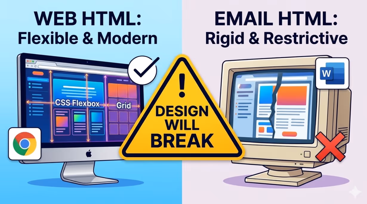
- Email HTML is not the same as web HTML. CSS support varies dramatically across email clients, with Outlook's rendering engine based on Microsoft Word being the most restrictive. Designs built with web development assumptions will break in Outlook without conditional code specific to each client.
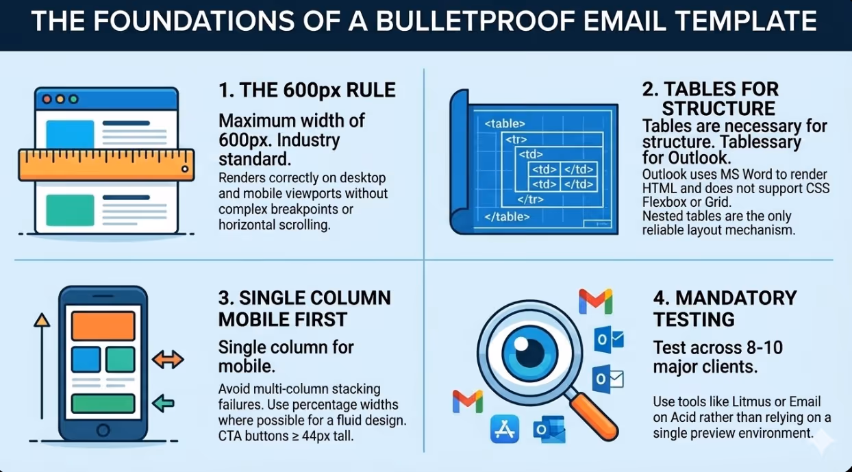
- A maximum template width of 600 pixels is the generally accepted industry standard for email body content because it renders appropriately on both desktop email clients and mobile screens without requiring complex responsive breakpoints.
- Layout built with tables remains the most reliable structural approach for email templates that must render correctly in Outlook. While CSS Flexbox and Grid are supported in modern web browsers and some email clients, Outlook does not support them and a layout fallback using tables is required for any layout that must be consistent across all clients.
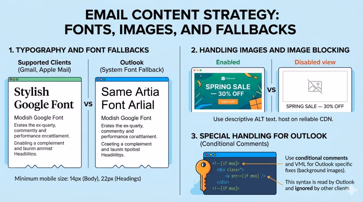
- All images in email templates should include descriptive alt text and be sized to match their intended display dimensions, because a significant proportion of email subscribers have images disabled by default and the alt text is the only content they will see in sections dominated by images.
- Layouts with a single column are the most reliable approach for mobile email design and produce fewer rendering failures across clients than layouts with multiple columns that depend on CSS transformations to stack on small screens.
- Google Fonts and custom web fonts are supported in Gmail and Apple Mail but not in Outlook, which substitutes the system font when a custom font is not available. Email templates must be designed to render acceptably with both the preferred font and the fallback system font in use simultaneously.
- Every email template should be tested across a minimum set of the eight to ten most common email clients before deployment, using a tool such as Litmus or Email on Acid rather than relying on a single preview environment.
The Email Rendering Problem
No other digital channel imposes the rendering inconsistency that email does. A web page rendered in Chrome, Firefox, Safari, and Edge looks essentially the same because modern web browsers follow the same web standards with consistent CSS support. An email opened in Gmail on a desktop browser, Gmail on Android, Apple Mail on an iPhone, Microsoft Outlook on a Windows desktop, and Yahoo Mail on a web browser can look dramatically different, because these clients do not share a common rendering standard.
The most significant source of rendering failures in professional email templates is Outlook. Microsoft's desktop Outlook application uses Microsoft Word as its HTML rendering engine rather than a web browser. This means that CSS properties supported universally by every modern web browser are simply not rendered in Outlook. Flexbox layouts collapse. Grid layouts are ignored. CSS background images do not display. Margin values on certain elements are misinterpreted. Padding behaves differently on images than on other elements. These are not obscure edge cases: they are predictable failures that affect the layout of the majority of email templates built by designers who learned to code for the web rather than for email.
Gmail, which accounts for a substantial portion of email opens worldwide, has its own rendering constraints. Gmail strips the <head> element and its contents from email HTML, which means CSS written in a <style> tag in the head of the document does not apply. Gmail supports inline styles, and some versions support embedded CSS in a <style> tag in the <body>, but the safest approach is to use inline styles for all critical layout and typography properties.
Apple Mail and iOS Mail, which dominate mobile email opens among Australian iPhone users, are among the most capable rendering environments, supporting a broad range of CSS features. However, Apple's automatic link detection applies blue underline formatting to phone numbers, dates, and addresses if they are not explicitly styled, which can disrupt the visual design of templates that include these elements.
Structural Foundations: Tables and the 600-Pixel Rule
The foundational structural pattern for a robust email template is a layout built with tables with a maximum content width of 600 pixels. These two choices are not aesthetic preferences. They are practical requirements imposed by the constraints of the email rendering environment.
Layout built with tables is the correct structural approach for email because it is the one HTML structural mechanism that is consistently interpreted the same way across all email clients including Outlook. A table with a defined width, a defined cell structure, and appropriate cellpadding and cellspacing attributes will render at the specified width in every email client tested. A CSS Flexbox or Grid layout will render correctly in Gmail, Apple Mail, and most modern clients but will collapse or behave unpredictably in Outlook without a fallback structure built with tables.
The practical email template structure uses a wrapper table at 100% width to centre the content on any screen width, and an inner content table at 600 pixels (or a maximum of 600 pixels for responsive templates) to constrain the content area. All layout within the template is built using nested tables rather than CSS positioning.
600 pixels is the appropriate maximum content width because:
- Desktop email clients typically display the email preview panel at a width between 600 and 700 pixels
- Most mobile email clients display content filling the full width within a narrower viewport, meaning a 600-pixel email scales down to fill the screen on most mobile devices without requiring zoom
- Any email wider than 600 pixels requires horizontal scrolling on some desktop clients, which is a functional failure regardless of how good the design looks at full width
Typography in Email: Fonts, Sizes, and Fallbacks
Typography in email templates requires more careful planning than typography in web design because font rendering across clients is inconsistent and fallback behaviour must be deliberately managed rather than assumed.
Fonts that come installed on virtually all devices by default are the only fonts guaranteed to render consistently across all email clients. The safe font options available to email designers include Arial, Helvetica, Georgia, Times New Roman, Trebuchet MS, and Verdana. These fonts are installed on virtually every device and operating system and will render in Outlook, Gmail, Yahoo, and all other clients without a fallback or a download.
Google Fonts and custom web fonts can be loaded in email templates using a @font-face declaration in the <style> tag of the <body> element. This approach is supported by Gmail, Apple Mail, and the Samsung Email client, among others, but is not supported by Outlook or Yahoo Mail. In clients that do not support the custom font, the declared fallback font from this safe set is used instead.
The consequence of partial custom font support is that email templates using Google Fonts must be designed to look intentional and complete with both the preferred font and the safe fallback font in use. If the heading style depends entirely on the custom font's proportions and weight for its visual impact, it will look wrong in Outlook and Yahoo where the safe fallback font is displayed instead. The template should be reviewed in a rendering with the fallback font before deployment to ensure the design holds up.
Minimum font sizes for mobile email reading are 14 pixels for body copy and 22 pixels for headings. Smaller text is technically rendered on mobile devices but requires zooming to read, which most subscribers will not do and which constitutes a mobile usability failure.
Responsive Design Patterns for Email
Making an email template adapt between desktop and mobile screen widths requires a different approach from responsive web design, because CSS media queries are only supported in some email clients (not Outlook, not some versions of Gmail) and cannot be relied upon as the primary responsive mechanism.
The most reliable approach to email design that renders well on mobile is a fluid, single-column structure: design the email at a single column width of 600 pixels or less, with all content stacked vertically, and use percentage widths where possible rather than fixed pixel widths. An email using a single column that is 600 pixels wide at desktop scale and fills the screen width at mobile scale, with appropriately sized fonts and call-to-action buttons sized for touch, works correctly in every email client without requiring media queries.
Where a layout with multiple columns is required for desktop presentation (for example, a product grid with two columns or a side-by-side text and image layout), the columns must be implemented using a hybrid approach that works with media queries where supported and degrades gracefully to a stacked single column layout where they are not. This typically means using a combination of max-width settings, width: 100% on the inner content table cells, and CSS display: block media query overrides for the clients that support them.
The call-to-action button deserves specific attention in mobile email design. A button that is 120 pixels wide and 36 pixels tall is fine for a desktop user with a mouse but is too small for a reliable tap on a mobile touchscreen. Email call-to-action buttons should be a minimum of 44 pixels tall, spanning the full width or close to it in a single column email, and styled using HTML table cells and inline CSS rather than CSS background properties (which do not render in Outlook without additional workarounds).
Images in Email: Handling Blocked Display
A significant proportion of email subscribers read email with images blocked by default, either because their email client blocks images for privacy reasons, their organisation's IT policy blocks images in email, or they have chosen to disable image loading to reduce data usage. An email template designed around large hero images with minimal text will appear as a nearly blank email to these subscribers.
Every image in an email template should be accompanied by a descriptive alt attribute that conveys the meaning or content of the image in text form. The alt text is displayed when the image does not load and is read by screen readers. An alt attribute of "" (empty) is appropriate for purely decorative images. An alt attribute of "Spring Sale — 30% off all homewares" is appropriate for a promotional banner image whose text content is important.
Images should be hosted on a reliable CDN or web server at a URL that is permanently accessible. Hotlinking images from a website that may be updated or taken offline between the time the email is sent and the time it is opened will result in broken image icons for any subscriber who opens the email after the images are removed.
Images should also be sized to their intended display dimensions rather than relying on CSS or HTML width attributes to scale them. A 1200-pixel-wide image displayed at 600 pixels in an email still downloads at the full 1200-pixel file size, which increases email load time and data usage for mobile subscribers. Exporting images at twice the intended display width (to account for Retina and high density displays) is the appropriate practice, not exporting at the full resolution of the original file.
Conditional Comments for Outlook
Microsoft Outlook on Windows uses Internet Explorer's conditional comment syntax to apply HTML and CSS that other clients will ignore. This mechanism allows email designers to create layout adjustments specific to Outlook without affecting the rendering in other clients.
A common use of conditional comments is to specify an alternative table width for Outlook that compensates for its different handling of padding and spacing:
html
<!--[if mso]>
<table width="600" cellpadding="0" cellspacing="0" border="0">
<tr><td>
<![endif]-->

<!-- Main content here -->

<!--[if mso]>
</td></tr></table>
<![endif]-->
The <!--[if mso]> syntax is read by Outlook and ignored by all other clients. This allows the template to include wrappers specific to Outlook, font stack declarations, and layout overrides without changing what other clients render.
The VML (Vector Markup Language) syntax is used in Outlook to render background images that CSS background-image cannot display. VML is an HTML language specific to Outlook that allows bitmap and gradient backgrounds to be defined in a format that Outlook's Word rendering engine understands:
html
<!--[if gte mso 9]>
<v:rect xmlns:v="urn:schemas-microsoft-com:vml" fill="true" stroke="false" style="width:600px; height:200px;">
  <v:fill type="frame" src="https://yourdomain.com/header-bg.jpg" color="#ffffff"/>
  <v:textbox inset="0,0,0,0">
<![endif]-->
<!-- Fallback content for other clients -->
<!--[if gte mso 9]>
  </v:textbox>
</v:rect>
<![endif]-->
FAQs
How should Australian email designers test their templates across email clients before deployment?
The practical approach for professional email template testing is to use a dedicated inbox preview service rather than manually testing in each client. Litmus and Email on Acid are the two most widely used services, both offering previews across 90 or more email client and operating system combinations, including all major versions of Outlook on Windows, Gmail across desktop and mobile, Apple Mail across macOS and iOS, and Samsung Email. Both services also provide spam filter analysis and accessibility checks alongside the visual previews. For Australian marketing teams sending to subscriber lists that include significant proportions of Outlook users, testing specifically across Outlook 2016, 2019, and Microsoft 365 is particularly important, as these versions have slightly different rendering behaviours. Testing on at least one physical iOS device using the native Mail app is also recommended, because the iOS Mail preview in inbox testing tools does not always replicate the rendering behaviour of the actual device.
What is the most common cause of email templates looking different from the design in Outlook specifically?
The most common cause is CSS properties that are supported in web browsers and most email clients but ignored or misinterpreted by Outlook's Word rendering engine. The most frequent failures include: CSS shorthand properties such as margin: 20px 0 being ignored in favour of expanded properties (Outlook often requires margin-top: 20px; margin-bottom: 20px; to be declared separately); padding applied to <img> elements not working as expected; line-height declarations being applied to the table cell rather than the text element causing unexpected spacing; CSS background-image on a <div> not rendering at all; and Flexbox or Grid layouts collapsing because Outlook does not support these display models. The reliable remedy is to build the template using layout built with tables from the outset and to test every CSS property used in the template against Outlook compatibility before assuming it will render correctly.
Should Australian businesses build email templates from scratch or use a template builder platform?
The decision depends on the complexity of the brand requirements, the technical resources available, and the degree of consistency across clients required. Template builder platforms including Mailchimp's template editor, Klaviyo's visual drag and drop editor, and dedicated tools such as Stripo and BeeFree produce HTML that handles many of the compatibility challenges across clients automatically, which makes them appropriate for most Australian businesses whose newsletter design requirements can be met within the constraints of the editor's block system. Building from scratch is the better choice when the brand's design system requires layout patterns, typographic combinations, or visual elements that cannot be replicated within a builder's block system, or when the business has the technical resources to maintain a template built from custom code and the rendering quality differences between a custom template and a builder output are commercially significant. For most Australian small and medium businesses, a properly configured template builder produces results that are good enough for their needs, and the ongoing maintenance advantage of a visual editor outweighs the design limitations it imposes.
An Email That Renders Correctly Is a Marketing Asset. One That Breaks Is a Liability.
A branded email newsletter that displays correctly for every subscriber, on every device, in every email client builds the visual consistency that compounds into brand recognition over time. One that breaks in Outlook for 30 percent of subscribers, shows missing images for another 20 percent, and renders with a different font stack in half the mobile clients is communicating something about the brand's attention to detail whether that communication is intentional or not. For Australian businesses investing in email marketing as a relationship and revenue channel, the technical quality of the template is not a minor implementation detail. It is the visual standard against which every campaign is judged.
Maven Marketing Co designs and codes branded email templates for Australian businesses, tested across all major email clients and built for reuse across campaign programmes.
Talk to the team at Maven Marketing Co →

Table of contents
read more blogs

Handing the Keys to Google's AI: How to Keep Control of Your Ad Budget Inside Performance Max
Performance Max is Google's most automated campaign type, and also the one that provokes the most anxiety among Australian advertisers who have spent years developing campaign management practices that depend on visibility, control, and the ability to make deliberate, measurable changes. The anxiety has some basis. Performance Max does take more control away from the advertiser than any previous Google Ads campaign type: it chooses the placements, it selects the creative combinations, it determines the bid for each impression, and it distributes the budget across Google's inventory in ways the advertiser cannot directly specify. The part of the anxiety that is not well based is the conclusion that these constraints make Performance Max unmanageable or a blank cheque handed to Google's algorithm. Performance Max has a specific set of levers that, when correctly configured, give advertisers meaningful influence over where the budget goes, which audiences it targets, which creative assets it uses, and which conversion events it optimises toward. Understanding and using these levers is the difference between a Performance Max campaign that works within the advertiser's strategic parameters and one that wastes budget on inventory, audiences, and objectives that the business never intended to pursue.

When Customers Search on TikTok and Instagram Instead of Google — How Australian Brands Adapt
Something structurally significant has changed in how younger Australian consumers research purchases, and most Australian brands have not yet adjusted their discoverability strategy to reflect it. A proportion of the audience that would previously have opened Google to search for "best brunch spots Fitzroy" or "honest review Mecca skincare serum" is now opening TikTok or Instagram instead. They are searching within these platforms for short video content that shows them what they want to know: the actual food, the actual product, the actual experience, from people who have actually been there or used the item. This is not a marginal behaviour limited to a niche demographic. TikTok's own data has reported that a significant share of its users use the platform as a search engine, and the query patterns on Instagram's search function have expanded well beyond celebrity and hashtag discovery into product, venue, and service research. For Australian brands that have built their discoverability strategy entirely on Google organic search and Google Ads, this shift represents a gap that is growing over time as the audience that uses social platforms as primary discovery tools ages into demographics with higher purchasing power. This article covers what the shift to social search means practically, what content and account configuration signals these platforms use to surface results, and what Australian brands need to do differently to be found on TikTok and Instagram by people who are actively looking for what they offer.

How to Build a Google Business Profile That Converts Browsers Into Booked Appointments
A Google Business Profile that has been set up and left alone is doing roughly the same work as a shop front with the lights off. It confirms the business exists and provides the phone number, but it is not actively persuading a local searcher who is comparing three businesses in the search results to choose this one rather than the competitors sitting directly above and below it in the local pack. The businesses that win appointments from Google local search are not simply those that are closest to the searcher or those with the most reviews, although proximity and reviews both matter. They are the businesses that have treated their Google Business Profile as a conversion surface rather than a directory entry, and have populated every element of the profile with the specific information, imagery, and social proof that a local searcher needs to make a confident decision to book rather than keep browsing. The difference between a profile that ranks and converts and one that ranks but loses its potential customers to competitors is in the specific decisions this article covers: how to write the business description, which photos produce engagement, how to use posts to maintain freshness signals, how to respond to reviews in a way that builds rather than diminishes trust, and how to configure the booking and contact features that reduce friction between intent and appointment.


