.svg)
.svg)
.svg)


%201.svg)
Key Takeaways
- Render-blocking CSS prevents the browser from displaying any content until the entire stylesheet has been downloaded and parsed, directly increasing First Contentful Paint and Largest Contentful Paint times.
- Critical CSS extraction identifies the minimum set of styles required to render the portion of the page visible without scrolling, inlines them in the HTML head, and defers the full stylesheet to load after the initial paint.
- First Contentful Paint improvements of one to three seconds are achievable on Australian websites with large, unoptimised stylesheets, particularly on mobile connections.
- The extraction process can be automated using tools such as Critical, Penthouse, and Critters, as well as build pipeline integrations available for Webpack, Vite, and major static site generators.
- WordPress, Shopify, and other sites on managed platforms can implement Critical CSS through established plugin and app solutions without requiring custom build pipeline development.
- The deferred loading of styles that are not critical must be implemented correctly to avoid a flash of unstyled content after the initial paint, which creates a poor user experience and can affect layout stability scores.
- Critical CSS extraction is most impactful on pages with heavy stylesheets, significant amounts of unused CSS, or content in the initial viewport with complex layout requirements.
Understanding Render-Blocking CSS
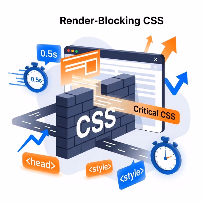
To understand why Critical CSS extraction matters, it helps to understand precisely what happens when a browser encounters a standard CSS link element in the head of an HTML document.
When a browser begins loading a web page, it parses the HTML and constructs the Document Object Model. The moment it encounters a stylesheet link, it stops rendering and initiates a request for that CSS file. Until that file has been fully downloaded and its styles processed, the browser will display nothing to the user. The page is blank. It does not matter that the stylesheet contains thousands of rules the browser does not need for the current viewport. The browser cannot know this until it has finished reading the file, and it will not show the user anything until it does.
On a fast desktop connection with a small stylesheet, this blocking time may be imperceptible. On a mobile connection, a large stylesheet, or a page that must load multiple stylesheets, the blocking time becomes significant. A modern commercial website's CSS file is commonly between 50 and 200 kilobytes or larger after all framework styles, component styles, and styles specific to the site are combined. Downloading and parsing that file on a typical Australian mobile connection before showing the user anything measurably increases the time to first paint and contributes directly to poor Core Web Vitals scores.
Google's Core Web Vitals framework measures First Contentful Paint as one of its key performance indicators. FCP measures the time between the user initiating the page load and the browser rendering the first piece of visible content. CSS that blocks rendering is one of the primary causes of poor FCP scores, and PageSpeed Insights explicitly flags resources that block rendering as a performance issue when it audits Australian websites.
What Critical CSS Extraction Actually Does
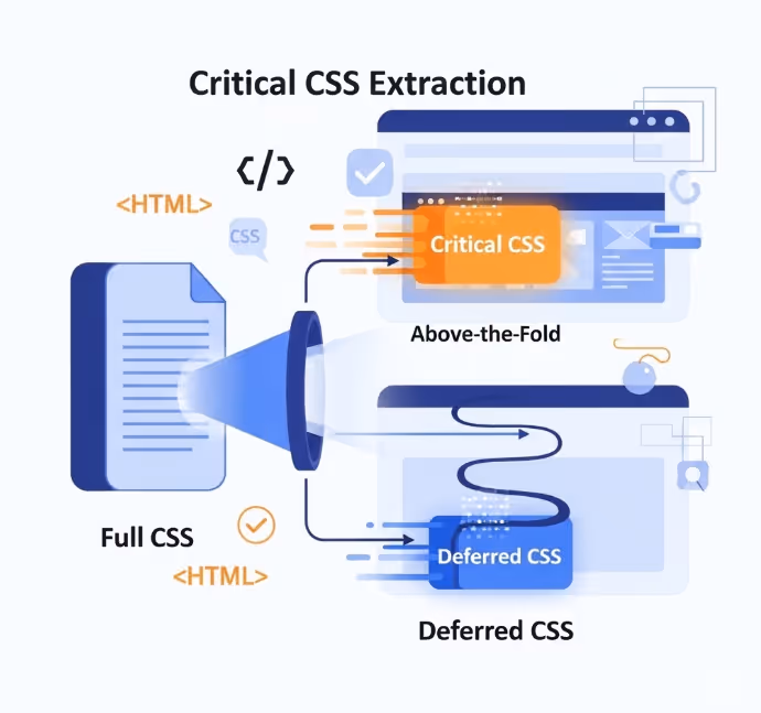
Critical CSS extraction is the process of programmatically identifying which CSS rules are applied to elements in the initial viewport of a given page, separating those rules from the full stylesheet, and restructuring how the styles are delivered so that the browser receives the critical rules immediately and the rest later.
The specific delivery mechanism is straightforward. The critical styles are embedded directly within a style element in the HTML head of the page. Because they are inline rather than external, the browser does not need to make a separate network request for them. It encounters them as it parses the HTML and processes them immediately, allowing the initial viewport to be rendered without waiting for any external stylesheet.
The styles that are not critical, those needed for content below the fold, for interactive states, for components that load later, or for other page templates, are loaded asynchronously. The standard technique for this involves setting the stylesheet link's media attribute to a value that does not block rendering during load and then switching it back to all once the page has loaded, using a short JavaScript snippet or a library that handles this pattern. The result is a page that displays visible content almost immediately while continuing to load the full stylesheet in the background.
The practical effect on user perception is significant. A page that previously showed a blank screen for two seconds before rendering anything now begins to display visible content almost immediately. The remaining styles load within the same total time as before, but because the critical portion has already been painted, the user experience feels substantially faster even when the total load time has not changed dramatically.
How Critical CSS Is Extracted
Manually identifying and extracting critical styles from a large stylesheet is not a practical approach for most Australian websites. The process is automated through tools that simulate a browser rendering the page, identify which CSS rules affect elements in the initial viewport, and extract those rules into a separate file or inline string.
Critical is a Node.js module maintained by Addy Osmani that automates the extraction process. It renders a page using a browser running in headless mode, identifies the applied styles for the visible viewport at a defined screen width and height, and outputs the critical CSS as a string that can be inlined into the HTML template. Critical integrates with Grunt, Gulp, Webpack, and several other build tools and is the most widely used standalone Critical CSS extraction tool.
Penthouse is another Node.js tool that performs a similar function, using Puppeteer to render the page and extract critical styles. It is useful for scenarios where finer control over the extraction process is needed or where Critical's output does not meet specific requirements.
Critters is a Webpack plugin developed by Google that inlines critical CSS and automatically defers the styles that are not critical. It is the extraction tool integrated into Angular CLI by default and is available as a standalone plugin for other build pipelines using Webpack.
For Australian web development teams using modern JavaScript frameworks, critical CSS handling is often available as a native feature or a documented configuration option within the framework itself. Next.js handles critical CSS inlining automatically for its CSS Modules and the styled components pattern. Nuxt has similar capabilities through its rendering pipeline. These implementations at the framework level remove the need for manual extraction tooling in most cases.
The Deferred Loading Problem
The most common implementation mistake in Critical CSS projects is correctly inlining the critical styles but failing to implement the deferred loading of the full stylesheet in a way that avoids visible flash of unstyled content.
Flash of unstyled content occurs when the full stylesheet finishes loading after the initial paint and the browser applies new styles that alter the visual appearance of elements already rendered. If the critical styles have positioned an element one way and the full stylesheet contains a conflicting rule, the user will see the element jump or change appearance as the full styles are applied. This is both visually disruptive and contributes negatively to the Cumulative Layout Shift metric within Core Web Vitals.
The standard deferred loading pattern uses a link element with the media attribute set to print, which tells the browser the stylesheet is not needed for the current rendering context and loads it without blocking. An onload handler then switches the media attribute to all once the file has finished loading, at which point the browser applies the full stylesheet to the page already rendered.
html
<link rel="stylesheet" href="styles.css" media="print" onload="this.media='all'">
<noscript><link rel="stylesheet" href="styles.css"></noscript>
The noscript fallback ensures that users with JavaScript disabled still receive the full stylesheet in the standard blocking manner. For modern Australian website audiences where JavaScript disabled browsing is extremely uncommon, this fallback is more of a correctness measure than a practical requirement, but it is considered good practice and should be included.
The key to avoiding flash of unstyled content is ensuring the critical CSS is genuinely complete for the initial viewport. If elements visible without scrolling are receiving styles from the portion of the stylesheet not marked as critical of the stylesheet, those elements will visibly change appearance when the full stylesheet loads. Thorough testing across multiple viewport sizes and page states is essential to identify and fill any gaps in the critical CSS coverage.
Viewport Variation: A Practical Challenge
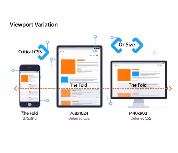
One of the genuine complexities of Critical CSS implementation is that the critical styles for a given page vary depending on the device and viewport size at which the page is viewed. The initial viewport on a mobile phone is different from a tablet, which is different from a desktop monitor. Content that is above the fold on a large screen may be below the fold on a small one, and vice versa.
Most extraction tools address this by accepting multiple viewport configurations and generating a merged critical CSS output that covers the initial viewport across all the specified dimensions. The resulting critical CSS file is larger than if it were generated for a single viewport, but it ensures that users on all common device sizes receive appropriate critical styles.
The practical recommendation for Australian website implementations is to generate critical CSS covering at minimum a common mobile viewport (375 by 812 pixels is a common reference), a tablet viewport (768 by 1024 pixels), and a desktop viewport (1440 by 900 pixels). For sites with unusual layout behaviour at specific breakpoints, additional viewport configurations may be needed to ensure complete coverage.
Some teams opt to generate critical CSS tailored to each device type and serve different inlined styles to mobile and desktop users based on the user agent, but this approach adds infrastructure complexity and maintenance overhead that most Australian website teams will find difficult to sustain. The merged merged viewport approach is a more robust and maintainable solution for the majority of implementations.
Platform Specific Implementation
For Australian websites running on managed platforms rather than codebases built on custom technology, Critical CSS implementation follows a different path from the build pipeline tooling described above.
WordPress. Several plugin solutions automate Critical CSS generation and delivery for WordPress sites. WP Rocket is among the most widely deployed performance plugins in the Australian WordPress ecosystem and includes automated Critical CSS generation through integration with a cloud service that extracts and updates critical styles whenever the page content changes. LiteSpeed Cache and NitroPack offer similar functionality. These plugins handle both the extraction and the deferred loading implementation, removing the need for any direct engagement with the underlying build process.
Shopify. Shopify's platform architecture limits direct access to theme CSS loading behaviour, but the Dawn theme and its successors include CSS loading patterns that prioritise performance loading patterns. Shopify's Online Store 2.0 architecture and its use of section rendering limits the size of stylesheets loaded on any given page by loading styles specific to each component only when those components are present. For merchants on custom Shopify themes, working with a Shopify developer to audit and optimise CSS loading patterns is the appropriate path rather than attempting direct Critical CSS tooling.
Squarespace and Wix. Both platforms manage CSS delivery through their own infrastructure, which limits the options for direct Critical CSS implementation. The performance optimisation levers available on these platforms are primarily at the content level rather than the CSS delivery level, and teams managing sites on these platforms should focus performance investment on image optimisation, content weight reduction, and third party script management rather than CSS delivery architecture.
Testing and Validating the Implementation
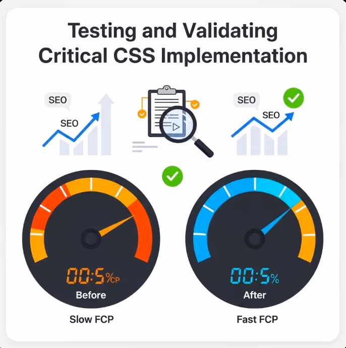
Implementing Critical CSS and then not measuring the outcome is a significant missed opportunity. The performance impact should be measured before and after implementation using consistent methodology to confirm the expected gains and identify any issues introduced by the implementation.
Google PageSpeed Insights measures FCP, LCP, and CLS for both mobile and desktop and will show the impact of Critical CSS implementation directly in its scoring. Running a PageSpeed Insights audit on the same page before and after implementation provides a clear comparison of results before and after that is both technically accurate and straightforwardly interpretable by stakeholders without a technical background.
Google's web.dev documentation on eliminating render-blocking resources provides detailed guidance on diagnosing render-blocking CSS issues and validating fixes, and is the most authoritative reference for the technical implementation details of Critical CSS as they relate to Core Web Vitals optimisation.
WebPageTest provides more detailed waterfall diagrams showing exactly how CSS loading fits into the overall page load sequence, which is useful for diagnosing specific issues in the implementation. Running a WebPageTest report from an Australian test location, using either the Sydney or Melbourne test nodes, gives results that are representative of real Australian user experience rather than results from overseas test infrastructure.
Lighthouse, available in Chrome DevTools, provides an accessible in-browser audit that identifies render-blocking resources and estimates the potential time savings from addressing them, which makes it a useful initial diagnostic tool before committing to a full Critical CSS implementation project.
FAQs
Does Critical CSS need to be regenerated when website content or templates change?
Yes, and this is one of the ongoing maintenance considerations that makes Critical CSS more complex to sustain than a single fixed implementation. If a page template changes significantly, new elements may appear in the initial viewport that require styles not captured in the existing critical CSS. If those styles are absent from the inlined critical portion, those elements will be unstyled until the full stylesheet loads. Solutions using plugins for WordPress and similar platforms typically handle this through automated regeneration triggered by template or content updates. For custom implementations using build pipeline tools, incorporating Critical CSS generation into the deployment process ensures the critical styles stay aligned with the current state of the page templates.
Is Critical CSS implementation worth the effort for a site that already scores reasonably well on PageSpeed Insights?
It depends on the specific score and the competitive context. For Australian websites where organic search is a significant traffic channel, the incremental improvement from Critical CSS can be meaningful at the margin even for reasonably performant sites. For sites with FCP scores already in the Good range according to Google's thresholds (below 1.8 seconds), the return on investment from Critical CSS implementation is lower than for sites with FCP scores in the Needs Improvement or Poor range. The highest return use of the effort is on sites with large stylesheets, poor FCP scores, and significant organic search traffic where even modest ranking improvements translate into measurable revenue impact.
Can Critical CSS extraction make a page slower in any circumstances?
In theory, yes, though this is uncommon when implementation is correct. If the critical CSS extraction tool generates an unusually large critical CSS payload, the overhead of parsing that inline CSS can exceed the benefit of avoiding the separate external stylesheet request, particularly on mobile devices with less processing power. This is most likely to occur when the extraction tool is not given precise viewport parameters and generates critical styles covering too broad a range of viewport conditions. The solution is to be specific about the viewport configurations passed to the extraction tool and to audit the size of the generated critical CSS output. A critical CSS payload above around 14 kilobytes is generally considered too large and suggests the extraction parameters need refinement.
A Performance Investment That Pays in Rankings and Conversions
CSS that blocks rendering is a well understood and thoroughly documented performance problem with a well understood solution. Australian websites carrying the weight of large, unoptimised stylesheets are leaving measurable PageSpeed and Core Web Vitals performance on the table, and that performance gap shows up in search rankings, in bounce rates, and in the conversion rates of every page affected.
Maven Marketing Co helps Australian businesses audit their web performance and implement the technical improvements that turn PageSpeed scores into commercial gains.
Talk to the team at Maven Marketing Co →

Table of contents
read more blogs

Handing the Keys to Google's AI: How to Keep Control of Your Ad Budget Inside Performance Max
Performance Max is Google's most automated campaign type, and also the one that provokes the most anxiety among Australian advertisers who have spent years developing campaign management practices that depend on visibility, control, and the ability to make deliberate, measurable changes. The anxiety has some basis. Performance Max does take more control away from the advertiser than any previous Google Ads campaign type: it chooses the placements, it selects the creative combinations, it determines the bid for each impression, and it distributes the budget across Google's inventory in ways the advertiser cannot directly specify. The part of the anxiety that is not well based is the conclusion that these constraints make Performance Max unmanageable or a blank cheque handed to Google's algorithm. Performance Max has a specific set of levers that, when correctly configured, give advertisers meaningful influence over where the budget goes, which audiences it targets, which creative assets it uses, and which conversion events it optimises toward. Understanding and using these levers is the difference between a Performance Max campaign that works within the advertiser's strategic parameters and one that wastes budget on inventory, audiences, and objectives that the business never intended to pursue.

When Customers Search on TikTok and Instagram Instead of Google — How Australian Brands Adapt
Something structurally significant has changed in how younger Australian consumers research purchases, and most Australian brands have not yet adjusted their discoverability strategy to reflect it. A proportion of the audience that would previously have opened Google to search for "best brunch spots Fitzroy" or "honest review Mecca skincare serum" is now opening TikTok or Instagram instead. They are searching within these platforms for short video content that shows them what they want to know: the actual food, the actual product, the actual experience, from people who have actually been there or used the item. This is not a marginal behaviour limited to a niche demographic. TikTok's own data has reported that a significant share of its users use the platform as a search engine, and the query patterns on Instagram's search function have expanded well beyond celebrity and hashtag discovery into product, venue, and service research. For Australian brands that have built their discoverability strategy entirely on Google organic search and Google Ads, this shift represents a gap that is growing over time as the audience that uses social platforms as primary discovery tools ages into demographics with higher purchasing power. This article covers what the shift to social search means practically, what content and account configuration signals these platforms use to surface results, and what Australian brands need to do differently to be found on TikTok and Instagram by people who are actively looking for what they offer.

How to Build a Google Business Profile That Converts Browsers Into Booked Appointments
A Google Business Profile that has been set up and left alone is doing roughly the same work as a shop front with the lights off. It confirms the business exists and provides the phone number, but it is not actively persuading a local searcher who is comparing three businesses in the search results to choose this one rather than the competitors sitting directly above and below it in the local pack. The businesses that win appointments from Google local search are not simply those that are closest to the searcher or those with the most reviews, although proximity and reviews both matter. They are the businesses that have treated their Google Business Profile as a conversion surface rather than a directory entry, and have populated every element of the profile with the specific information, imagery, and social proof that a local searcher needs to make a confident decision to book rather than keep browsing. The difference between a profile that ranks and converts and one that ranks but loses its potential customers to competitors is in the specific decisions this article covers: how to write the business description, which photos produce engagement, how to use posts to maintain freshness signals, how to respond to reviews in a way that builds rather than diminishes trust, and how to configure the booking and contact features that reduce friction between intent and appointment.


