.svg)
.svg)
.svg)


%201.svg)
Key Takeaways
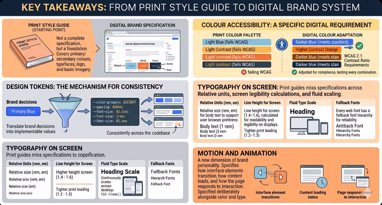
- A brand style guide built for print is a starting point for digital brand integration, not a complete specification. Digital requires additional decisions about interactive states, responsive behaviour, accessibility compliance, and design at the component level that print guides do not address.
- Design tokens are the mechanism that translates brand decisions (this is our primary blue, this is our heading typeface) into implementable values (the CSS custom property for the primary blue, the font face declaration for the heading typeface) that apply consistently across the entire codebase.
- Colour accessibility is a specific digital requirement that print colour palettes frequently fail to meet. Every foreground and background colour combination in the web design must meet WCAG 2.1 contrast ratio requirements, which sometimes requires adjusting the brand colour values for digital use.
- Typography on screen requires a different specification set from typography in print. Type size must be specified in relative units, line height must be calculated for screen legibility rather than print leading, and the scale must adapt across breakpoints with explicit rules rather than ad hoc adjustments.
- The component library is the digital equivalent of the brand's visual language applied to the specific interface elements that websites use: buttons, forms, navigation, cards, modals, tables, and the other building blocks from which every page is constructed. Designing this library at the brand level, rather than page by page, is what produces visual consistency across a complex site.
- Motion and animation are a dimension of brand personality that print guides cannot address. How interface elements transition, how content loads, and how the page responds to interaction are part of the brand experience and should be specified with the same deliberateness as colour and typography.
- A digital brand system should be documented alongside the codebase that implements it, so that new developers, designers, and content contributors can apply it correctly without needing to work backwards from decisions from the existing website.
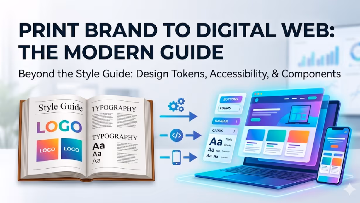
Why Print Style Guides Fall Short of Digital Requirements
The gap between a print style guide and a comprehensive digital brand specification is not a criticism of print guides. It reflects the genuine difference in what digital requires.
A print designer working with a brand style guide needs to know the primary and secondary colours, the typefaces, the logo clearance zones, the approved image treatment style, and the compositional principles that give the brand its visual character. These decisions are made once per execution and are not affected by the state of the user, the width of the screen, or the accessibility requirements of the distribution medium.
A digital designer implementing the same brand needs all of the above, plus:
Interactive state specifications. Every interactive element on a website exists in multiple states: default, hover, focus, active, disabled, and error. Each state requires a distinct visual treatment that communicates the element's current state to the user. A print style guide specifying a primary button colour tells the digital designer what the button looks like by default. It does not specify what it looks like when the cursor is over it, when it is selected by keyboard navigation, or when it is in a disabled state. Without these specifications, each developer or designer makes independent decisions that produce inconsistent interactive behaviour across the site.
Responsive behaviour rules. A digital design must specify how the layout and typography adapt across different screen widths. Which columns collapse on mobile? At what breakpoint does the heading size decrease? How does the navigation transform from desktop to mobile? A print style guide designed at a single format size provides no guidance on these questions, and without explicit rules the implementation becomes a series of ad hoc decisions that produce an inconsistent experience across device types.
Accessibility requirements. The Web Content Accessibility Guidelines require that text and interface elements meet specific contrast ratio thresholds for legibility. A brand colour palette designed primarily for print aesthetics may include colour combinations that fail these thresholds in digital use. Identifying and resolving these failures before implementation, rather than discovering them after launch, prevents the need to either compromise the brand's colour usage or violate the accessibility standard.
Specification at the component level. A web page is not a single designed artefact. It is an assembly of reusable components: navigation bars, hero sections, card grids, form fields, buttons, accordions, modals, and dozens of other interface patterns. Each of these components needs to be specified at the brand level so that every instance on every page is consistent, not independently designed each time it is needed.
Design Tokens: Making Brand Decisions Systematic
Design tokens are the foundational mechanism for implementing brand decisions in a digital product in a way that is systematic, maintainable, and consistent. A design token is a named value that stores a single brand decision: a colour, a font size, a spacing unit, a border radius, an animation duration.
Instead of every developer writing color: #2E5BFF when they need to apply the primary brand blue, they write color: var(--color-primary) or color: tokens.primary. The token stores the connection between the brand concept expressed in plain language (primary) and the implementation value (#2E5BFF). If the brand's primary blue changes, changing the token value updates every instance of it across the entire codebase.
A design token system that is well structured for an Australian business website typically covers:
Colour tokens. The full brand colour palette expressed as tokens, organised by role (primary, secondary, accent, neutral, semantic colours for success, warning, error, and information) and by variant (primary-50 through primary-900 for a full tonal scale). Interactive state colours are included as tokens rather than calculated ad hoc.
Typography tokens. The font families, the type scale (the full set of sizes from the smallest body caption to the largest display heading), the line heights, the letter spacing values, and the font weights. On a responsive site, typography tokens may be defined as fluid values using CSS clamp() that scale continuously between defined minimum and maximum sizes across screen widths.
Spacing tokens. A defined spacing scale, typically based on a base unit (4px, 8px, or a custom base) with a set of multipliers that produce the full range of spacing values used in the design. Consistent spacing tokens prevent the visual inconsistency that results from developers and designers picking arbitrary pixel values.
Border and shape tokens. Border radius values, border widths, and border colours defined as tokens ensure that the visual language of rounded versus sharp corners, thin versus thick borders, and the specific border colour palette is applied consistently across every component.
Shadow tokens. Elevation and shadow values defined as tokens so that the depth cues used in the design, which communicate hierarchy and layered relationships between interface elements, are consistent across the site.
Motion tokens. Duration values, timing functions, and easing curves defined as tokens so that animation and transition behaviour is consistent with the brand's motion language rather than defaulting to browser defaults or arbitrary developer choices.
Colour in Digital: Accessibility and Interactive States
Translating a print colour palette to digital requires two specific adaptations that print designers rarely need to consider.
Contrast ratio compliance. WCAG 2.1 Level AA requires that standard body text achieves a contrast ratio of at least 4.5:1 against its background, and that large text and interface components achieve at least 3:1. Many brand colour combinations that look distinctive and appropriate in print fail these thresholds when applied to digital text and interface elements.
The practical process for colour accessibility in brand integration is:
- Test every foreground and background colour combination in the design against the WCAG contrast requirements using a tool such as Colour Contrast Checker or the accessibility audit in Chrome DevTools.
- Identify any combinations that fail the required threshold.
- Adjust the failing combinations by either shifting the value (lightness) of the colour within the brand's colour family to achieve compliance, or by specifying an alternative combination from the brand's palette for digital use when the primary combination does not comply.
Most brand colour palettes can be adapted for digital accessibility without compromising the brand's core colour identity. The adjustment is typically in lightness rather than hue, which preserves the brand's colour character while meeting the contrast requirement.
Interactive states. The hover, focus, active, and disabled states of interactive elements need specific colour values that communicate the state change clearly. These are not usually specified in a print style guide and need to be designed explicitly as part of the digital brand integration.
The hover state for a primary button, for example, might be a 10 to 15 percent lighter or darker value of the primary button colour, derived systematically from the tonal scale rather than chosen arbitrarily. The focus state, which is critical for keyboard navigation accessibility, must be visually distinct enough to meet the WCAG focus indicator requirements introduced in WCAG 2.2. Designing these states explicitly ensures they are consistent and accessible, rather than depending on browser default focus indicators that may not align with the brand aesthetic.
Typography on Screen: What Print Specifications Miss
Print typography is specified in points (pt) at a fixed print size. Web typography must be specified in a way that scales with the browser's base font size setting (using rem or em rather than px for body text), adapts across screen widths (using responsive type scales or fluid typography with CSS clamp()), and maintains legibility across the range of display conditions that web users experience.
The specific web typography specifications that print guides do not include are:
Relative units. Body text should be specified in rem units so that users who have set a larger base font size in their browser preferences (a common accessibility accommodation) see the text at the correct relative size rather than having their preference overridden by a fixed pixel value.
Line height for screen. Print leading is typically tighter than screen line height because the physical contrast between ink and paper is different from the contrast between pixels on a screen. Web typography typically requires a line height of 1.4 to 1.6 for body text, which is higher than the 1.2 to 1.3 that print typography often uses for equivalent body sizes.
Fluid type scale. A heading that is 64px on a desktop screen should not be 64px on a mobile screen. A fluid type scale using CSS clamp() allows the heading to scale continuously between a defined minimum and maximum size across the viewport width range, without requiring manual specification of each size at each breakpoint.
Fallback fonts. Every custom or web font specified in the design needs a fallback font stack that maintains the typographic personality as closely as possible when the web font is unavailable. This is particularly important for the first render of the page before web fonts load, which the browser displays using the fallback stack.
The Component Library: Applying Brand at Scale
A component library is the set of reusable interface patterns built to the brand specification that is used to construct every page on the site. Rather than designing each page from scratch, the designer assembles pages from the established component library, ensuring that every page shares the same visual language.
The components that form the core of most Australian business websites include:
Navigation (primary navigation, mobile navigation, utility navigation, breadcrumbs), Buttons (primary, secondary, tertiary, and destructive variants, in all interactive states), Form elements (text inputs, select menus, radio buttons, checkboxes, date pickers, file uploads), Content cards (article cards, product cards, team member cards, testimonial cards), Modals and overlays, Data display components (tables, charts, statistical callouts), Feedback and status elements (alerts, toasts, progress indicators, empty states), and Layout components (containers, grids, dividers, spacers).
Each component is designed at the brand level: the button component specifies all variants, all sizes, all interactive states, and all edge cases (what happens when the button text is very long, or when the button appears on a coloured background) before any page is designed. This upfront component design investment produces significant efficiency in page design and development, and produces a consistency of visual language that design conducted page by page cannot replicate.
FAQs
How should an Australian business handle the situation where the existing brand style guide uses colours that fail digital accessibility requirements?This is a common situation and it does not require a full brand refresh to resolve. The recommended approach is to develop a digital colour system that extends the existing brand palette rather than replacing it. This typically involves creating a full tonal scale for each of the brand's primary colours (a range from very light to very dark), selecting the values within each scale that meet the WCAG contrast requirements when combined with the relevant background colours, and specifying these as the values specific to digital use in the brand documentation. The brand identity remains anchored to the same colour family, but the specific values used in digital applications are chosen from within that family based on accessibility compliance rather than aesthetic preference alone. This approach preserves the brand character while meeting the digital medium's requirements, and the digital colour system becomes an additional section of the brand style guide rather than a replacement for it.
What is the difference between a design system and a brand style guide, and does an Australian business need both?A brand style guide describes the brand's visual identity: the logo, the colours, the typography, the visual language principles, and the tone. It is a document that answers the question "what does this brand look and sound like?" A design system is the set of documented patterns, components, and guidelines for implementing that brand identity in digital products: the token values, the component library, the usage guidelines, and the code that implements the components. A design system answers the question "how do we build digital products that express this brand consistently?" Most Australian businesses need both, but they serve different audiences and different purposes. The brand style guide is used by brand managers, marketing teams, print designers, and anyone who creates branded materials. The design system is used by product designers, developers working on the front end, and digital marketing teams. A business without a design system relies on individual judgement to interpret and apply the brand style guide in digital contexts, which produces inconsistency. A business with both has a documented, implementable system for consistent digital brand expression.
How long does it take to develop a digital brand system for an Australian business that has an existing print style guide?The timeline depends on the complexity of the brand, the number of digital products to be covered, and whether new components need to be designed or only existing ones specified in a systematic way. For a small to medium Australian business with a website and social media channels as the primary digital touchpoints, developing a digital brand system from an existing print style guide typically takes four to eight weeks of design work. This includes a colour accessibility audit and adaptation, a digital typography system, the design token structure, and a core component library covering the primary website components. For larger organisations with multiple digital products, a customer portal, a mobile application, and multiple digital marketing formats, the design system development is a more substantial project of eight to sixteen weeks. In both cases, the investment produces returns across the life of the digital property by reducing design and development time for subsequent projects, improving brand consistency, and reducing the discovery of accessibility and usability issues after launch.
Brand Consistency Is a System Problem, Not a Good Intentions Problem
Australian businesses that rely on individual contributors making good design decisions each time they create a digital touchpoint will not achieve brand consistency, even with talented and people with good intentions. Brand consistency at scale is produced by systems: design token systems that make brand values implementable without interpretation, component libraries that make patterns that are correct to the brand as the default rather than the exception, and documentation that makes the system accessible to every contributor without requiring them to work backwards from decisions from the existing site. Building that system is the work of digital brand integration, and it produces returns every time a new page, campaign, or product feature is built on top of it.
Maven Marketing Co designs digital brand systems for Australian businesses, including colour accessibility adaptation, design token architecture, and component library development aligned to existing brand identities.
Talk to the team at Maven Marketing Co →

Table of contents
read more blogs

Handing the Keys to Google's AI: How to Keep Control of Your Ad Budget Inside Performance Max
Performance Max is Google's most automated campaign type, and also the one that provokes the most anxiety among Australian advertisers who have spent years developing campaign management practices that depend on visibility, control, and the ability to make deliberate, measurable changes. The anxiety has some basis. Performance Max does take more control away from the advertiser than any previous Google Ads campaign type: it chooses the placements, it selects the creative combinations, it determines the bid for each impression, and it distributes the budget across Google's inventory in ways the advertiser cannot directly specify. The part of the anxiety that is not well based is the conclusion that these constraints make Performance Max unmanageable or a blank cheque handed to Google's algorithm. Performance Max has a specific set of levers that, when correctly configured, give advertisers meaningful influence over where the budget goes, which audiences it targets, which creative assets it uses, and which conversion events it optimises toward. Understanding and using these levers is the difference between a Performance Max campaign that works within the advertiser's strategic parameters and one that wastes budget on inventory, audiences, and objectives that the business never intended to pursue.

When Customers Search on TikTok and Instagram Instead of Google — How Australian Brands Adapt
Something structurally significant has changed in how younger Australian consumers research purchases, and most Australian brands have not yet adjusted their discoverability strategy to reflect it. A proportion of the audience that would previously have opened Google to search for "best brunch spots Fitzroy" or "honest review Mecca skincare serum" is now opening TikTok or Instagram instead. They are searching within these platforms for short video content that shows them what they want to know: the actual food, the actual product, the actual experience, from people who have actually been there or used the item. This is not a marginal behaviour limited to a niche demographic. TikTok's own data has reported that a significant share of its users use the platform as a search engine, and the query patterns on Instagram's search function have expanded well beyond celebrity and hashtag discovery into product, venue, and service research. For Australian brands that have built their discoverability strategy entirely on Google organic search and Google Ads, this shift represents a gap that is growing over time as the audience that uses social platforms as primary discovery tools ages into demographics with higher purchasing power. This article covers what the shift to social search means practically, what content and account configuration signals these platforms use to surface results, and what Australian brands need to do differently to be found on TikTok and Instagram by people who are actively looking for what they offer.

How to Build a Google Business Profile That Converts Browsers Into Booked Appointments
A Google Business Profile that has been set up and left alone is doing roughly the same work as a shop front with the lights off. It confirms the business exists and provides the phone number, but it is not actively persuading a local searcher who is comparing three businesses in the search results to choose this one rather than the competitors sitting directly above and below it in the local pack. The businesses that win appointments from Google local search are not simply those that are closest to the searcher or those with the most reviews, although proximity and reviews both matter. They are the businesses that have treated their Google Business Profile as a conversion surface rather than a directory entry, and have populated every element of the profile with the specific information, imagery, and social proof that a local searcher needs to make a confident decision to book rather than keep browsing. The difference between a profile that ranks and converts and one that ranks but loses its potential customers to competitors is in the specific decisions this article covers: how to write the business description, which photos produce engagement, how to use posts to maintain freshness signals, how to respond to reviews in a way that builds rather than diminishes trust, and how to configure the booking and contact features that reduce friction between intent and appointment.


