.svg)
.svg)
.svg)


%201.svg)
.avif)
Quick Answers
Q: What makes landing pages convert so much better than regular website pages, and what specific conversion rates should Australian businesses expect?
Landing pages outperform standard website pages by three to ten times through ruthless singular focus that eliminates everything not directly supporting conversion. Regular website pages serve multiple purposes with navigation menus, sidebars, footer links, and various content sections that provide value but also create exit opportunities. Every additional link or distraction gives visitors reasons to leave without converting. Landing pages remove these friction points entirely, guiding attention through carefully structured hierarchy toward one specific action. According to research from Unbounce, dedicated landing pages convert at 9.7% average versus 2.35% for homepage traffic, representing more than four times improvement through proper implementation. Australian businesses should expect baseline conversion rates of 5% to 15% for well-designed landing pages targeting relevant traffic, with optimised pages achieving 15% to 30% conversion for qualified audiences and compelling offers. E-commerce product pages typically convert at 2% to 5%, whilst lead generation landing pages for professional services often achieve 10% to 25% when properly optimised. However, conversion rates vary dramatically based on traffic source quality, offer strength, audience targeting, and implementation quality. A landing page receiving cold traffic from broad Facebook ads naturally converts lower than one receiving warm traffic from targeted Google searches or email campaigns to existing subscribers.
Q: How should Australian businesses balance design aesthetics against conversion optimisation when developing landing pages, especially regarding page load speed?
Beautiful design and conversion optimisation complement each other when approached strategically rather than existing in opposition. The tension emerges when aesthetics prioritise visual complexity over functional performance or when design elements distract from conversion goals rather than supporting them. Professional design builds trust and credibility that directly impacts conversion, with research from Stanford's Web Credibility Research showing that 75% of users judge company credibility based on website design. However, visual complexity must serve conversion purpose rather than obscure it. Strategic design elements like high-quality hero imagery showing product outcomes, professional photography building aspirational connection, subtle animations drawing attention to calls-to-action, and thoughtful typography creating readable hierarchy all enhance conversion when implemented purposefully. Every design element should justify its inclusion through conversion contribution. Performance optimisation prevents beautiful designs from becoming slow-loading conversion killers through aggressive image compression using WebP format and lazy loading, code minification eliminating unused styles and scripts, critical CSS inlining for above-fold content rendering, and CDN usage serving assets from geographically close servers. These technical optimisations enable visual richness without performance penalties that cost conversions. Mobile-first design naturally constrains visual complexity by forcing prioritisation within small-screen limitations, and A/B testing resolves subjective design debates objectively by measuring actual conversion impact rather than aesthetic preferences.
.avif)
A Brisbane solar company spent thousands on Google Ads directing traffic to their homepage. Visitors landed on generic company information, explored various pages, and rarely contacted the company. Cost per lead exceeded $180 with conversion rates hovering at 2.1%.
They built a focused landing page matching ad messaging with a headline promising "Save $2,000+ on Power Bills," a calculator estimating individual savings, testimonials from Brisbane customers, and a clear "Get Free Quote" form. Same ad spend, same traffic volume. Conversion rate jumped to 11.3%. Cost per lead dropped to $34. ROI from paid advertising quintupled overnight.
The difference wasn't traffic quality or budget. It was landing page focus. The homepage served multiple purposes inadequately whilst the landing page served one purpose excellently: converting interested prospects into quote requests.
This illustrates landing page fundamentals that separate high-performing campaigns from expensive failures: match message to traffic source, eliminate distractions and alternative paths, focus ruthlessly on singular conversion goals, and optimise every element for action-taking.
Understanding Landing Page Strategy and Purpose
Landing pages serve fundamentally different purposes from websites, requiring distinct design thinking, development approaches, and success metrics that prioritise conversion above all other considerations.
Singular conversion focus differentiates landing pages from multi-purpose websites in ways that dramatically impact performance. Landing pages exist for precisely one action such as downloading a lead magnet, requesting a quote, booking a consultation, purchasing a product, registering for an event, or starting a trial. Every element on the page serves this singular goal without compromise. Navigation menus, footer links, sidebars, and alternative paths that websites legitimately need become conversion inhibitors on landing pages and get removed entirely to prevent distraction. This ruthless focus channels visitor attention through carefully designed pathways toward the conversion goal.
Traffic source alignment ensures landing page messaging matches visitor expectations created by the source that brought them to the page. Paid advertising through Google Ads or Facebook creates specific expectations through ad copy and imagery, meaning landing page messaging must align precisely with those promises. Email campaigns promote specific offers that landing pages must deliver on exactly as promised. Social media posts create particular expectations that landing pages need to fulfil immediately upon arrival. Misalignment between traffic source messaging and landing page content creates confusion that reduces conversion regardless of design quality or offer strength. The visitor expected one thing based on the ad or link they clicked, arrived to find something different or unclear, and left without converting.
Campaign-specific customisation creates relevance through audience targeting where different landing pages address different customer segments with messaging specific to their needs and pain points. Offer variations test multiple value propositions to identify which resonates strongest with target audiences. Seasonal customisation adapts messaging and imagery for holiday periods or time-sensitive campaigns. Geographic personalisation incorporates Brisbane-specific references for Brisbane traffic or Melbourne details for Melbourne campaigns. Generic one-size-fits-all landing pages attempting to serve diverse audiences simultaneously underperform targeted variations that speak directly to specific visitor segments.
Temporary versus permanent deployment differs from traditional websites built for longevity. Many landing pages serve specific campaigns with defined lifespans such as product launches, seasonal promotions, or event registration, then get archived or replaced when campaigns conclude. Some landing pages operate indefinitely for ongoing lead generation, product sales, or service signup, but their content evolves continuously based on testing and performance data rather than remaining static. This temporary or evolving nature enables aggressive optimisation without concern for long-term consistency or comprehensive navigation structures.
Success metrics for landing pages focus on conversion-related KPIs rather than engagement metrics that websites appropriately prioritise. Conversion rate measuring the percentage of visitors completing the goal action provides the primary success indicator. Cost per conversion calculated by dividing advertising spend by total conversions determines campaign profitability. Form completion rate comparing visitors who start forms versus those who complete submission identifies friction points. Time to conversion tracks how quickly visitors decide to act. Meanwhile, bounce rate, pages per session, and time on page, whilst important for websites, matter significantly less for landing pages where immediate conversion represents the goal rather than extended engagement.
Testing culture dominates landing page development more intensively than traditional websites because landing pages exist specifically for conversion optimisation rather than brand building or information provision. Systematic A/B testing of headlines, calls-to-action, imagery, copy, forms, and layouts identifies highest-converting variations through data rather than assumptions. Testing insights gained from landing page experiments often inform broader website optimisation by revealing what messaging, offers, and design patterns resonate most strongly with target audiences.
.avif)
Essential Landing Page Structure and Elements
High-converting landing pages follow proven structural patterns that organise information strategically and guide visitors toward conversion through deliberate element placement and visual hierarchy.
Above-the-fold hierarchy captures attention and communicates value within the critical first impression before visitors scroll. The compelling headline serves as the largest text element clearly stating the primary benefit or unique value proposition in terms immediately relevant to visitor needs. A benefit-focused subheading elaborates on the headline promise whilst addressing visitor pain points or desires without requiring them to scroll for clarification. The hero image or video visually represents the offer or outcome in ways that create emotional connection and illustrate benefits concretely. The primary call-to-action appears as a prominent button or form initiating the conversion process without requiring scrolling. This above-fold section makes or breaks landing pages because first impressions determine whether visitors engage further or leave immediately based on rapid judgments about relevance and value.
Headline formulas that convert consistently focus on benefits over features, specificity over vagueness, and relevance over cleverness. "Save $2,000 Annually on Brisbane Power Bills" outperforms "Go Solar Today" because it quantifies the specific benefit, includes a timeframe, and adds geographic relevance. "Get Your Free Marketing Audit in 48 Hours" beats "Improve Your Marketing" through concrete promise and definite timeframe that reduces perceived risk and ambiguity. Testing headline variations systematically often creates 10% to 30% conversion improvements from headline changes alone, making this the highest-leverage optimisation element.
Trust-building elements establish credibility and reduce anxiety about conversion by providing social proof and authority signals. Customer testimonials featuring specific results, real names, and photos create peer validation whilst detailed case studies demonstrate proven track records. Trust badges including security seals, certifications, and awards provide third-party credibility. Client logos showcasing recognizable brands you've served build authority through association. Media mentions from press coverage or industry publications add external validation. Social proof indicators such as customer counts, review ratings, or success statistics leverage bandwagon effects. Guarantees or warranties offering risk reversal reduce commitment fear by protecting customer investment. According to research from BrightLocal, 87% of consumers read online reviews for local businesses, with 79% trusting reviews as much as personal recommendations, making social proof critical for conversion.
Benefit-focused copy throughout the landing page emphasises outcomes visitors receive rather than features you provide, framing value in terms of customer gains rather than product characteristics. "Book more clients without wasting time on unqualified leads" as a benefit resonates more powerfully than "Advanced lead qualification system" describing a feature. "Sleep better knowing your family is protected" creates emotional connection compared to "Comprehensive insurance coverage" which merely describes the product. Features explain what you offer whilst benefits describe what customers gain, and benefits drive conversion decisions by addressing the fundamental question every visitor asks: what's in it for me?
Visual hierarchy guides eyes through the page strategically using size where larger elements attract attention first, colour with high-contrast elements standing out from backgrounds, spacing where isolated elements gain prominence through whitespace, and directional cues including arrows, lines, or gaze direction in images pointing toward conversion elements. Strategic visual hierarchy ensures visitors encounter information in optimal sequence starting with the headline, then value proposition, followed by social proof, and finally the call-to-action, creating a natural flow toward conversion.
Progressive disclosure introduces information gradually to prevent overwhelming visitors with excessive detail whilst accommodating varying information needs. Bullet points preview key benefits before detailed explanations in body copy. Expandable sections behind "Learn More" links provide additional details without cluttering the initial view. Multi-step processes show one question at a time rather than displaying entire lengthy forms immediately. This gradual revelation maintains engagement whilst serving both visitors who need minimal information to convert and those requiring comprehensive details before committing.
Call-to-action optimisation makes conversion obvious and compelling through action-oriented button copy like "Get My Free Quote" rather than passive "Submit" labels. Contrasting colour ensures visibility against page backgrounds whilst adequate size enables easy clicking, particularly on mobile devices where touch targets need minimum 44 by 44 pixel dimensions. Strategic placement includes multiple CTA instances throughout longer pages to maintain conversion opportunities during scrolling. Urgency language such as "Start Your Free Trial Today" creates motivation for immediate action rather than deferral. Research from HubSpot demonstrates that personalised CTAs convert 202% better than generic alternatives, highlighting the impact of specific, relevant action language.
Form design balances information collection needs against completion friction by minimising field count where every additional field reduces completion rates by 5% to 10%. Clear labels positioned above fields rather than placeholder-only text improve usability and accessibility. Inline validation provides immediate error feedback preventing form submission failures. Privacy reassurance through statements like "We'll never spam you" or "Your information is secure" reduces data-sharing anxiety. Mobile optimisation uses appropriate input types triggering correct keyboards, large touch targets, and simplified layouts. Forms represent the final conversion barrier, making optimisation critically important for achieving high completion rates.
Footer elements on landing pages differ dramatically from standard websites by eliminating navigation footer links that provide exit paths and alternatives to conversion. Instead, landing page footers include only essential elements such as privacy policy links meeting legal requirements, contact information building trust through transparency, copyright notices, and possibly additional trust badges. Some exceptionally high-performing landing pages omit footers entirely, ending with a final call-to-action that maintains singular focus until the page conclusion.
.avif)
Conversion Psychology and Persuasion Principles
Understanding psychological principles influencing decision-making enables strategic landing page design that ethically increases conversion likelihood by aligning with natural human behavioral patterns and cognitive biases.
Reciprocity principle triggers obligation to give when receiving value, making free resources like ebooks, guides, templates, or tools powerful conversion motivators. Free trials or samples allow experiencing value before commitment whilst valuable content through webinars, training, or assessments demonstrates expertise. Consultation offers providing personalised value create reciprocity desire. Visitors receiving genuine value feel inclined to reciprocate through email submission, signup, or purchase. However, perceived value must be authentic because low-quality "free" offers attempting to manipulate reciprocity typically backfire by damaging trust rather than building it.
Social proof reduces uncertainty about decisions by allowing observation of others' choices and outcomes. Customer testimonials providing specific results with recognizable details create peer validation more powerful than company claims. Case studies detailing success stories demonstrate proven track records. Customer count statements like "Join 50,000+ Brisbane businesses" leverage bandwagon effects. Expert endorsements from industry authorities build credibility through association. Media mentions provide third-party validation. Ratings and reviews offer aggregated social validation. Social media follower counts signal popularity and trustworthiness. These social proof elements work because humans naturally look to others when uncertain, trusting collective wisdom over isolated claims.
Scarcity and urgency create motivation to act immediately rather than defer decisions to uncertain futures. Limited-time offers with countdown timers or expiration dates create deadline pressure. Limited quantity messaging like "only 10 spots remaining" or "limited inventory" suggests exclusivity and potential loss. Seasonal availability frames offers as temporary opportunities. Early-bird pricing rewards immediate action over procrastination. However, false scarcity damages trust catastrophically, so these tactics must reflect genuine constraints rather than manufactured pressure. Real urgency from legitimate deadlines or actual limited availability converts ethically and sustainably.
Authority signals build credibility and trust particularly important for high-investment or high-risk conversions where visitor anxiety naturally runs high. Industry certifications and credentials demonstrate qualified expertise. Years in business suggest stability and experience. Expert author status from published work or speaking engagements builds thought leadership. Professional affiliations with recognized organisations provide third-party validation. Awards and recognition offer external credibility. Media appearances and published work demonstrate public recognition. According to research from Edelman, trust in experts and authority figures significantly influences purchase decisions, making authority establishment crucial for conversion.
.avif)
Commitment and consistency create psychological momentum where small initial commitments increase likelihood of larger subsequent commitments. Quiz participation, reading articles, or watching videos represent small initial investments that create psychological consistency desire toward completion. Multi-step processes create micro-commitments at each step, making final conversion more likely through consistency principle. Progress indicators showing completion percentage leverage commitment by visualising investment already made, creating reluctance to abandon partially completed processes.
Loss aversion frames offers emphasising what visitors lose by not acting, leveraging the psychological reality that humans feel losses more intensely than equivalent gains. "Don't miss this opportunity" resonates more powerfully than "Take advantage of this opportunity" by highlighting potential loss. "Stop losing customers to competitors" motivates more than "Gain new customers" by emphasising current loss rather than future gain. However, excessive negative framing creates anxiety rather than action, requiring balance with positive messaging about benefits gained.
Value perception influences conversion more than objective pricing because humans make decisions based on perceived value rather than absolute cost. Anchoring shows original prices versus discounted prices to frame savings. Comparison presents basic versus premium tiers to make desired options appear reasonable. Bundling combines multiple items together to increase perceived value over individual pricing. Bonus stacking adds free items to core offers increasing total perceived value. Managing value perception often matters more than changing actual pricing for optimising conversion rates.
Cognitive fluency makes information processing feel easier, increasing conversion likelihood because things that feel easy to understand inspire more trust than complex, difficult information. Clear, simple language avoiding jargon and complexity improves processing ease. Consistent formatting with uniform spacing, alignment, and styling reduces cognitive load. Predictable patterns place expected elements in anticipated locations. Visual clarity through high contrast and readable fonts prevents reading strain. When something feels easy to understand, people are more likely to trust it and act on it compared to information requiring significant mental effort to process.
Mobile-First Development and Optimisation
Mobile devices generate 60% or more of Australian web traffic, making mobile optimisation absolutely essential for landing page success rather than an optional consideration added after desktop design completion.
Mobile-first design approach starts with mobile constraints then enhances for desktop, creating inherently better experiences across all devices. Designing for small screens first forces ruthless prioritisation of essential elements whilst eliminating nice-to-have features that clutter without contributing meaningfully to conversion. Touch interfaces require different interaction patterns than mouse-dependent desktop designs, with thumb-friendly tap targets and elimination of hover-dependent interactions. Variable network speeds common on mobile connections demand performance optimisation from initial development rather than as afterthought. One-handed use patterns influence layout with critical elements positioned in thumb-friendly zones. This constraint-first approach creates designs that work beautifully everywhere because solutions built for limitations function well in less constrained environments, whilst desktop-first designs often struggle when adapted to mobile constraints.
Simplified mobile layouts remove desktop complexity that clutters small screens without adding conversion value. Single-column layouts replace multi-column desktop arrangements that break awkwardly on narrow screens. Prominent headlines use large, scannable text readable on small displays. Generous spacing prevents tap errors from closely positioned elements. Streamlined navigation uses hamburger menus if navigation exists at all, though many high-converting landing pages eliminate navigation entirely. Reduced imagery uses smaller, optimised images appropriate for mobile bandwidth. Every desktop element must justify inclusion on mobile versions or face removal, creating focused experiences that prioritise conversion over comprehensive information provision.
Touch-optimised interactions replace mouse-dependent patterns with mobile-appropriate alternatives. Minimum 44 by 44 pixel tap targets for buttons, links, and form fields prevent frustration from missed taps. Adequate spacing between interactive elements prevents accidental activation of wrong targets. Tap-friendly form fields sized large enough for accurate selection without zooming. Swipe gestures for galleries or multi-step processes feel natural on touch devices. Obvious visual feedback when tapping elements confirms interaction registration. These touch-specific optimisations dramatically improve mobile usability compared to designs merely shrinking desktop interfaces.
Mobile form optimisation reduces friction through appropriate input types triggering correct keyboards automatically, with email inputs showing @ symbols, tel inputs displaying numeric keypads, and number inputs providing calculator-style keyboards. Minimal field counts become even more critical on mobile where typing represents tedious effort compared to desktop keyboards. Autofill implementation allows browser autocomplete to populate fields quickly. Progress indicators show completion progress through multi-step forms. Inline validation provides immediate error feedback preventing submission failures. Generous tap targets on form fields and submit buttons prevent missed interactions. Every eliminated field or optimisation represents significant mobile conversion improvement because mobile form completion friction exceeds desktop friction substantially.
Performance optimisation for mobile networks ensures fast loading despite variable connections through aggressive image compression and WebP format usage with lazy loading for below-fold images. Code minification reduces JavaScript and CSS file sizes. Critical CSS inlining enables above-fold content rendering immediately without waiting for stylesheet downloads. Deferred JavaScript loading prevents non-critical scripts from blocking page rendering. CDN usage serves assets from geographically close servers reducing latency. These optimisations create sub-three-second load times even on 4G networks. Mobile users abandon sites loading over three seconds according to Google research, making performance a conversion requirement rather than nice-to-have feature.
Vertical scrolling optimisation accommodates natural mobile interaction patterns where long, well-organised pages work better than pagination or complex navigation. Clear visual sections with distinct backgrounds or spacing delineate content areas. Strategic heading placement provides scannable landmarks during scrolling. Prominent CTAs throughout scrolling maintain conversion opportunities at multiple decision points. Sticky elements like persistent header CTAs remain accessible during page exploration. However, critical information gets front-loaded because mobile users scroll but prioritise above-fold content for initial relevance assessment.
Mobile-specific CTAs place conversion opportunities strategically through bottom-sticky CTAs providing persistent buttons at screen bottom accessible without scrolling. Click-to-call buttons enable immediate phone contact for service-based businesses where phone conversations close sales better than forms. SMS options offer text-based lead capture for mobile-first audiences. Thumb-friendly positioning places buttons within easy reach without hand adjustment. Not all desktop conversion paths translate effectively to mobile, requiring mobile-appropriate alternatives matching actual mobile usage patterns rather than forcing desktop interactions onto mobile contexts.
Testing on real devices validates mobile optimisation beyond emulator limitations. Emulators catch many issues but miss device-specific quirks, actual touch interaction nuances, real network performance under varied conditions, and OS-specific behaviours differing between iOS and Android. Testing across both platforms, various screen sizes from small phones to large phablets, and actual mobile networks rather than just WiFi reveals problems desktop and emulator testing misses. Real device testing with actual users provides invaluable insights into mobile experience quality.
.avif)
Systematic Testing and Conversion Optimisation
A/B testing separates assumptions from data-driven improvements, typically delivering 20% to 100% or greater conversion increases over initial landing page designs through systematic experimentation and iteration.
Testing hypotheses create structured experiments with clear learning objectives. Forming specific hypotheses like "Reducing form fields from seven to four will increase completion rate by 20%" provides testable predictions. Basing hypotheses on data from analytics showing 60% abandon at forms or research indicating field count impacts completion creates rational foundations. Testing one variable at a time isolates specific changes enabling clear attribution of results. Measuring against specific metrics like completion rate rather than vague improvement goals provides concrete success criteria. Hypothesis-driven testing enables learning regardless of outcome because well-structured experiments reveal insights even when hypotheses prove incorrect.
High-impact elements warranting testing priority include headlines representing the largest conversion impact opportunity, with tests exploring benefit emphasis, specificity levels, and length variations. Calls-to-action testing examines button copy, colour, size, and placement. Form design experiments manipulate field count, layout approaches, and optional versus required field designation. Social proof testing varies testimonial placement, format, and quantity. Image testing compares hero imagery, product shots, and people versus object photographs. Copy length experiments contrast short versus detailed content, bullet points versus paragraphs. Prioritising elements with largest potential conversion impact maximises testing ROI.
Testing methodology ensures reliable results through proper implementation. A/B testing tools from providers like Google Optimize, VWO, or Optimizely handle traffic splitting and statistical analysis. Proper tracking implementation measures conversion goals, micro-conversions like scroll depth or video plays, and engagement metrics. Achieving statistical significance typically requiring 95% confidence and minimum 100 conversions per variation prevents premature conclusions from insufficient data. Running tests for full business cycles accounts for weekly or seasonal patterns that create misleading results if tests run only during atypical periods. Avoiding simultaneous tests on the same page prevents confounding variables from multiple concurrent experiments creating unreliable results.
Multivariate testing examines multiple elements simultaneously when traffic volume supports increased complexity. Testing headline plus CTA plus image combinations identifies optimal combinations rather than testing each element sequentially. However, multivariate testing requires significantly more traffic than simple A/B tests because sufficient conversions across all combinations demand larger sample sizes. Most Australian small business landing pages lack traffic volume for meaningful multivariate testing, making sequential A/B testing more practical and reliable.
Iterative optimisation builds on winning tests through continuous improvement cycles. Implementing winning variations creates new baselines for subsequent testing. Testing new hypotheses against improved baselines compounds improvements over time. Twenty percent improvement followed by fifteen percent improvement on the new baseline then ten percent creates cumulative 52% improvement over original design. Never assuming optimisation completion enables ongoing refinement as visitor preferences evolve and new best practices emerge.
Qualitative research complements quantitative testing by explaining why variations perform differently. User testing through watching real users interact with landing pages reveals confusion points and decision-making processes. Heat maps show click and scroll patterns identifying attention distribution. Session recordings review individual visitor journeys revealing unexpected behaviors and friction points. User surveys asking why visitors converted or didn't provides direct feedback on messaging effectiveness and conversion barriers. Quantitative testing shows what works whilst qualitative research explains why, informing better future tests based on understanding rather than just pattern replication.
Common testing mistakes to avoid include testing without sufficient traffic where achieving statistical significance requires months, wasting time that could be spent on higher-impact improvements. Changing multiple elements simultaneously makes attribution impossible when conversion rates change but causes remain unclear. Stopping tests prematurely before statistical significance leads to false conclusions from random variance rather than true differences. Not testing regularly misses ongoing optimisation opportunities from one-off experiments. Testing trivial changes like button colour variations before addressing major elements like headline, offer, or form fields wastes testing capacity on low-impact variations. Prioritising high-impact tests and implementing properly maximises optimisation returns.
Documentation and learning capture insights for future campaigns through recording test hypotheses, results, statistical significance, and learnings explaining why variations succeeded or failed. Creating pattern libraries of winning elements like effective headlines, CTA formats, and social proof presentations enables reuse across campaigns. Sharing learnings across teams builds institutional knowledge. Systematic documentation from testing compounds value over time, informing new landing pages and reducing time to optimised performance through applied knowledge rather than starting from scratch with each campaign.
Building High-Converting Landing Pages for Australian Businesses
Translating these principles into practical implementation requires structured development processes balancing speed with quality whilst maintaining focus on conversion optimisation throughout creation.
Planning phase establishes clear objectives and audience understanding before design begins. Defining conversion goals specifically as qualified lead generation, product purchase, event registration, or trial signup focuses all subsequent decisions. Understanding target audience through demographics, pain points, motivations, and objections shapes messaging and design. Analysing traffic sources determines whether paid search, social media, email campaigns, or other channels drive visitors, influencing message matching requirements. Researching competitors reveals market standards and differentiation opportunities. This foundational planning prevents directionless development whilst ensuring strategic alignment.
Copywriting development creates compelling messaging before visual design because words drive conversion whilst design supports and enhances message communication. Crafting benefit-focused headlines addresses visitor needs immediately. Writing persuasive body copy balances brevity with necessary detail whilst maintaining benefit emphasis throughout. Developing strong CTAs uses action language creating clear next steps. Creating social proof through testimonial collection or case study development builds credibility. This copy-first approach ensures design serves message rather than constraining it.
Design and visual development translates messaging into visual hierarchy and aesthetic execution. Creating wireframes establishes layout and element positioning before detailed design. Developing visual hierarchy guides attention through size, colour, and spacing manipulation. Selecting imagery that reinforces benefits rather than merely decorating pages adds conversion value. Designing mobile-responsive layouts ensures experiences translate effectively across devices. Maintaining brand consistency whilst prioritising conversion prevents brand guidelines from constraining conversion optimisation excessively.
Technical implementation builds functional landing pages optimised for performance and conversion tracking. Developing responsive HTML and CSS ensures cross-device compatibility. Optimising performance through image compression, code minification, and efficient loading creates fast experiences. Implementing conversion tracking through Google Analytics goals, pixel installation, or CRM integration enables measurement. Adding form functionality with validation and submission handling ensures reliable lead capture. Integrating with email marketing platforms or CRM systems automates lead nurturing. Technical execution quality determines whether strategic planning translates into functional reality.
Testing and optimisation commence immediately upon launch rather than waiting for arbitrary timelines. Running initial A/B tests on highest-impact elements like headlines and CTAs identifies quick wins. Analysing user behavior through heat maps and session recordings reveals friction points. Gathering qualitative feedback through user testing or surveys explains quantitative patterns. Iterating based on data rather than opinions drives continuous improvement. Documenting learnings creates knowledge base for future campaigns. This commitment to ongoing optimisation compounds conversion improvements over time.
Ready to Develop High-Converting Landing Pages?
Landing pages represent one of the highest-leverage investments Australian businesses make in digital marketing. The strategic frameworks, design principles, and optimisation techniques outlined here provide a comprehensive roadmap for developing landing pages that consistently convert visitors into customers, transforming advertising spend and marketing efforts into measurable business results.
Whether you're launching new products, generating leads, promoting events, or driving sales, dedicated landing pages focused ruthlessly on conversion outperform general-purpose alternatives dramatically. The difference between 2% conversion rates from homepage traffic and 15% conversion from optimised landing pages transforms campaign economics entirely, making previously unprofitable marketing channels suddenly viable whilst multiplying returns from already successful efforts.
Need expert help developing high-converting landing pages for your Australian business? Maven Marketing Co. specialises in conversion-focused landing page design, development, and optimisation delivering measurable ROI through data-driven strategies. Our team combines strategic planning, persuasive copywriting, conversion-optimised design, and systematic testing to create landing pages that transform traffic into business results.
We don't just build beautiful pages. We develop conversion machines tested and optimised specifically for your Australian audience, your offers, and your business goals. From initial strategy through launch and ongoing optimisation, we partner with you to maximise every visitor's potential value.
Contact Maven Marketing Co. today for a complimentary landing page strategy consultation. Let's discuss your campaigns, analyse your current conversion performance, and develop a roadmap for landing pages that drive the conversions and revenue growth your business deserves. Transform your marketing investment into measurable results through landing pages that actually convert.

Table of contents
read more blogs

Handing the Keys to Google's AI: How to Keep Control of Your Ad Budget Inside Performance Max
Performance Max is Google's most automated campaign type, and also the one that provokes the most anxiety among Australian advertisers who have spent years developing campaign management practices that depend on visibility, control, and the ability to make deliberate, measurable changes. The anxiety has some basis. Performance Max does take more control away from the advertiser than any previous Google Ads campaign type: it chooses the placements, it selects the creative combinations, it determines the bid for each impression, and it distributes the budget across Google's inventory in ways the advertiser cannot directly specify. The part of the anxiety that is not well based is the conclusion that these constraints make Performance Max unmanageable or a blank cheque handed to Google's algorithm. Performance Max has a specific set of levers that, when correctly configured, give advertisers meaningful influence over where the budget goes, which audiences it targets, which creative assets it uses, and which conversion events it optimises toward. Understanding and using these levers is the difference between a Performance Max campaign that works within the advertiser's strategic parameters and one that wastes budget on inventory, audiences, and objectives that the business never intended to pursue.

When Customers Search on TikTok and Instagram Instead of Google — How Australian Brands Adapt
Something structurally significant has changed in how younger Australian consumers research purchases, and most Australian brands have not yet adjusted their discoverability strategy to reflect it. A proportion of the audience that would previously have opened Google to search for "best brunch spots Fitzroy" or "honest review Mecca skincare serum" is now opening TikTok or Instagram instead. They are searching within these platforms for short video content that shows them what they want to know: the actual food, the actual product, the actual experience, from people who have actually been there or used the item. This is not a marginal behaviour limited to a niche demographic. TikTok's own data has reported that a significant share of its users use the platform as a search engine, and the query patterns on Instagram's search function have expanded well beyond celebrity and hashtag discovery into product, venue, and service research. For Australian brands that have built their discoverability strategy entirely on Google organic search and Google Ads, this shift represents a gap that is growing over time as the audience that uses social platforms as primary discovery tools ages into demographics with higher purchasing power. This article covers what the shift to social search means practically, what content and account configuration signals these platforms use to surface results, and what Australian brands need to do differently to be found on TikTok and Instagram by people who are actively looking for what they offer.
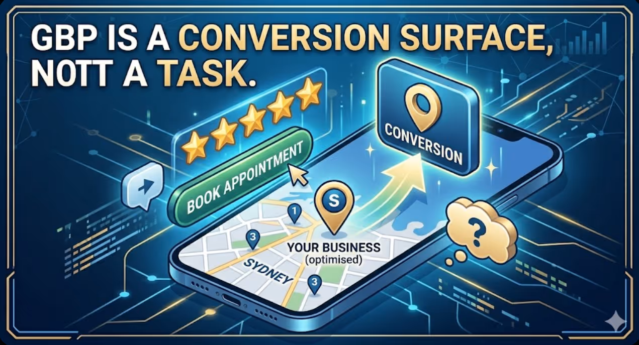
How to Build a Google Business Profile That Converts Browsers Into Booked Appointments
A Google Business Profile that has been set up and left alone is doing roughly the same work as a shop front with the lights off. It confirms the business exists and provides the phone number, but it is not actively persuading a local searcher who is comparing three businesses in the search results to choose this one rather than the competitors sitting directly above and below it in the local pack. The businesses that win appointments from Google local search are not simply those that are closest to the searcher or those with the most reviews, although proximity and reviews both matter. They are the businesses that have treated their Google Business Profile as a conversion surface rather than a directory entry, and have populated every element of the profile with the specific information, imagery, and social proof that a local searcher needs to make a confident decision to book rather than keep browsing. The difference between a profile that ranks and converts and one that ranks but loses its potential customers to competitors is in the specific decisions this article covers: how to write the business description, which photos produce engagement, how to use posts to maintain freshness signals, how to respond to reviews in a way that builds rather than diminishes trust, and how to configure the booking and contact features that reduce friction between intent and appointment.


